Epic and Pyxis
Designing a tool for a local hospital to help nurses complete essential patient screenings and reduce patient safety mistakes.
My Role: Product Design, User Research, Personas, Journey Mapping, User Flows, Usability Testing, Prototyping
The Team: Executive Nursing Manager, Unit Charge Nurse, Speech Pathologist, 2 Developers, and myself - the Product Designer.
*All identifying information about the hospital and its employees has been removed in accordance with the NDA. All names and other information on prototypes, final products, and all other deliverables are not in any way the personally identifiable information of real patients, in accordance with patient privacy laws (HIPAA). *
The Problem
Difficulty swallowing is a common symptom of a stroke. At my client’s hospital, only 54% of patients who were admitted for a stroke were screened for a swallowing problem. They brought me in to design a tool for Epic, their electronic medical record system, to help nurses screen patients more consistently. I conducted a contextual inquiry and learned users have a large number of tasks to do in a short time and are frequently interrupted, which makes it difficult for them to complete the screenings consistently.
The Solution
I designed a new form for Epic in order to help nurses easily complete and document the screening. I also designed a reminder to complete the screening for their Pyxis machines (automated medication dispensers). Within 3 months of launching the tools, the rate of screenings completed on patients who needed them increased from 54% to 97%, and preventable cases of pneumonia due to a swallowing issue decreased from 8.8% to 1.6%.
Constraints
• The solution should be finished, launched, and running smoothly on at least one unit of the hospital within 8 weeks.
• It needed to increase the amount of completed screenings to 90% or more.
• It should include a way to help the nurses remember to complete the screenings.
• It could not cause significant disruptions to the nurses' current workflow.
Key Lessons Learned
I started this project assuming I would only be designing a screening form for Epic. I didn't anticipate designing a second, complementary tool for the Pyxis machine. Since this project, I always approach problems with my mind wide open to all possibilities, even (and especially!) unconventional ones.
I also learned how important it is to observe users in their context of use whenever possible, especially when working with complex software meant for expert users. Onsite observations were essential to gathering crucial information about environmental factors affecting the users' workflow. Without this information, I would have designed a form for Epic that looked good and functioned well, but didn't solve the whole problem.
Through this project, I improved my ability to advocate for the user and educate stakeholders about user experience and the design process. This team had never worked with a product designer and the concept of user experience was new to them.
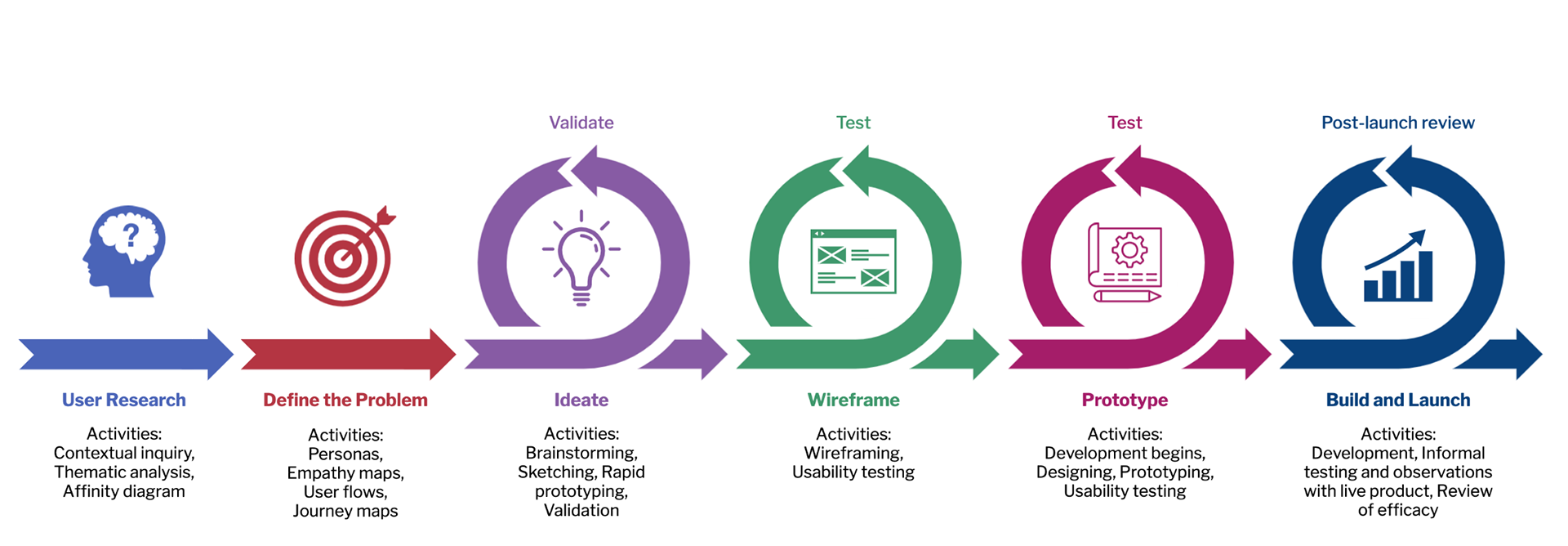
Process Overview
We applied agile and lean UX principles to ensure we met our deadline with a quality, user-centered product. Getting user input and validating design decisions was more important than producing extensive, elaborate deliverables every step of the way. Developers were able to begin building the validated aspects of the design earlier on, which minimized wasted time.
User Research: Contextual Inquiry
We needed to find out why the screenings weren’t getting done, and the best way to do that was to go straight to the source: the nurses themselves. Although I drew from my own experience working in the healthcare industry, I made sure to put aside my own assumptions and approach the project with an open mind to see the problem from the users' point of view. The charge nurse and I worked together to form a user research plan and recruit participants from various units in the hospital. I interviewed and observed 5 users (nurses) from different units to find out more about their work flow and what made it difficult for them to complete screenings on all patients.
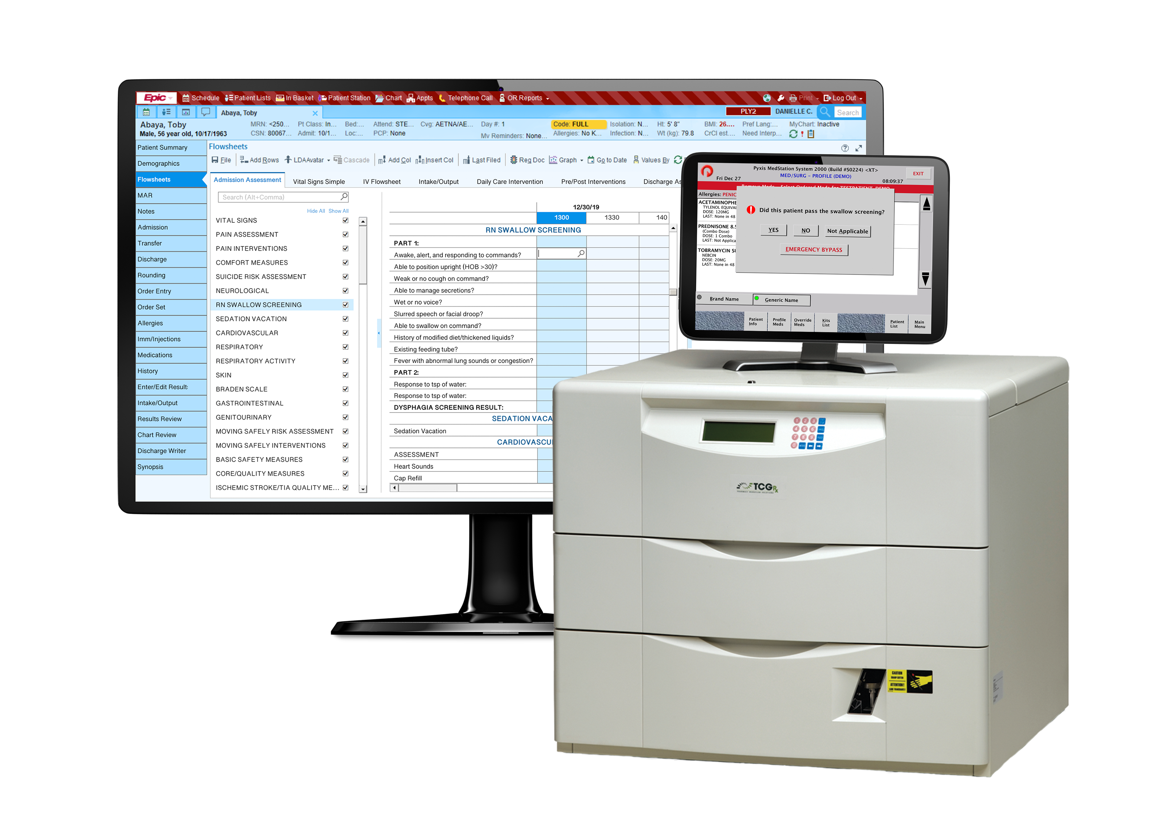
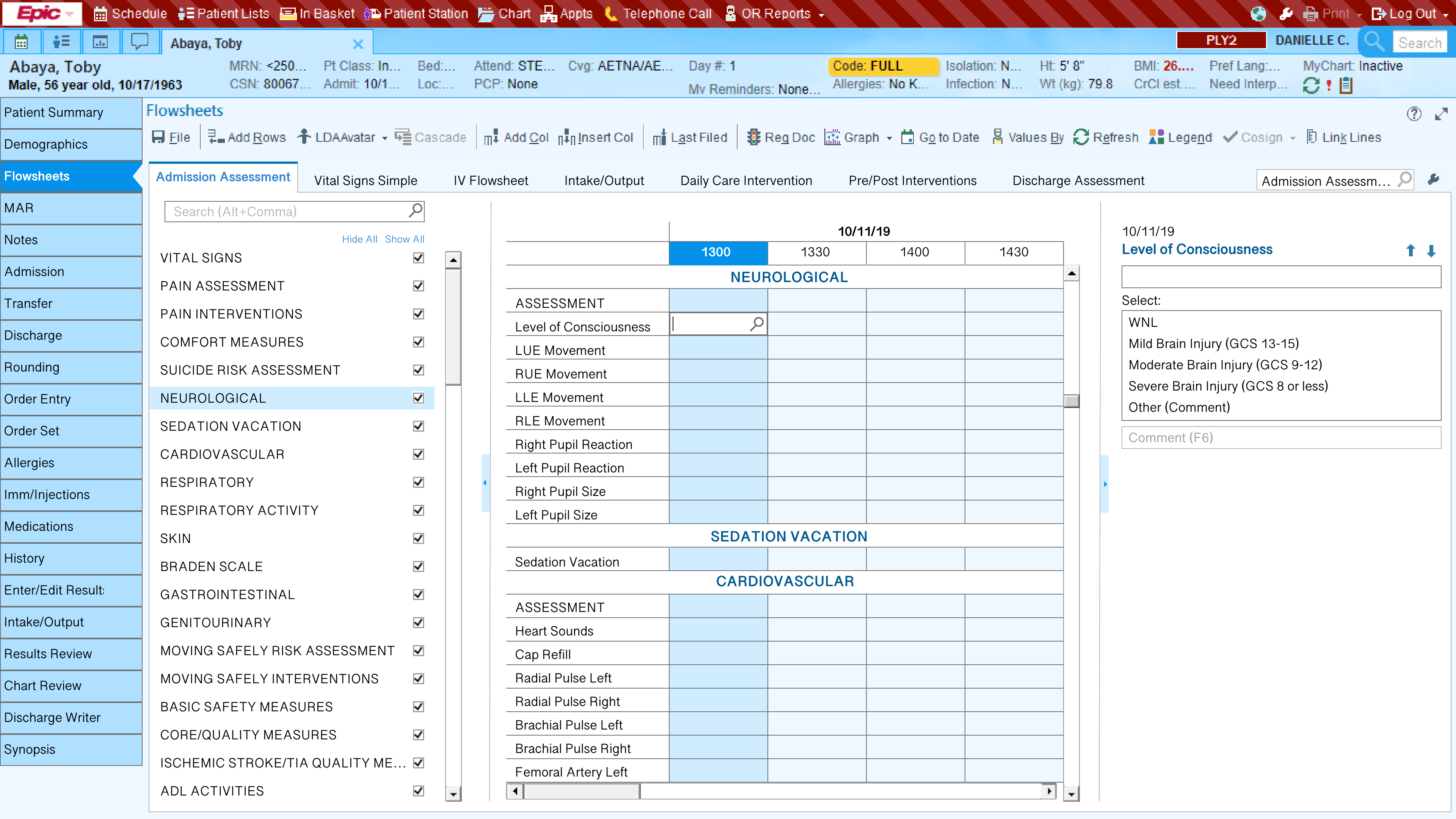
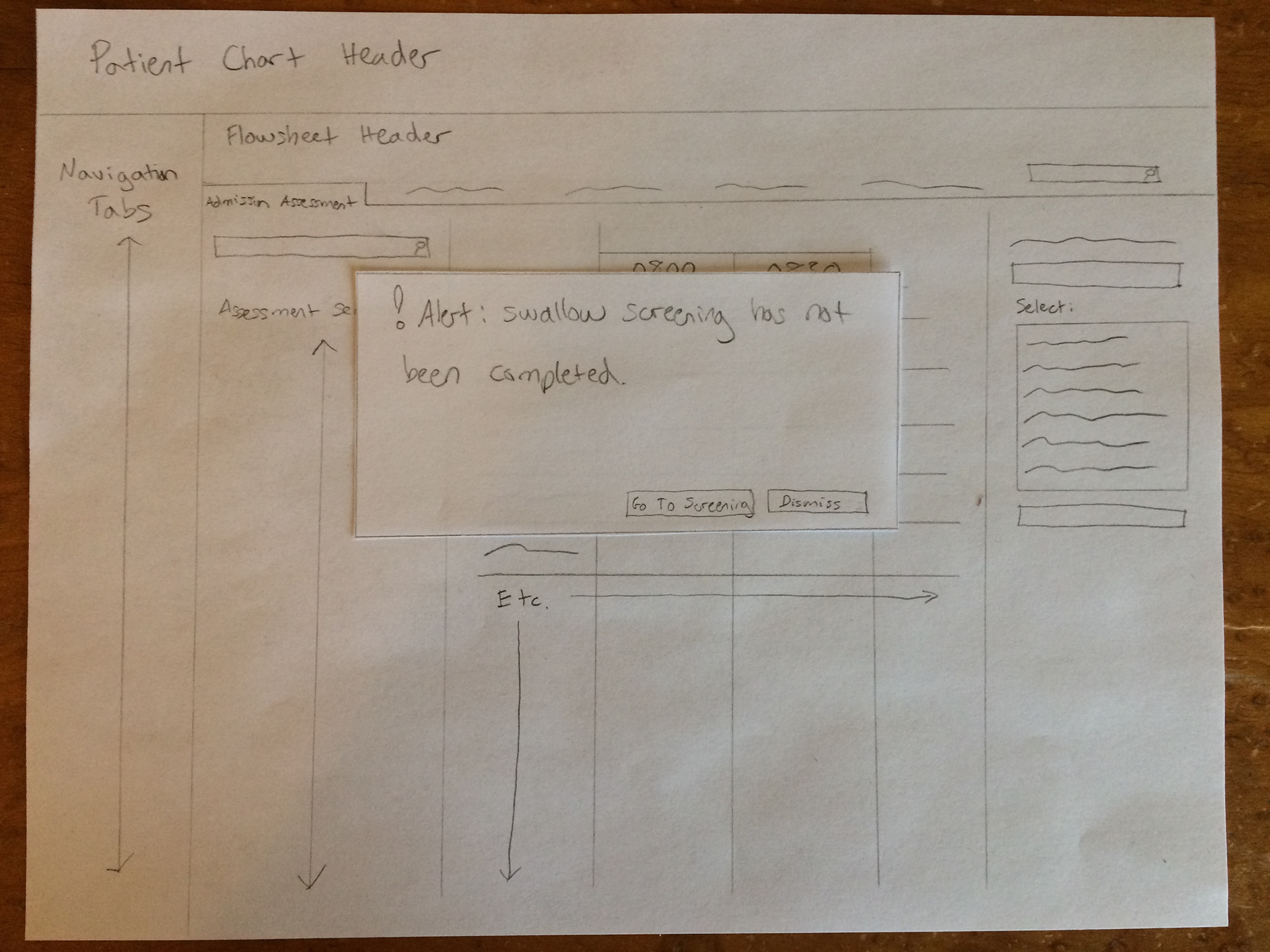
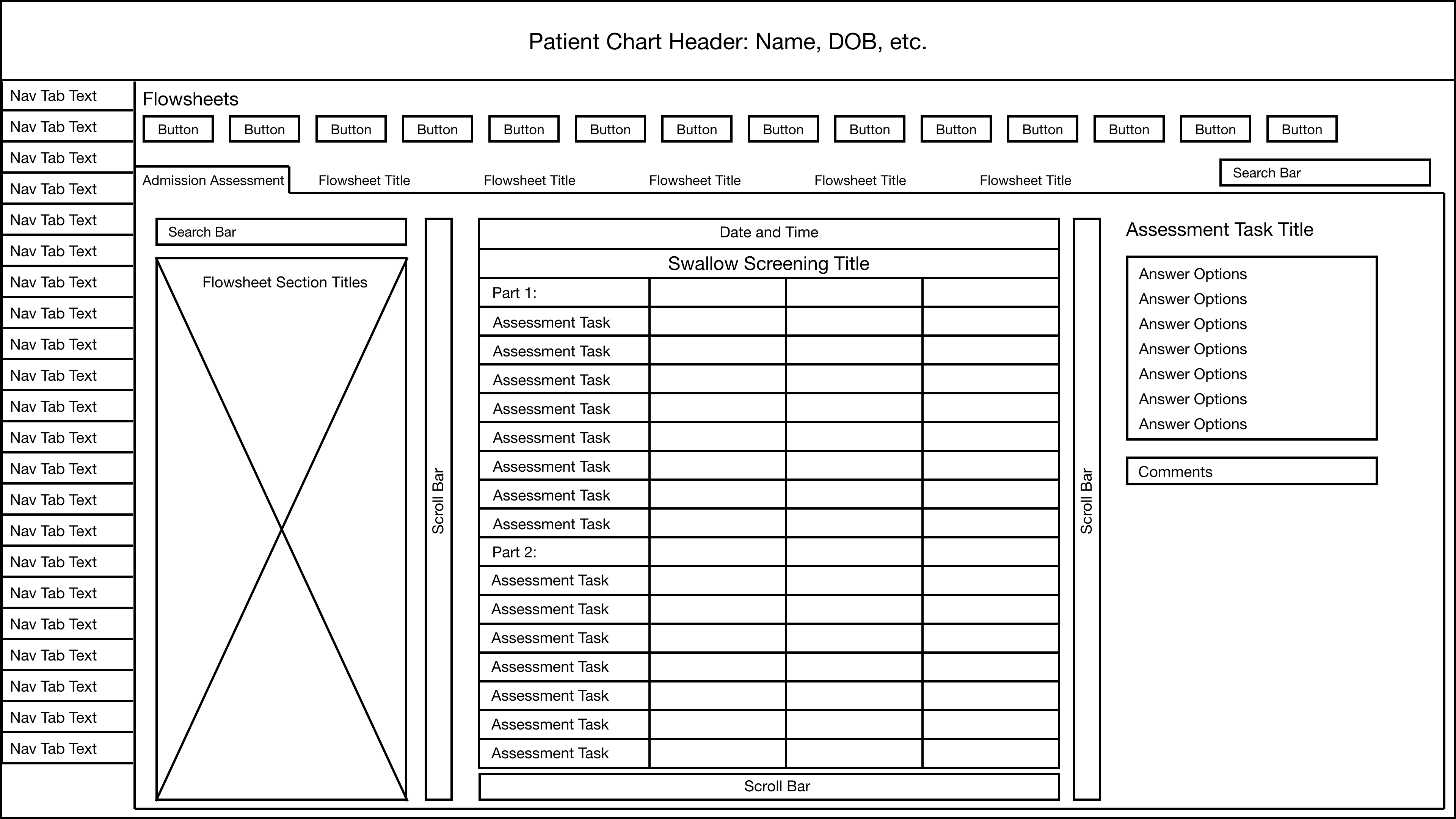
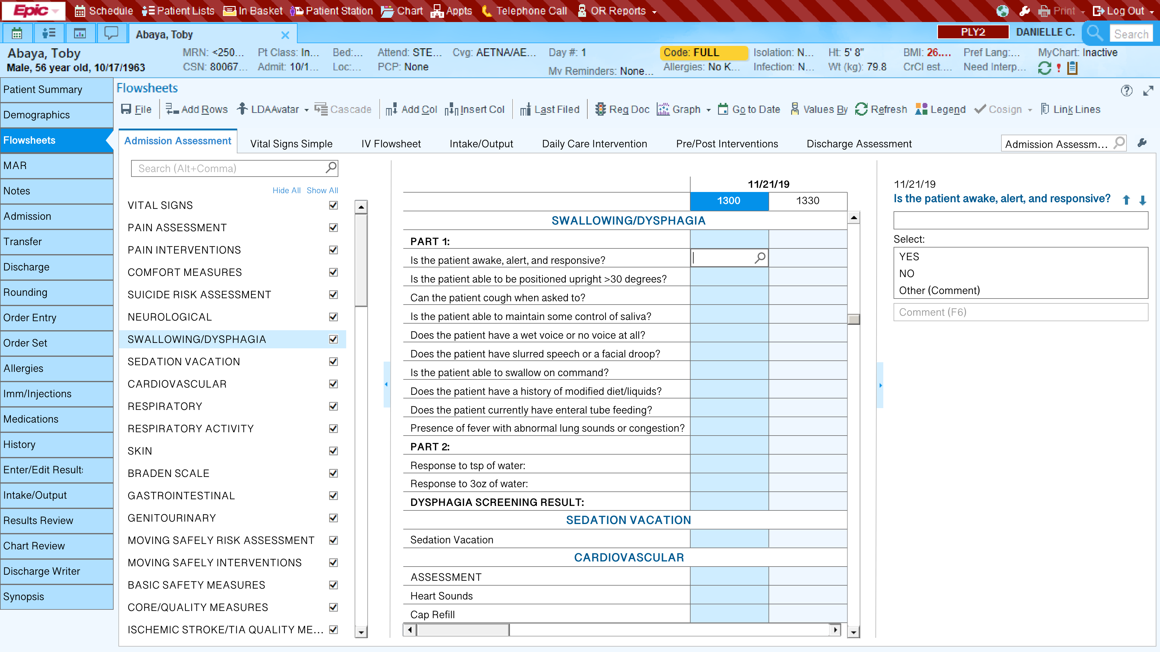
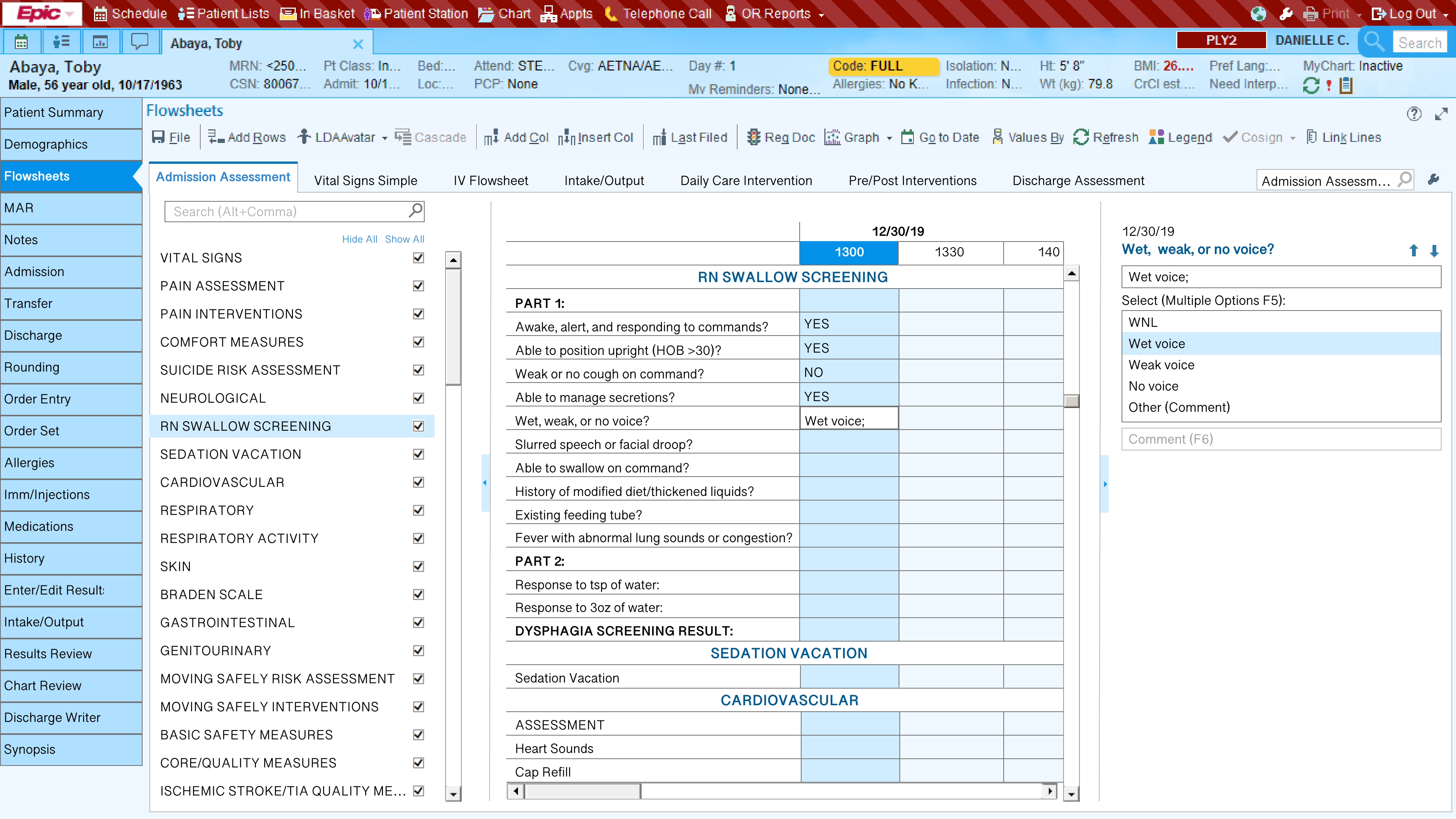
I noticed they used a flowsheet in Epic, their electronic medical record system, to document the admission assessment as they assessed the patient:
Defining the Problem
Now that we had our research results and great insights from users, it was time to nail down the actual problem. What was really getting in the way of these screenings? To figure this out, we used the research results to empathize with users and begin to generate ideas about what the biggest problems might be.
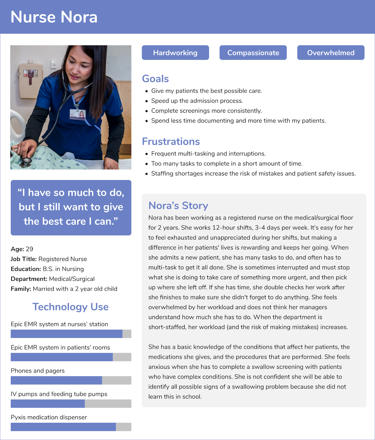
To help the team put themselves in the users' shoes, I created a persona to represent the main themes identified during the contextual inquiry:
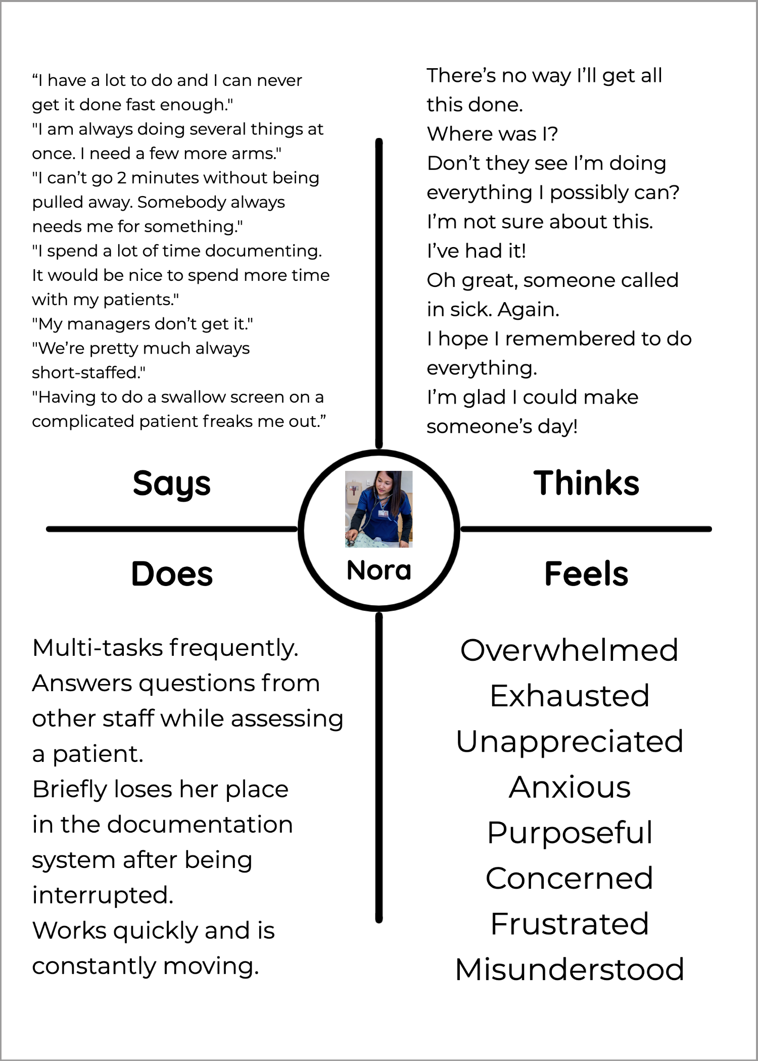
I also created an empathy map for that persona in order to help the team go deeper into the users' world:
To truly nail down the problem, we needed a solid understanding of the users’ workflow. I worked with the charge nurse to create a user flow for the admission and assessment process. This helped us identify pain points in the workflow, and spot potential barriers to the screenings getting done.

We determined that the best time for the swallow screening to be completed was during the head-to-toe physical assessment because that is when all other screenings were already taking place. After completing a task analysis, I created a user journey to represent the actions, thoughts, emotions, and goals of the user during the admission assessment process. We used it to identify specific pain points and begin to generate ideas.
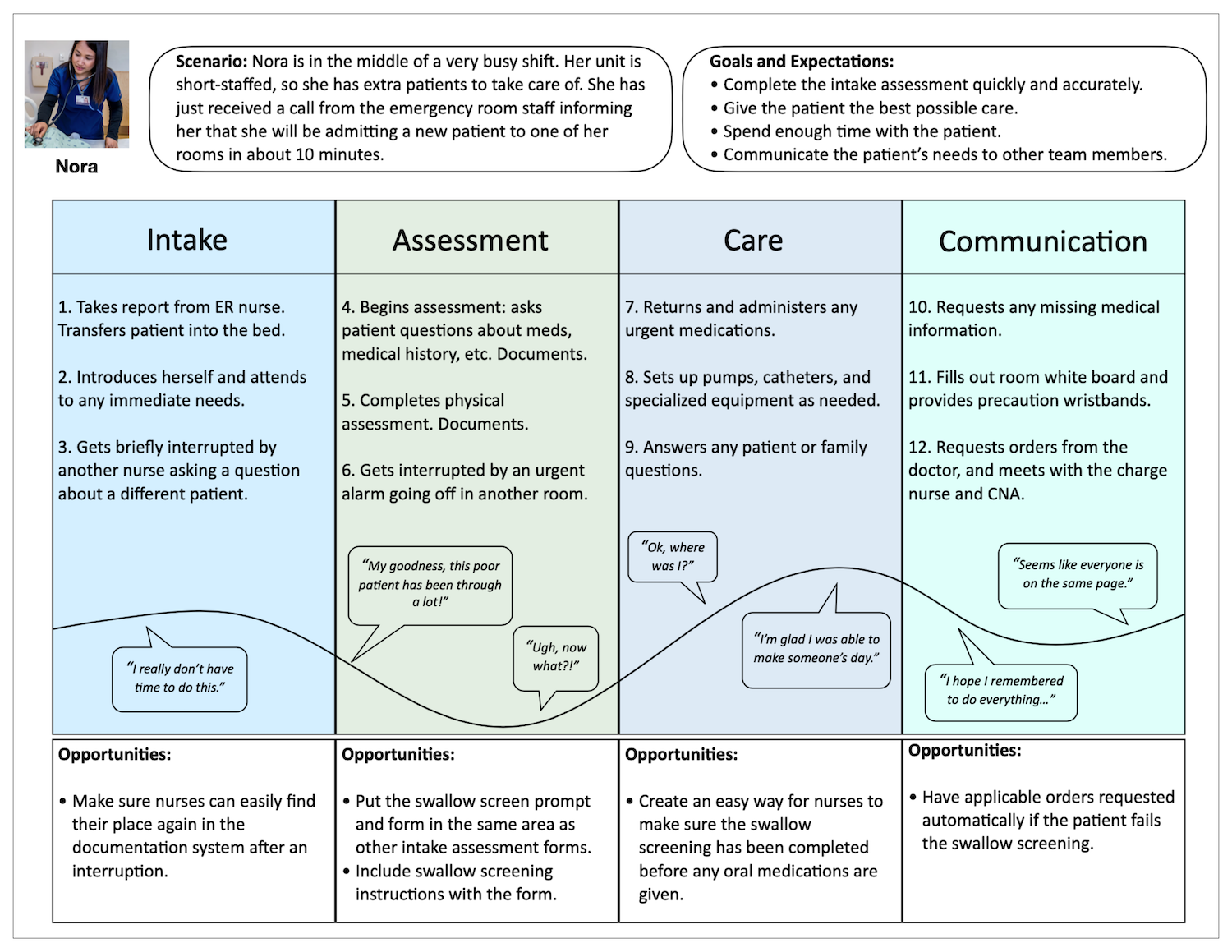
We identified the the main problem: the high cognitive demands of the job. Multi-tasking, frequent interruptions, stress, exhaustion, having many tasks to do, having to rush, trying to remember how to do a task you aren’t familiar with, and frequently switching tasks are all things that, individually, can cause anyone to make mistakes and slips. Combined, well, it was no wonder the users were sometimes forgetting to complete the screening!
We created a problem statement to guide the team through the rest of the design process:
“Nurses need a way to easily remember, complete, and document swallow screenings because their busy, demanding jobs make it hard for them to complete all tasks without external reminders and aides.”

Ideation and Rapid Prototypes
We used brainstorming and sketching to generate ideas because these methods were familiar to everyone on the team. Some of our initial ideas were:
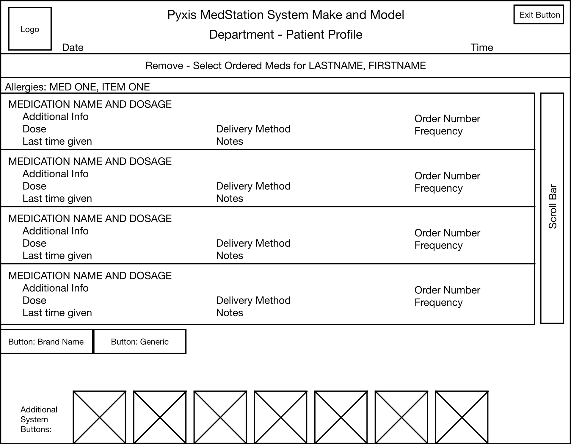
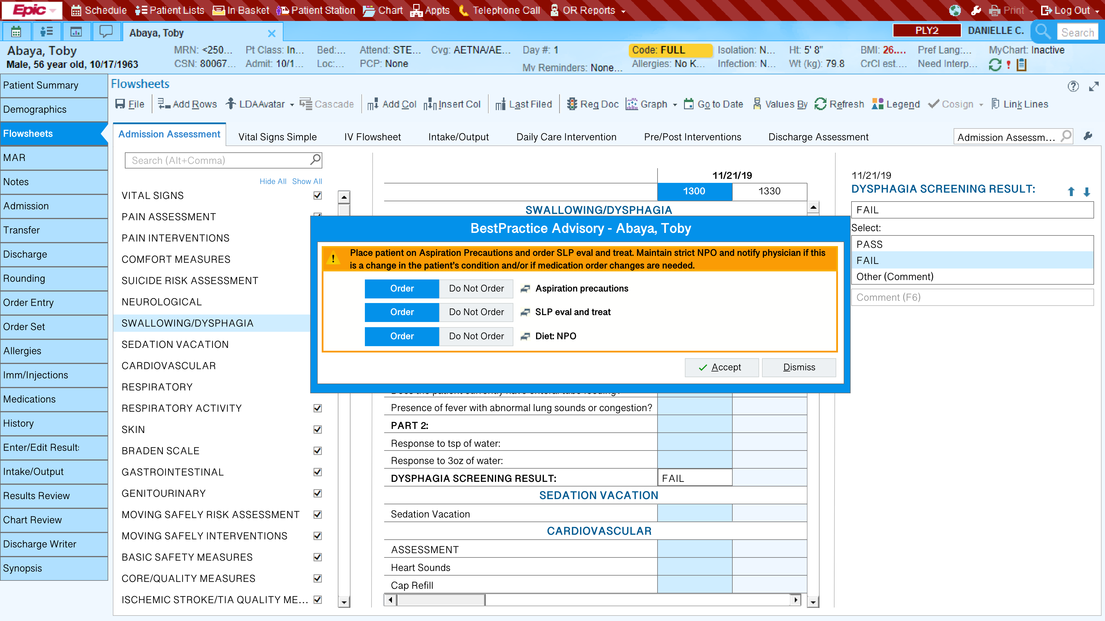
Put the swallow screening somewhere in the admission assessment flowsheet in Epic because users already use this to guide themselves through their current assessment tasks. If the patient fails the screening, have applicable orders applied automatically or with a single click. This will minimize disruption to the rest of the assessment, save time, and ensure the orders are entered.
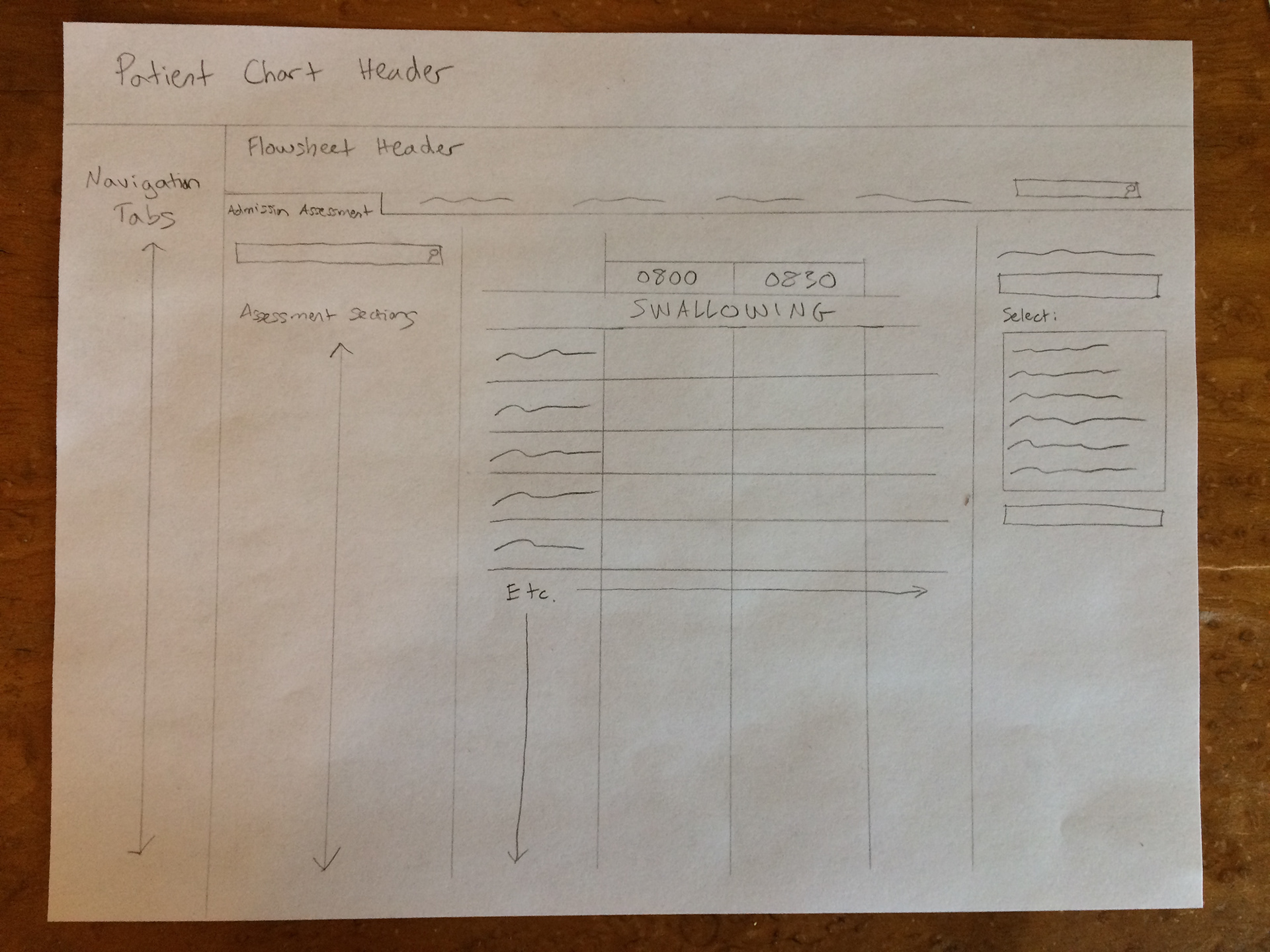
Epic swallow screening form
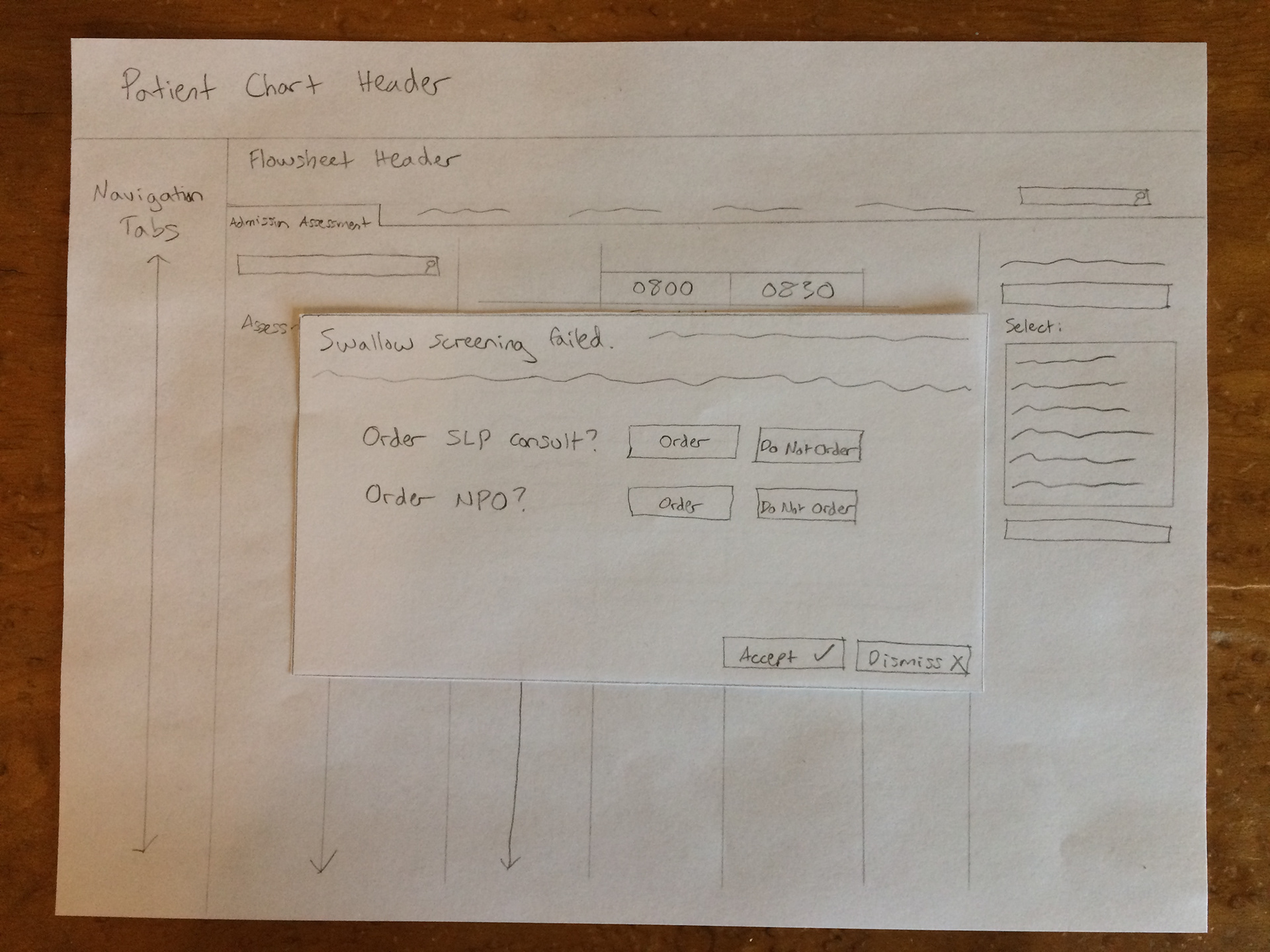
Automatic order prompt
Have Epic remind users to complete the screening, either via a flag or a modal window.
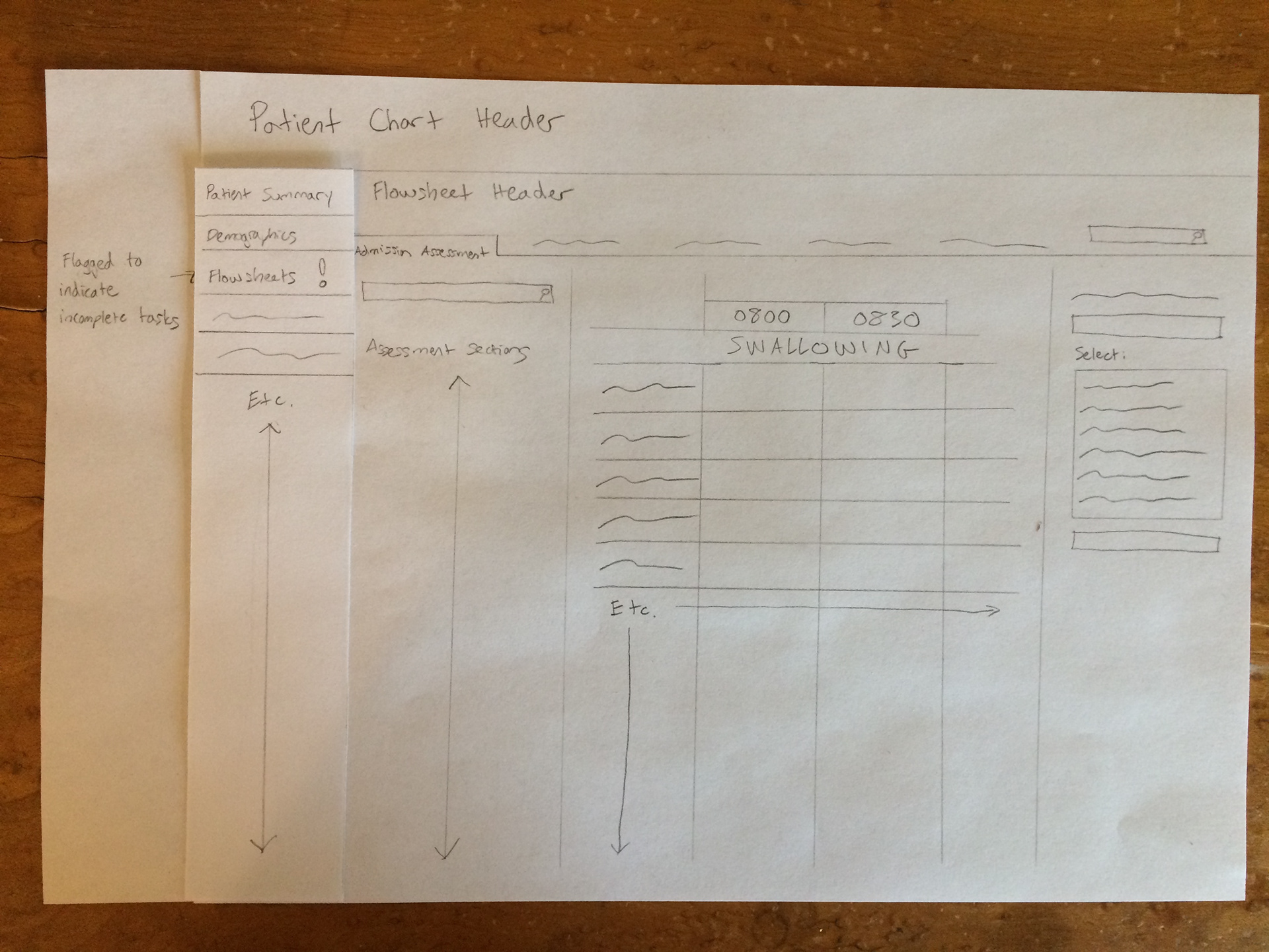
Flag reminder
Pop-up reminder
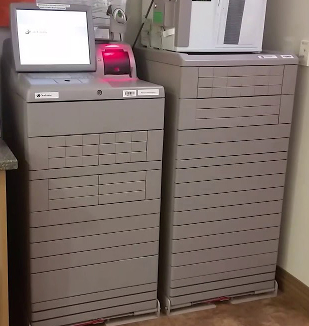
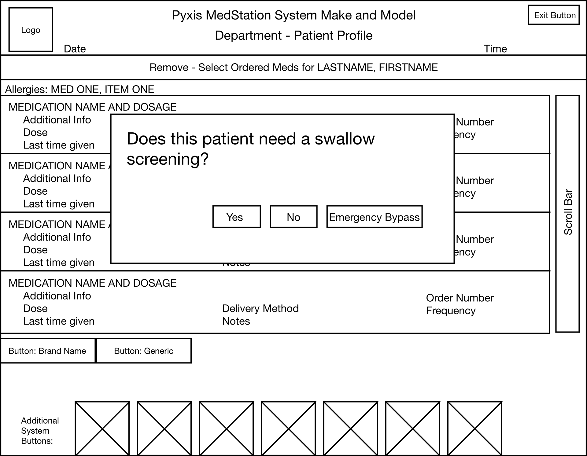
We were disappointed to learn that putting a reminder feature into Epic would force users to complete the screening before they could do anything else, which would prevent them from doing more urgent tasks. I knew from our user research that having an external reminder was essential, so I referred to the user journey and the user flow to identify another point in the admission process when a screening reminder would be relevant: withdrawing medications from the Pyxis machine, their automated medication dispenser. During user observations I learned that giving medications was often the first time the patient needed to swallow something, so it was important for the screening to be completed first.
Pyxis machine:
I sketched the screening reminder for Pyxis, checking in with the development team along the way to ensure the technical feasibility of each feature. After selecting a patient, the reminder would ask users to confirm that a swallow screening has been completed before they can select and dispense medications. Saying "yes" or "no" would be a 2-step process for error prevention and recovery, which is especially important in the users' hectic environment.
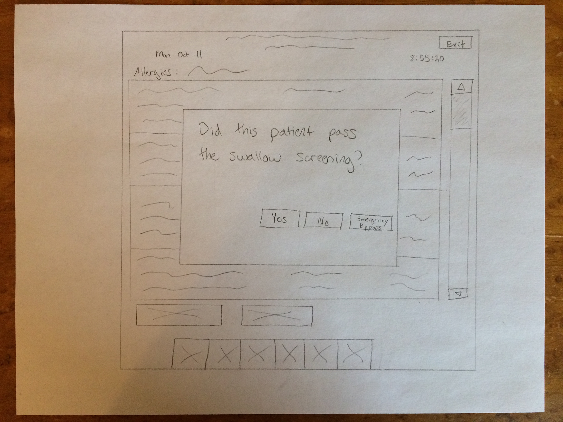
Pyxis swallow screening reminder
Confirm selection
Wireframes
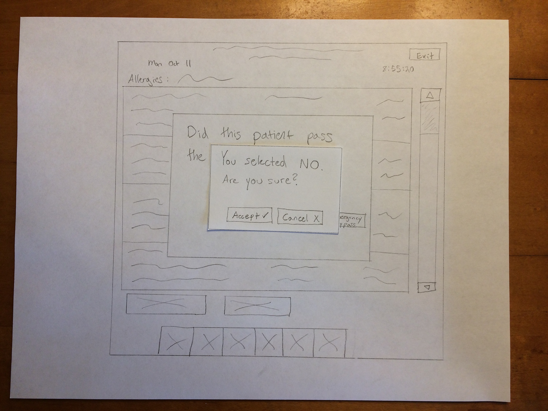
Before creating wireframes, I wanted to make sure our ideas worked for users. I did some quick usability testing with the sketches and discovered that users were confused about what to do when the patient didn't need a swallow screening, so we changed the wording of the reminder prompt. The current Epic and Pyxis design systems guided my UI decisions throughout the design process.
Pyxis swallow screening reminder prompt
Medication screen after reminder prompt is completed
It was clear from our user research that users were exceptionally busy, so we split the Epic assessment form into two parts in order to save time for the user. If the patient doesn't pass the first part, there is no need to complete the second part.
Epic swallow screening form
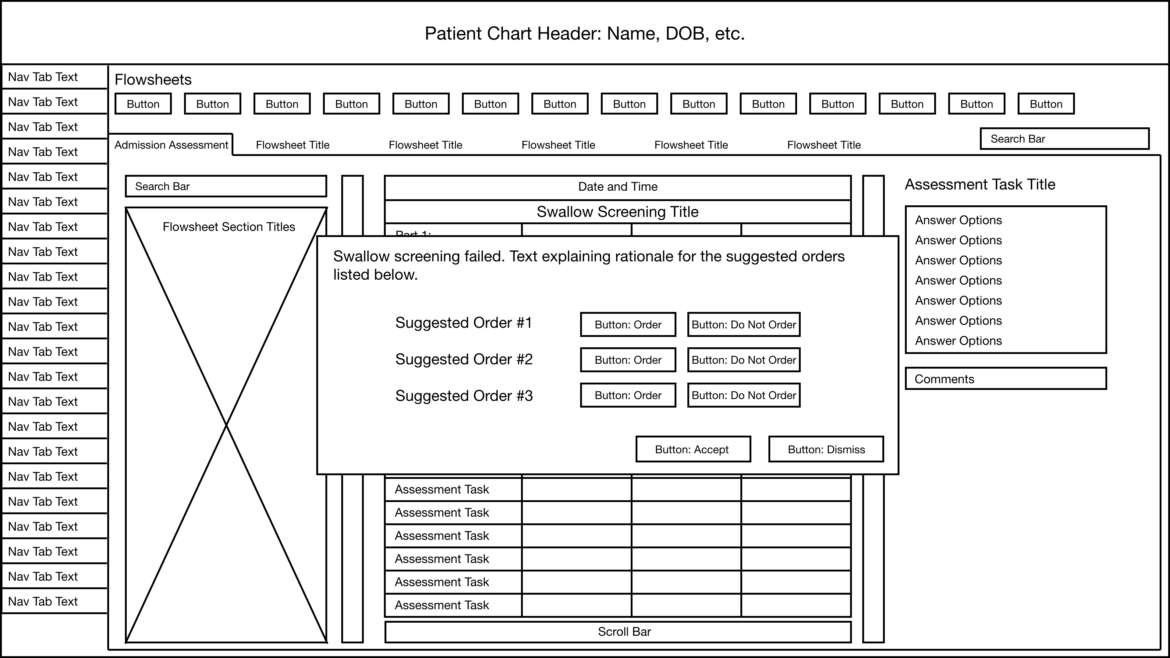
Failed screening order prompt
High-Fidelity Prototypes
I shared the wireframes with the charge nurse and manager, and explained all of the design decisions to make sure everyone was on the same page. After they approved the wireframes, the speech pathologist and I worked together to create the content and prompts for the swallow screening form.
We needed something more interactive and realistic to be able to accurately test the screening form with users, so I created a high-fidelity prototype of the Epic swallow screening. In order to reduce time and effort for the user, we listed the most common symptoms first. As I created the prototype, I collaborated with the development team along the way to ensure technical feasibility. Pyxis was a simpler machine that could easily be represented on paper, so to save time for the team I did not create a high-fidelity prototype of the reminder.
The swallow screening flowsheet:
The charge nurse and I worked together to create the content of the order prompt. The most common choice for users was "order" so I set this option as the default to save time and effort for the user.
The order prompt:
Usability Testing
Now that we had the prototypes ready to go, it was time to test them with users. The charge nurse and I collaborated to form a testing plan and recruit participants. The context of use was critically important, so 5 users tested the prototypes while they completed a mock intake assessment on an unfamiliar staff member who played the part of the patient. Users left their pagers and other communication devices on to allow for distractions and mimic the real context of use.
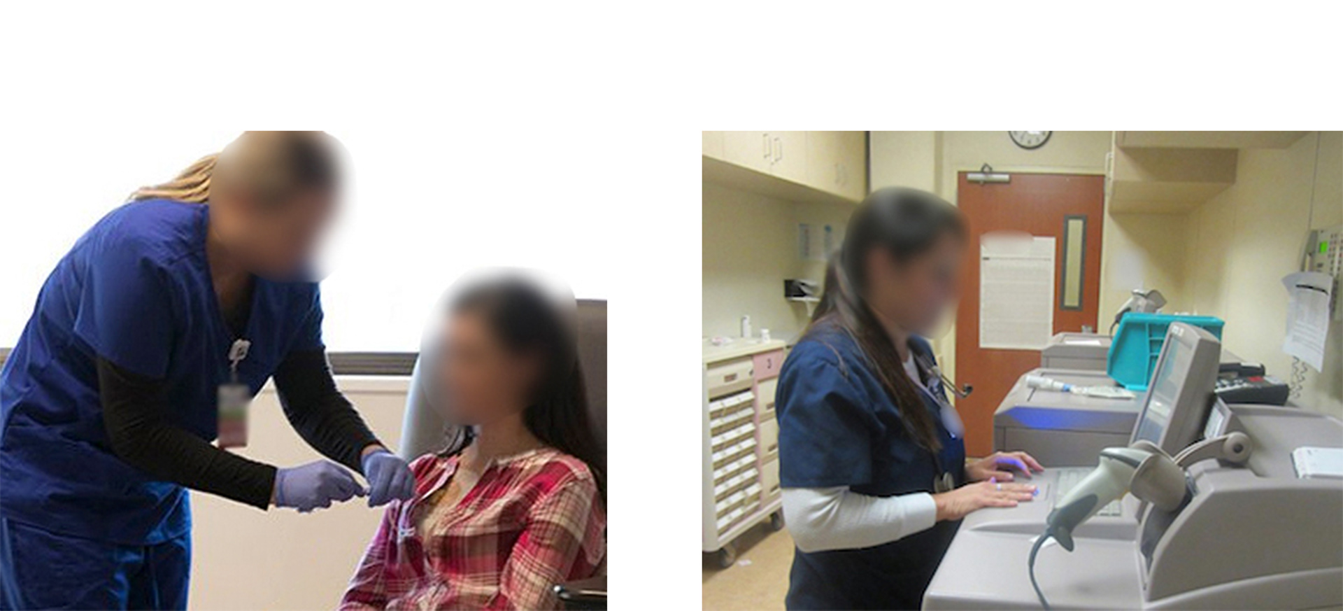
Completing the mock patient intake assessment and testing the swallow screening tools
Results
Successes:
√ 5/5 users successfully completed the swallow screening.
√ 3/5 users noticed the new screening form in the admission assessment flowsheet in Epic and completed it right away. The other 2 users benefitted from the Pyxis reminder, which prompted them to complete it.
√ The questions on the screening form walked the users through the process, which reduced confusion and errors.
√ The automatic order prompt following a failed screening significantly reduced time and effort for the users.
Pain Points:
X Users liked having a screening flowsheet to follow, but 4/5 reported that it took too long to complete compared to every other assessment flowsheet in Epic.
X 3/5 users were confused by the title of the flowsheet and asked what it was.
X 4/5 users were confused by the wording of the reminder on Pyxis. For example, they weren't sure if selecting "YES" meant "Yes, they still need it because I haven't done it yet" or "Yes it has been completed."
The Final Product
The Final Epic Swallow Screening Form
I collaborated with the speech pathologist to shorten the questions and prompts in order to to make it quicker to scan and process. We also changed the title of the flowsheet to clarify the purpose of it.
The user begins the swallow screening by answering the questions in order:

Here, they are documenting a symptom that will cause the patient to fail the screening:
The system prompts them to enter the applicable orders:

The Final Pyxis Reminder
The charge nurse, speech pathologist, and I collaborated to change the wording and options on the reminder. To ensure technical feasibility, I met with the developers to discuss the proposed design changes. I demonstrated the wording and UI changes by annotating the wireframes.
First, the nurse selects a patient from the list:
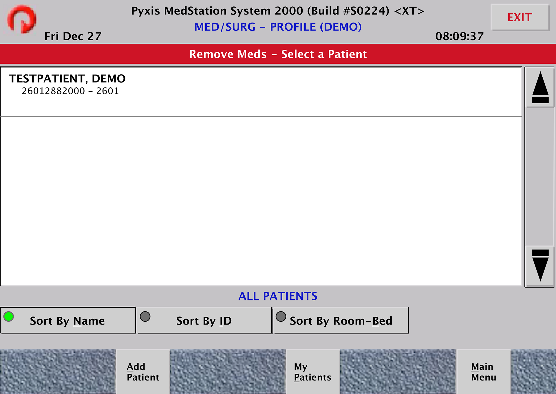
Next, the swallow screening reminder pops up and must be completed before they can select medications:
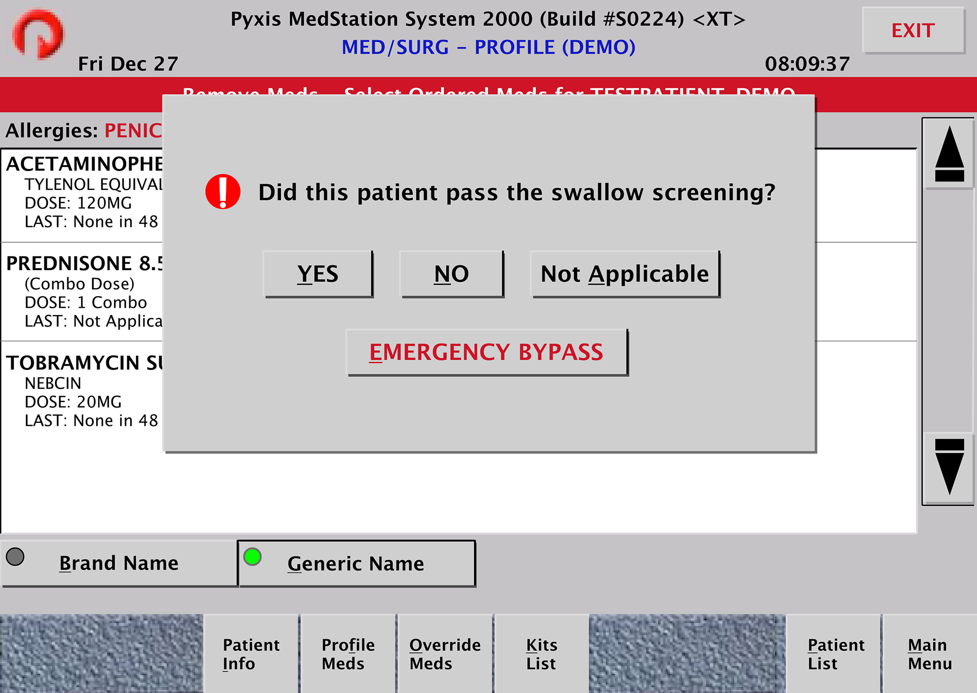
They confirm that their selection was correct:

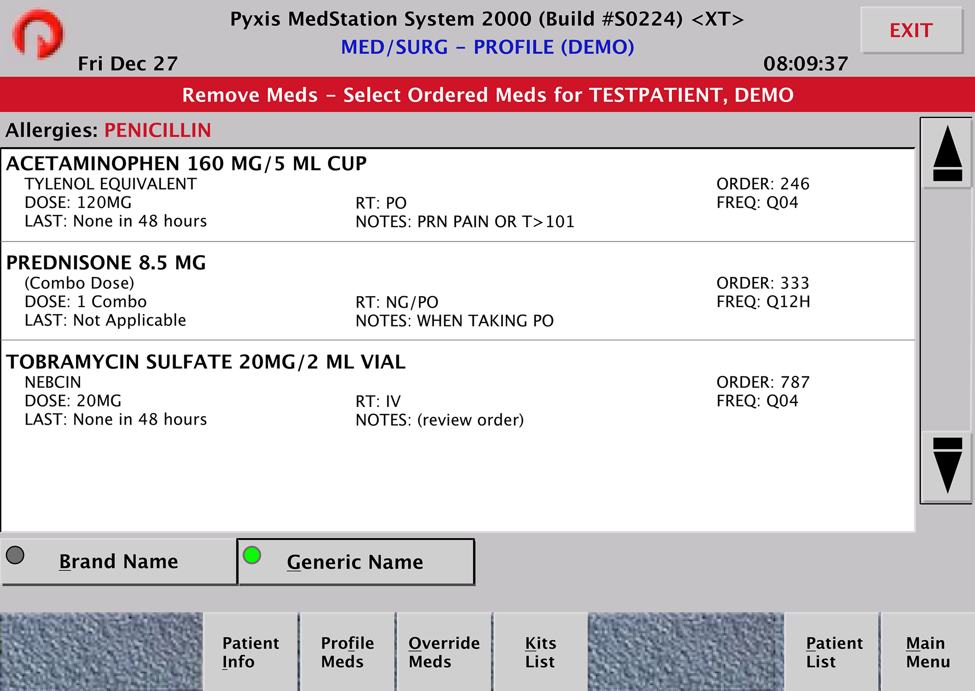
After addressing the reminder, they can select medications from the list:
Outcomes
After the screening form and reminder were launched, we wanted to make sure the changes we made after the usability testing sessions were effective. The speech pathologist and I observed users using the live products with real patients to make sure the products were usable and achieved the desired goal of increasing the rate of screening completion in the real context of use.
The wording changes on both Epic and Pyxis successfully eliminated confusions, and reduced time and effort for the user. Neither the screening nor the reminder caused a significant disruption or delay to the users' workflow. And most importantly, all of the users we observed completed the swallow screenings accurately!
Quotes from users:
"This is easy to follow.”
"I like that it tells you exactly what to do. I feel a lot more comfortable doing the swallow test with that.”
"I was worried this was going to be annoying, but it’s not.”
Within 3 months of launching, the number of swallow screenings completed on patients who needed them increased from 54% to 97%, and preventable cases of pneumonia due to a swallowing issue decreased from 8.8% to 1.6%. These tools were so successful that management decided to use them at all of the other hospitals within that system.
More Case Studies
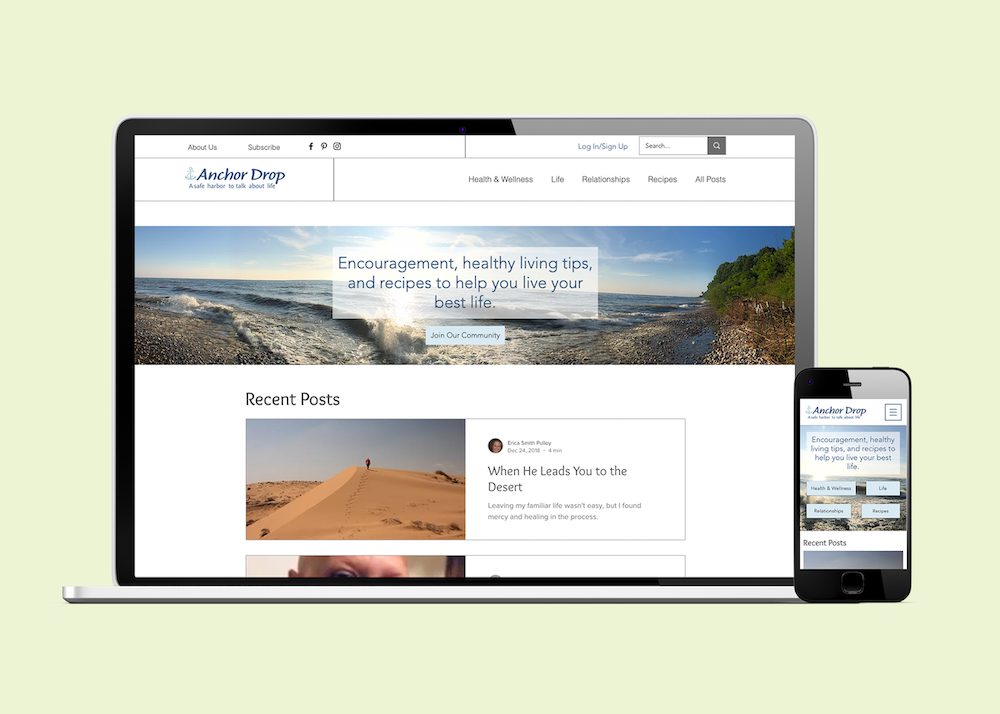
Anchor Drop
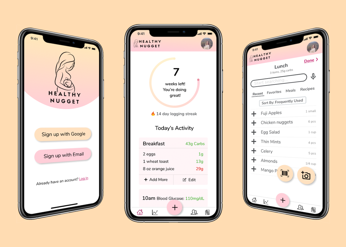
Healthy Nugget