Flora2Go
Designing an app for a two-sided flower delivery marketplace to help customers quickly select and send flowers, and help florists easily manage orders.
My Role: UX/UI Design, User Research, Usability Testing, Wireframing, Prototyping, User Flows, Journey Maps, Brand Design, Content Writing
The Problem
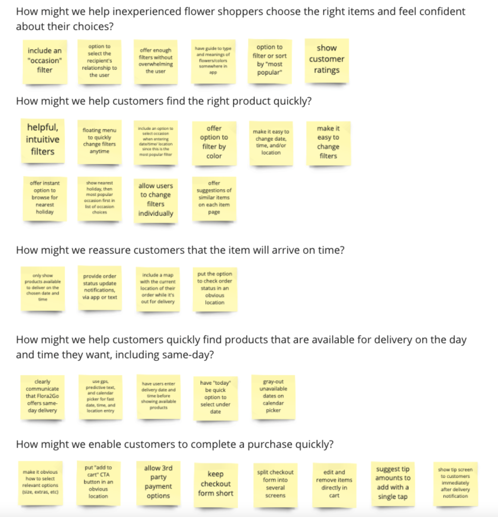
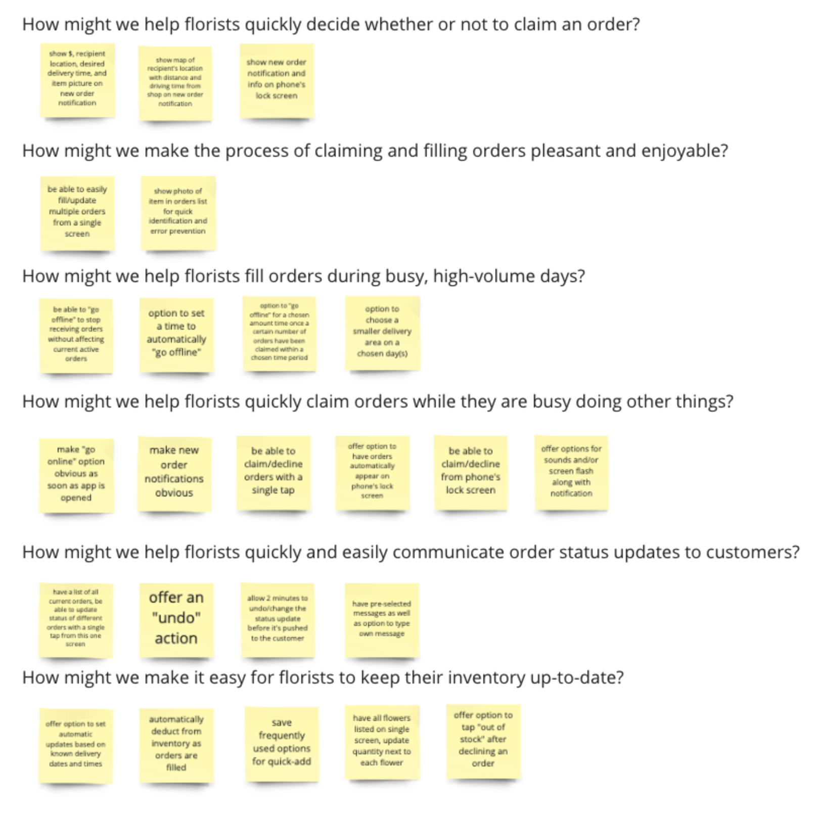
Flora2Go is a mobile app-based startup whose goal is to let customers have flowers, bouquets, and other floral arrangements delivered same-day. They wanted a design for a two-sided marketplace: an app for customers to purchase flowers, and a corresponding app for florists to receive and manage orders. I conducted user interviews with both customers and florists. I learned that customers don’t have much experience buying flowers, are unsure which item to choose, and are anxious for it to arrive on time. I learned that florists are often accepting and filling multiple orders at once, all while simultaneously completing other tasks.
The Solution
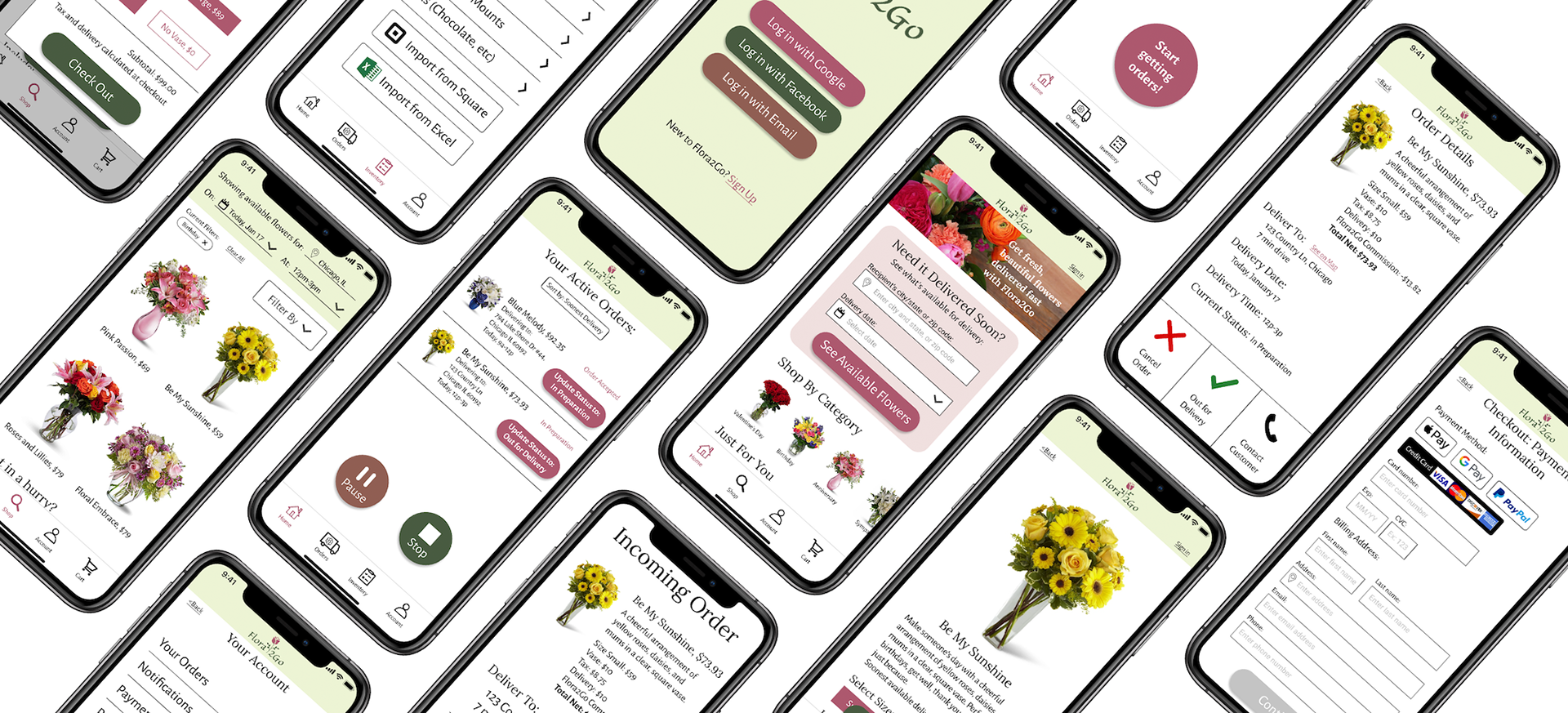
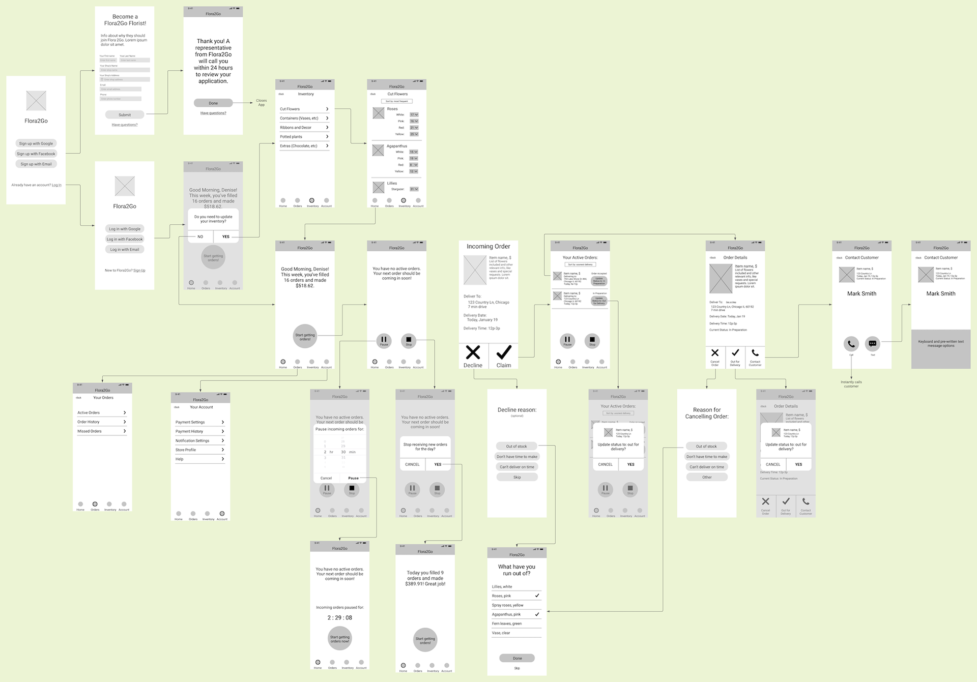
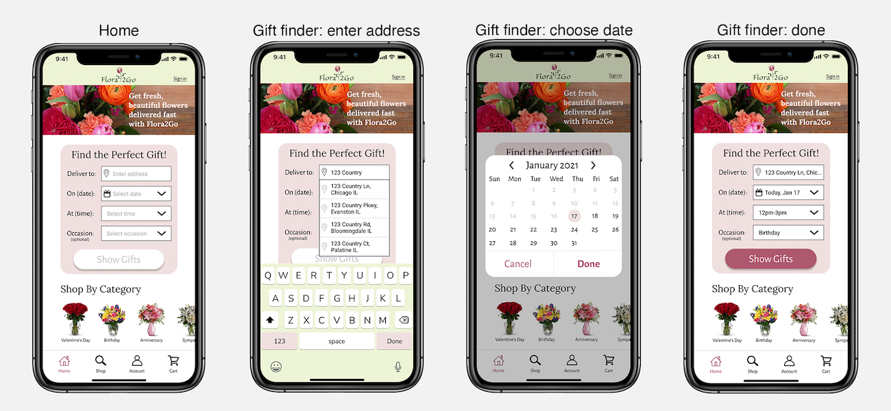
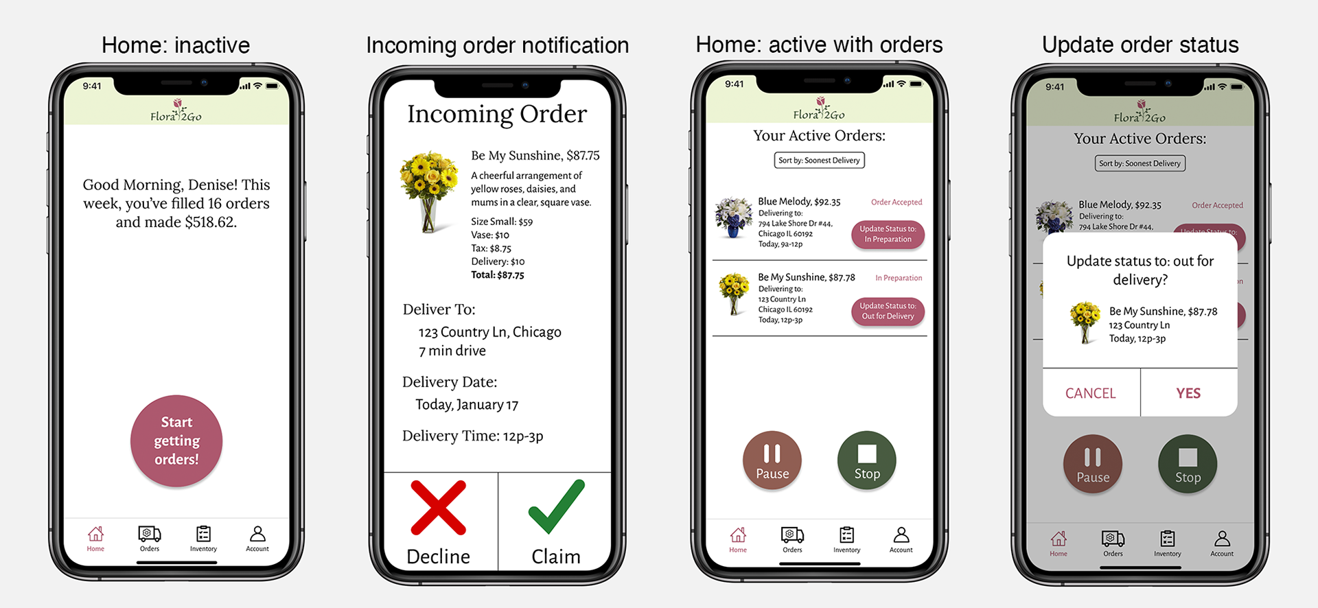
I designed an app for customers that includes a fast and instructive form on the homepage to help users immediately narrow down items that are available for delivery at the desired location and date. Intuitive filters help inexperienced shoppers quickly find the right item. I also designed a corresponding app for florists to receive and manage orders. Incoming order notifications include brief information to help them decide whether or not they can accept it. Large decline and claim buttons to make it easy to respond to orders while multi-tasking. Active orders are shown on the homepage, allowing users to easily update and manage multiple orders at once.
Constraints
• Customers must be able to quickly and easily search and filter products by price, style, flower type, and color.
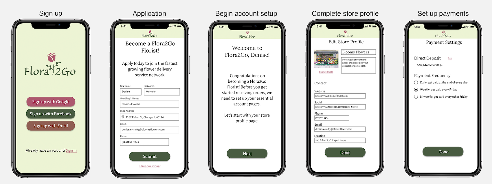
• Florists must be able to sign up for their account within 2 screens and receive information via a 3rd screen about the approval process.
• Customers and florists must be able to sign up quickly via Google or Facebook authorization.
• There should be some form of order status tracker for customers to see where their order is in the delivery process. There should be a corresponding design for florists to update this status tracker.

Key Lessons Learned
I learned that onsite usability testing (field testing) can reveal issues and use cases that weren’t apparent during user research. During interviews, florists stated they would prefer to manage their inventory in the Flora2Go app separately from their current inventory management system. During testing, it became clear that doing so would be a significant burden and integrations were needed. What users say they want and what they actually need are often different.
I also learned to question everything and always advocate for the user. The initial project brief asked for the customer app to require users to create an account before doing anything else. I quickly recognized this would turn many potential customers away, and instead designed an app that let them shop first and offered the option to create an account later. Users need to see the value they will get before giving away sensitive information.

User Research and Defining the Problem
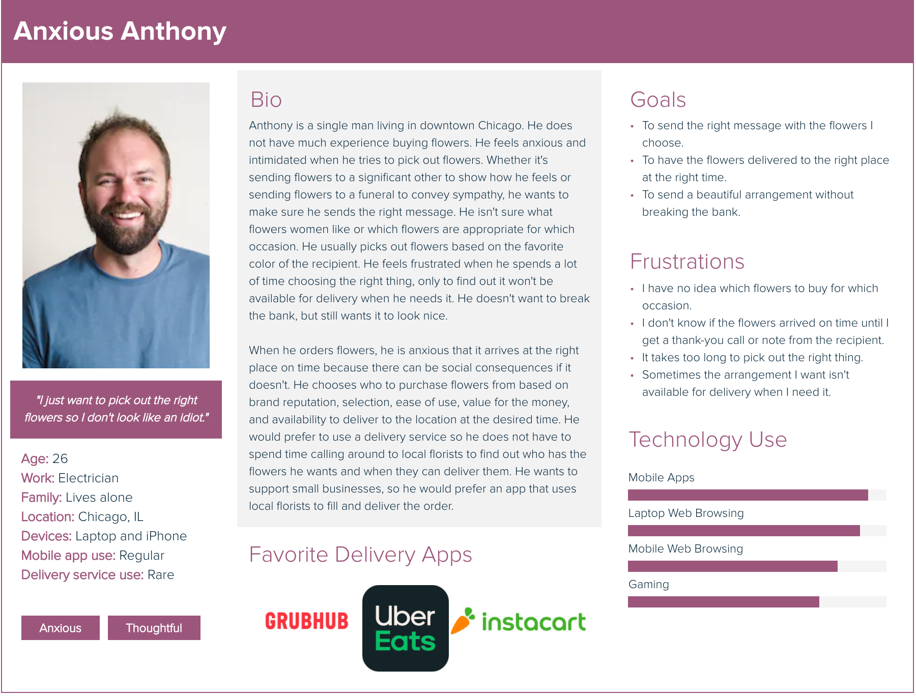
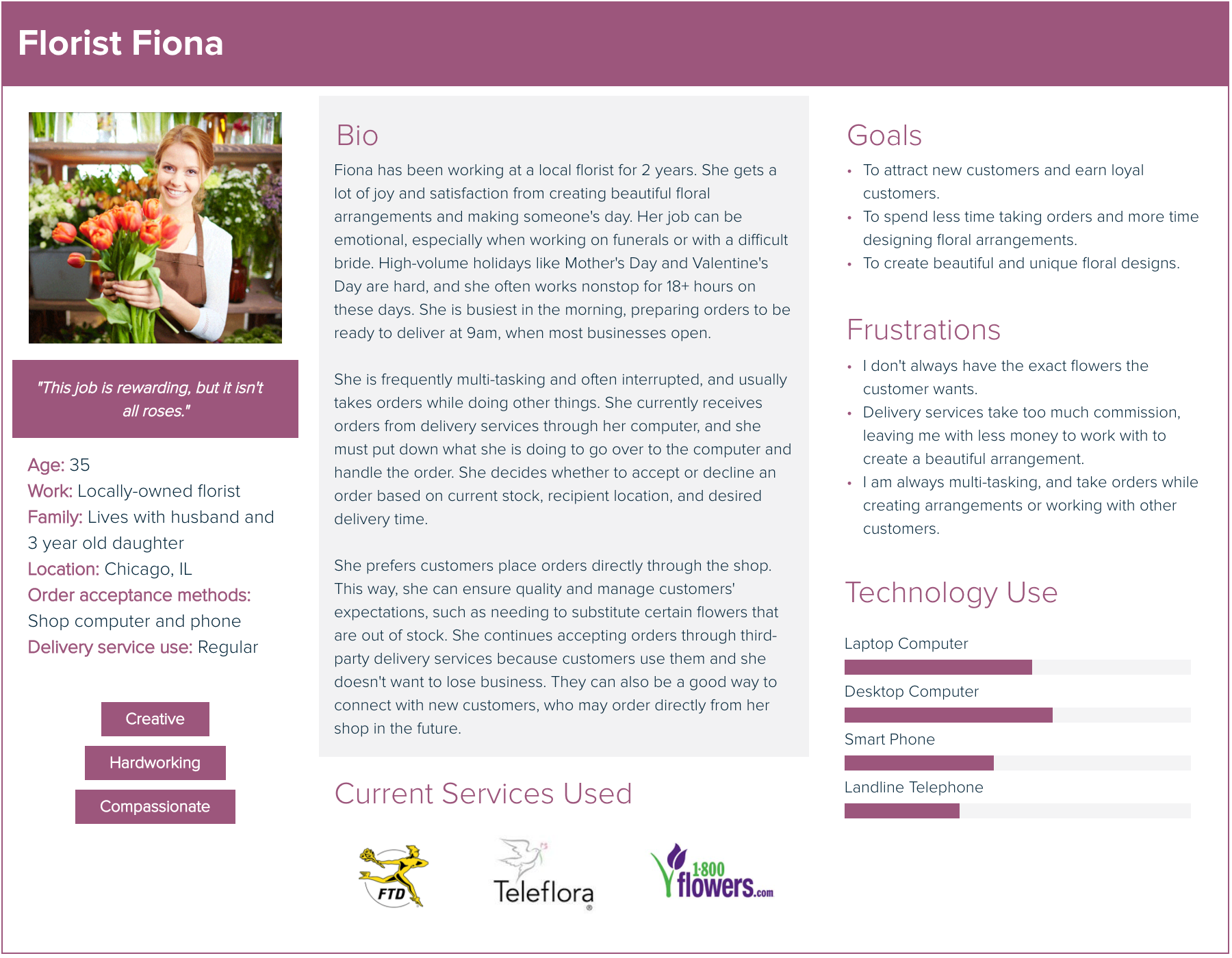
Before recruiting participants for user research, I needed to know who our primary users were. As this was a 2-sided app, I had two main user groups to identify: the customer and the florist. Most florists will accept orders from flower delivery services like Flora2Go. Customers who order using third-party delivery services and apps are usually younger, less experienced shoppers.
Although I drew from my past experience working in the flower industry, I made sure to put aside my own assumptions and conduct research with an open mind to see the problem from the users' point of view. I conducted user research by interviewing florists and customers. I analyzed my results and created personas based on the main themes I identified:
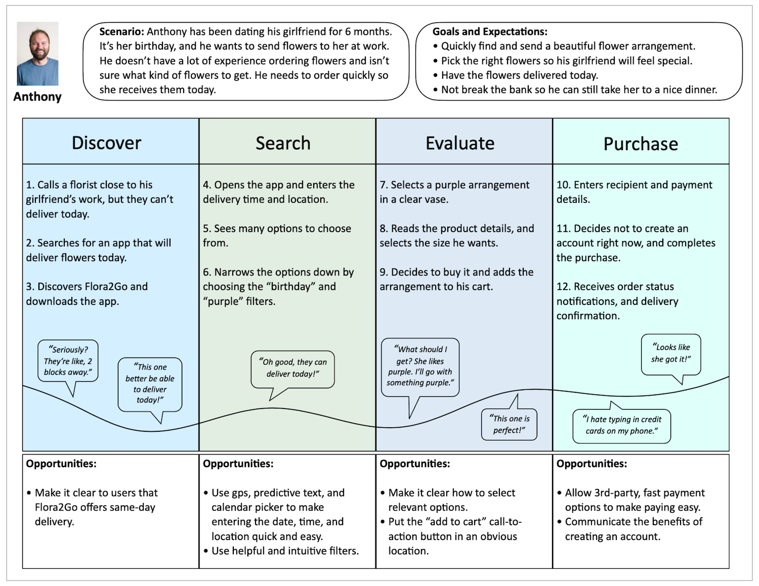
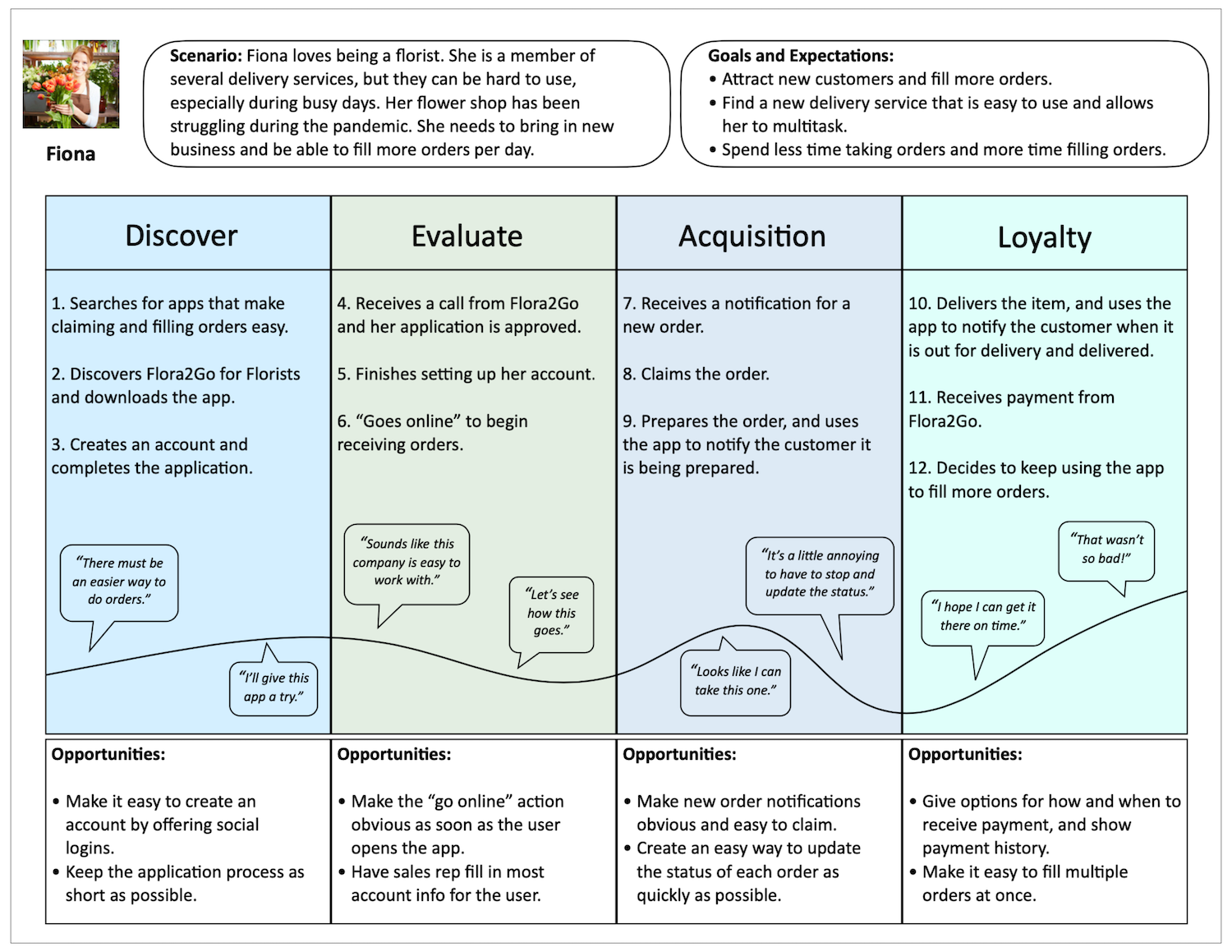
I also created a journey map for each persona in order to represent the actions, thoughts, goals, and emotions of customers as they shop for and purchase an item, and florists as they receive and fill an order. These journey maps helped me begin to identify pain points and generate ideas.
To help guide the rest of the project, I created problem statements that summarized the users' primary needs and problems.
Customer problem statement: “Inexperienced floral customers need a way to quickly and easily select flowers for fast delivery because they are not sure what to buy and are often pressed for time.”
Florist problem statement: "Florists need a way to quickly and easily accept and fill orders because their jobs are very busy and they must often take and fill these orders while completing other tasks."

Ideation
A good understanding of the user flow was essential to design an app that would help users achieve their goals with as little friction as possible. I created user flow charts to map out the steps each type of user would take to complete common tasks in the app. This helped me begin to generate ideas for ways to make these flows easy, pleasant, and fun.
Customer flow:

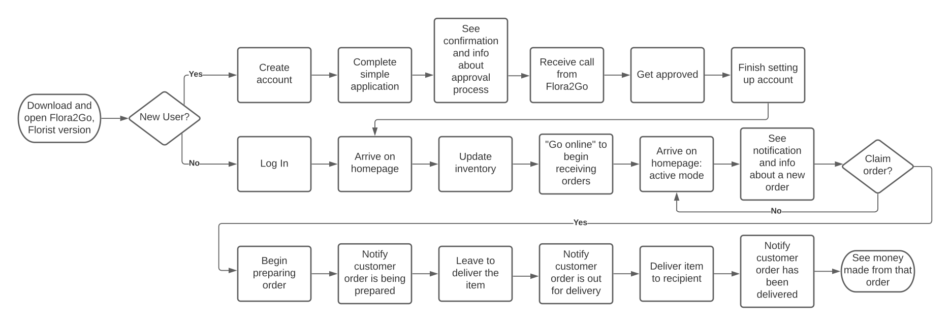
Florist flow:
When a customer places an order with a flower delivery service, the delivery service sends information about that order to all florists in their network who are within a reasonable delivery distance of the recipient. One of those florists then “claims” the order, and the order is no longer available to the other florists.
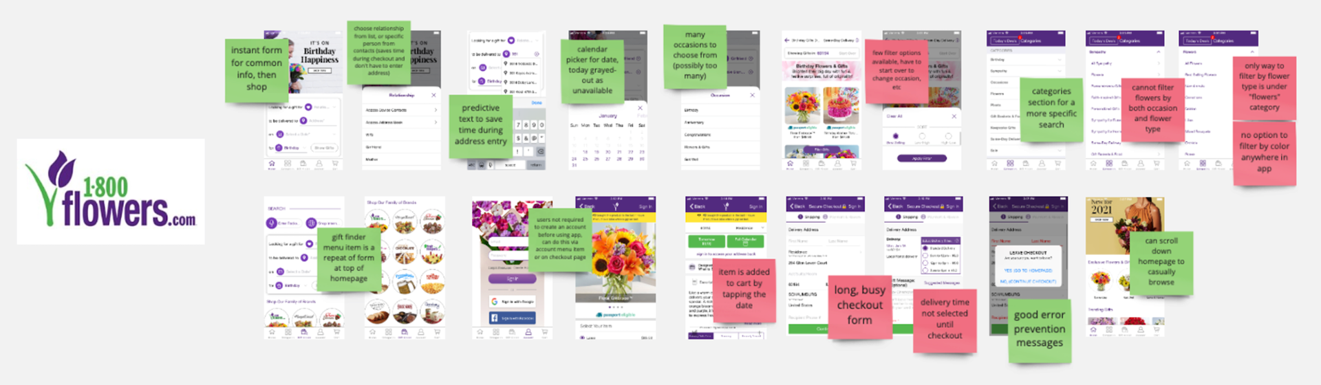
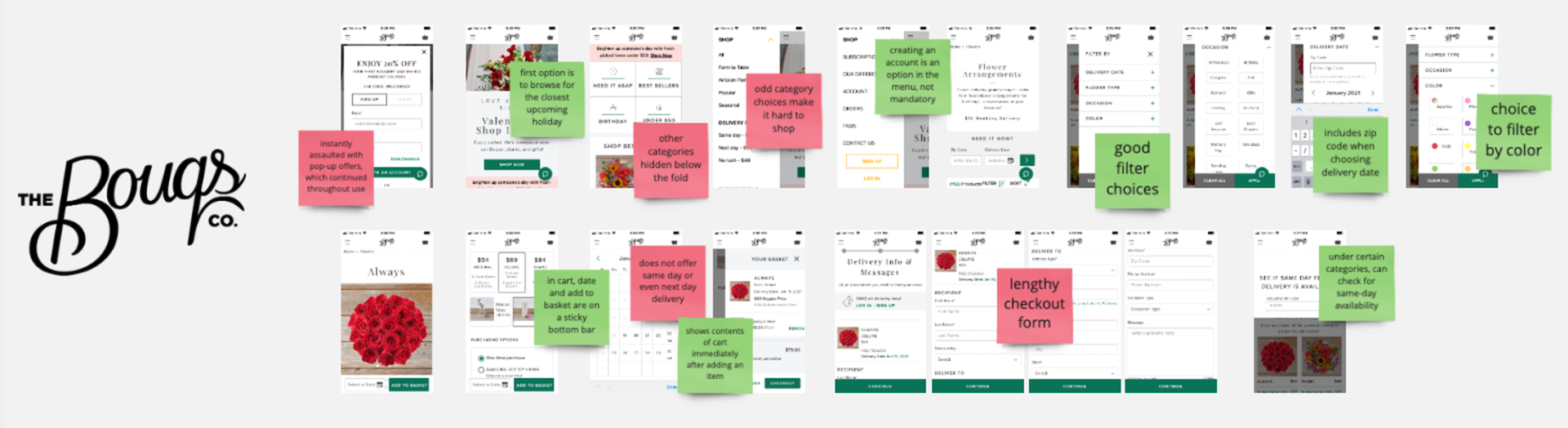
To make sure I designed an app that was different and better than the competition, while sharing some basic qualities to ensure the app would still be intuitive to use, I analyzed the main competitors to see what they were doing well, and what I could improve upon.

To help guide UI decisions, I created a moodboard to reflect the overall look and feel I wanted to achieve:

Using "how might we" questions to address user problems and needs helped me generate many more ideas.
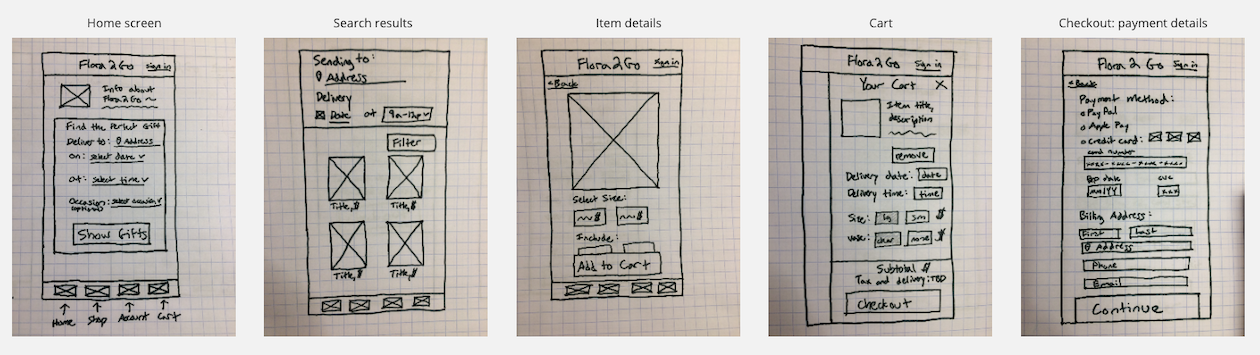
Sketches: Customer App
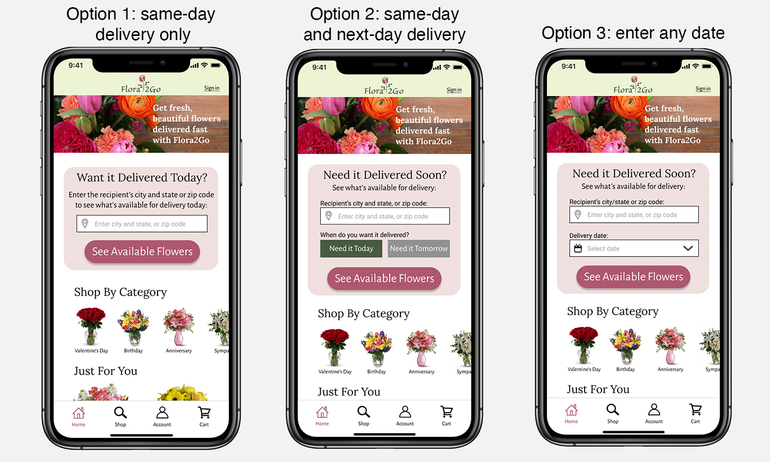
I began to sketch my ideas to quickly decide between different designs. On the customer app, the home screen features a short form for users to quickly find items that are available for delivery at the desired location and date. In the floral industry, location and date are very important as flowers are perishable, and therefore not every item will be in stock at any given time. Users can edit this information in the header of the search results page.
Sketches: Florist App
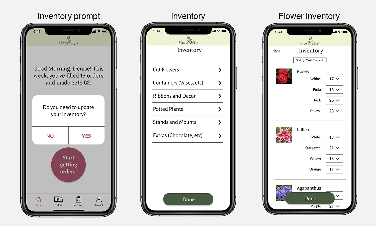
Florists must be approved by Flora2Go before joining their supplier network. After getting approved and setting up their account, they arrive on the homepage where a large button makes it obvious how to "go live" and begin receiving orders. The incoming order notification includes all of the information a florist would need to decide whether or not they can claim and fill the order. Florists can easily respond to orders and update orders while multi-tasking.


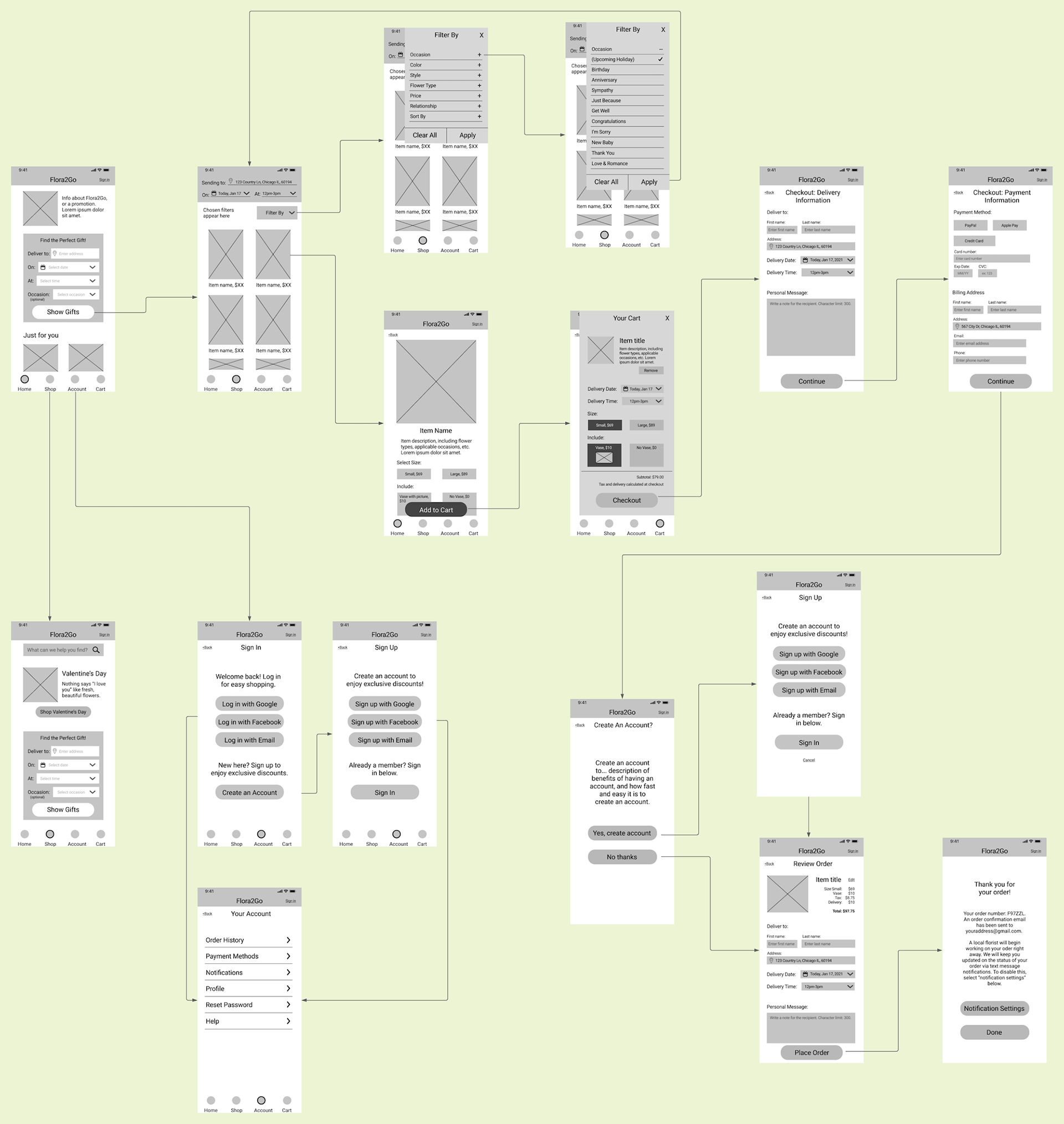
Wireframes
In order to test with users to get their input early on, I refined my sketches and created cleaner wireframes that included additional details and screen designs.
Customer app wireflow:
I conducted brief usability testing with these wireframes, which revealed:
• Inexperienced purchasers and users who do not need delivery today or tomorrow were less likely to search for products using the gift finder form.
• Users who needed same-day delivery but chose to skip the gift finder form experienced frustration when the items they saw were not available for delivery.
• Returning users were more likely to use the gift finder form.
Florist app wireflow:
The availability of florists for usability testing was significantly more limited, so I decided to wait and test the high-fidelity interactive app with users to get the most accurate information possible.

High-Fidelity Prototypes
Customer App
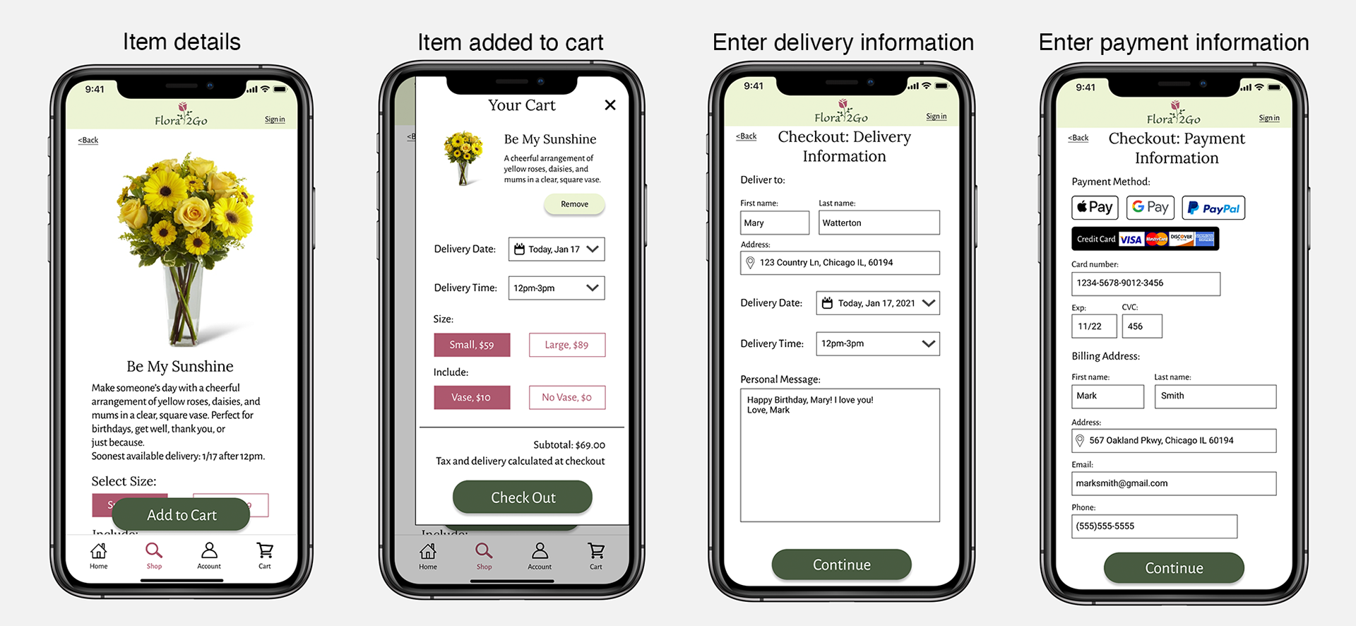
In order to thoroughly and accurately test the designs with users, an interactive prototype was needed. Based on the results of usability testing the wireframes, it was important to offer both the gift finder as well as another method of shopping above the fold on the homepage. During interviews, users communicated anxiety about having the product arrive on time. Therefore, by default customers will receive order status updates via text.


Florist App
Notification settings include a "screen flash" for incoming orders, which offers an attention-capturing way to be notified of an incoming order. Users typically work in busy shops where they may not hear notification sounds or notice a more subtle visual notification. It is disabled by default as a flashing screen can be dangerous for users with certain disabilities. When users update an order, the modal confirmation includes information about the order to help reduce cognitive load and prevent errors for users who are working quickly and multi-tasking.


Usability Testing
Customer App
Now that the prototypes were ready to go, it was time to test them with users. Testing tasks included finding an item to buy given criteria, completing a purchase, creating an account, changing notification settings, and finding information about an order.
Successes:
√ 5/5 users experienced no difficulty creating an account.
√ 5/5 users quickly located and changed notification settings.
√ 5/5 users easily located the status of their current order, and were able to identify different ways they might receive information about their order.
√ 5/5 users easily located information about a previous order, and were able to identify how to re-order that item.
Pain Points:
X 4/5 users were unsure of the purpose of the gift finder form on the homepage.
X 3/5 users were hesitant to give the address, time, and date up front.
X 3/5 users skipped the form and browsed by category, and were frustrated when first few items they selected were not available for the date they wanted.
X 5/5 users needed to exit the app to find the recipient's address in their phone contacts, which disrupted the checkout process.
It was clear that users were confused about the purpose of the gift finder form on the homepage. Therefore, I created several new form designs to test. I chose option 3 because it is applicable to more users, and does not leave users wondering what to do if they are ordering something further in the future than tomorrow.
Florist App
For the florist app, testing tasks included creating an account and completing the application, setting up their account, updating inventory, going live and claiming an order, and updating the status of an order. The availability of florists for usability testing was limited, and I was only able to test with 2 florists. Therefore, the results of usability testing the florist app are based more on observations than data.
Successes:
√ Users easily located and updated the active orders using the buttons on the homepage.
√ Users quickly completed the application, and commented that it was shorter than competitors' applications.
√ Users easily figured out how to go live.
√ They easily figured out how to contact a customer.
√ They easily located the notifications. They liked the screen flash option, and the ability to fully customize notifications.
√ The large decline and claim buttons made it easy to respond to orders.
Pain Points:
X Users found it cumbersome to manually update inventory in Flora2Go. Most already use software like square or excel to manage their inventory.
X Users needed to see the net amount of money they will make before claiming an order.
X They commented that the buttons to update the order status were slightly difficult to read at-a-glance, or from a distance when their phone is sitting on their work table as they prepare orders.
X They commented that they may not want to see a notification for every missed order. They would rather look at all of the missed orders at the end of the day.

The Final Product
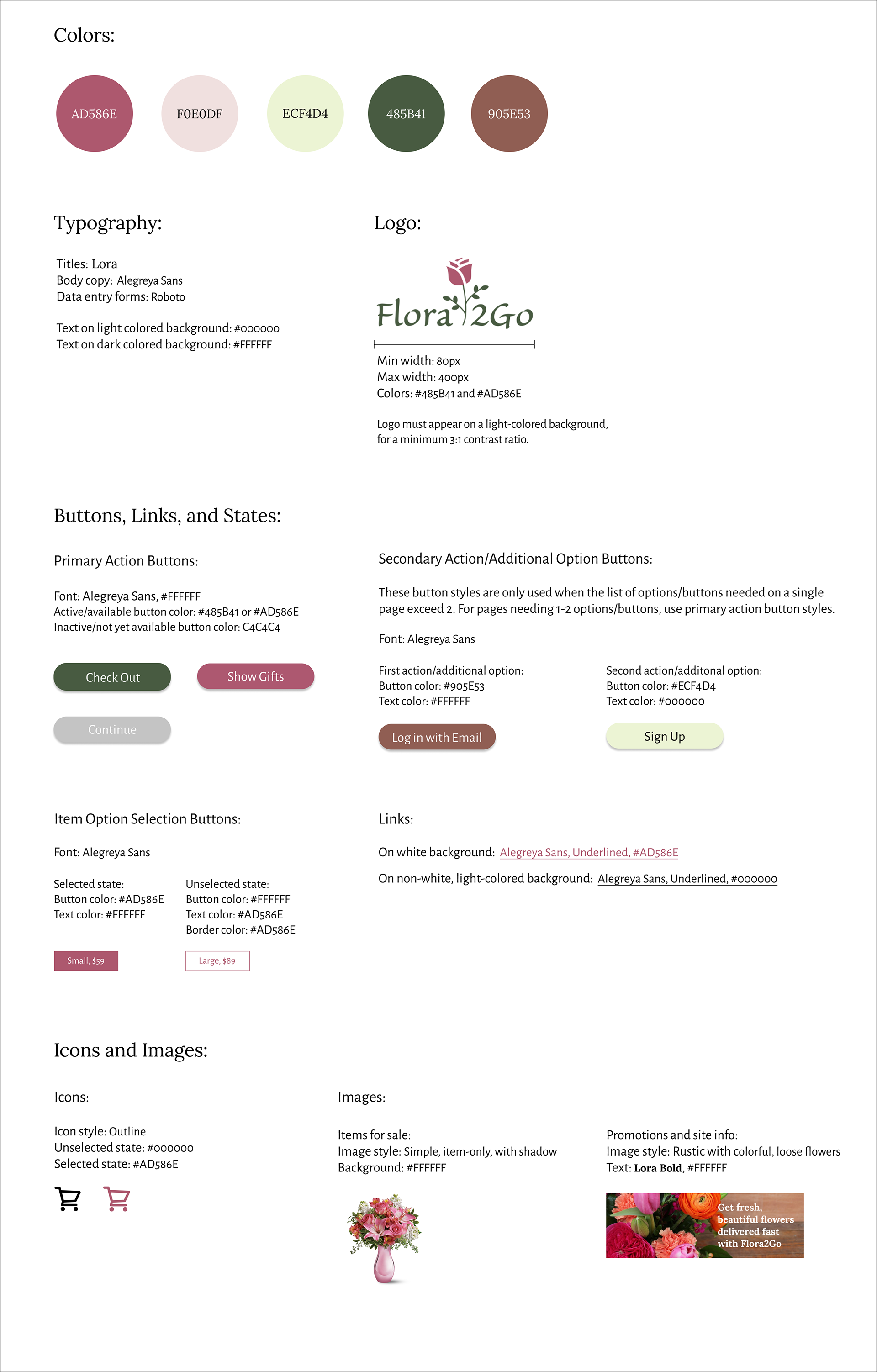
Style Guide
The Final Customer App
The wording on the new gift finder form clearly communicates why the app asks for this information. I modified the wording of the header on the search results page to make it clear that filling out those fields means filtering the results by availability for the desired location, date, and time. I learned that it is common for florists to make some substitutions if they do not have a specific flower type, so I added this information to the item details page to make users aware of this.
Interact with the Customer Prototype (Desktop Browser)
Just want to see images? View Mockups of the Customer App
The Final Florist App
Integrations with common inventory software, including Square and Excel, give users an easier option to manage their inventory. The Missed Orders page helps users plan ahead by seeing what items are being ordered, when customers typically place orders, and how quickly competitors are claiming orders.
Interact with the Florist Prototype (Desktop Browser)
Just want to see images? View Mockups of the Florist App
More Case Studies
Epic and Pyxis
Anchor Drop