Healthy Nugget
Designing an app to help women with gestational diabetes easily log and share vital health information with their doctor in order to reduce the risk of complications during their pregnancy.
My Role: UX/UI Design, User Research, Usability Testing, Wireframing, Prototyping, User Flows, UX Writing, Brand Design
The Problem
Gestational diabetes mellitus (GDM) affects up to 10% of all pregnant women. In order to manage it, these women must log all the food they eat and and take 4 blood glucose readings every day, and share this information with their doctor. The client wanted us to design an app to help women with GDM log and track their food intake and blood glucose because there are not many apps specifically for GDM, and none of them can share data with users' doctors. Through user research we learned that exhaustion and uncertainty about what is safe to eat make it difficult to consistently log all food and glucose readings.
The Solution
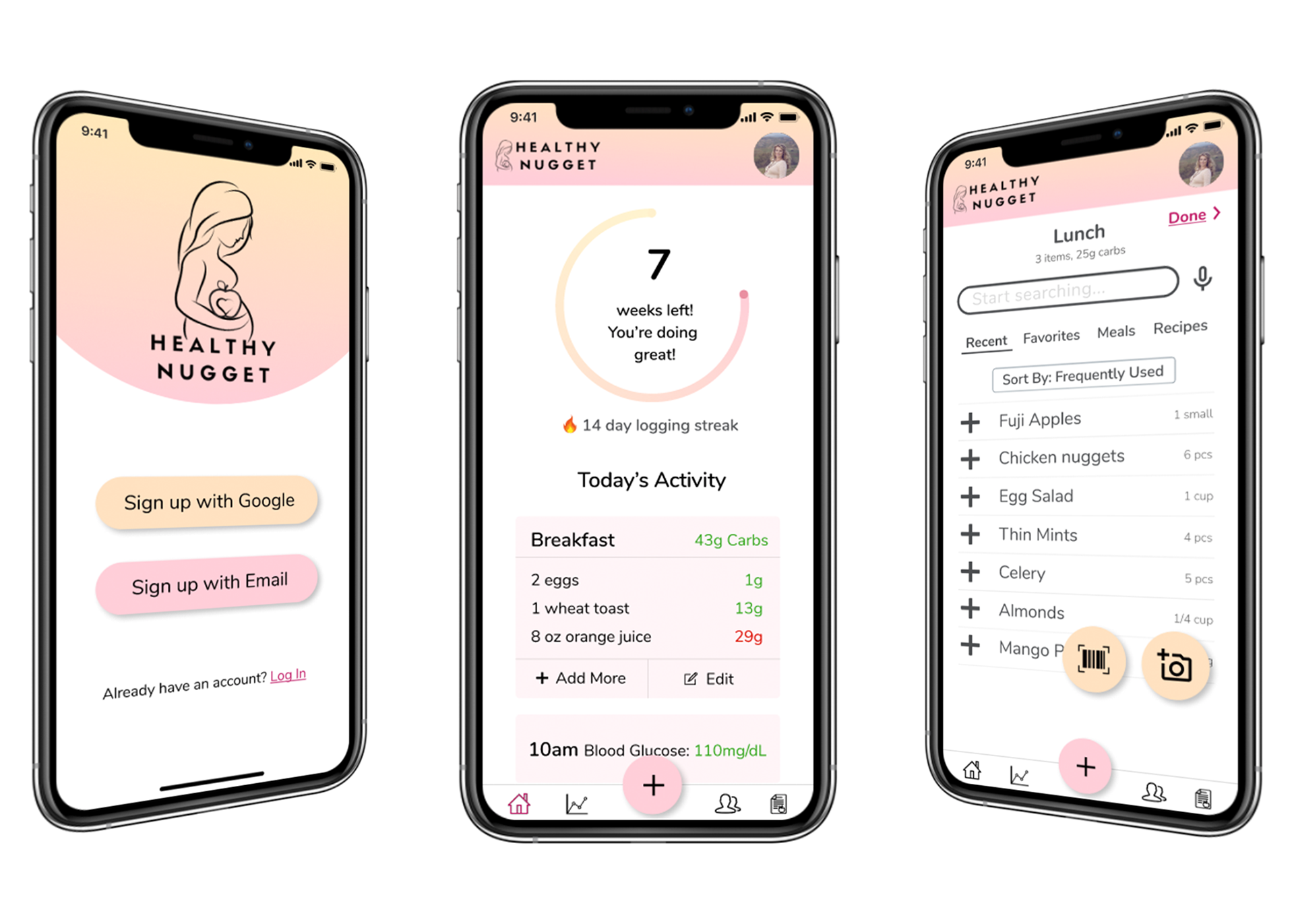
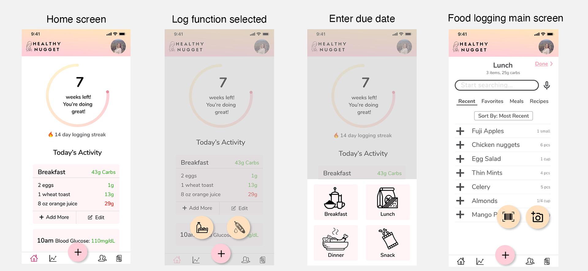
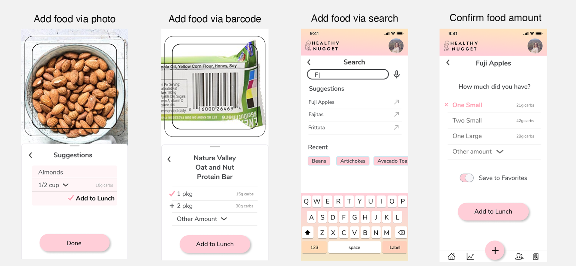
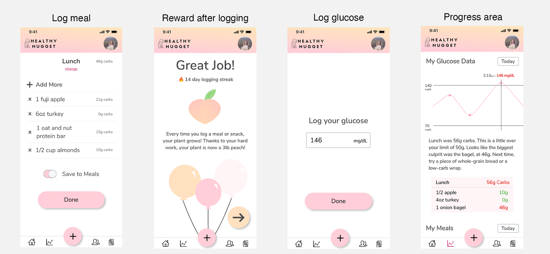
Through several rounds of ideating and testing, we created an interactive prototype of a new app, Healthy Nugget. Many input methods, including quick-add from frequent food lists and AI photo recognition, make it quick and easy to log food intake. When users log a glucose reading that is too high, the app explains what foods caused it and gives suggestions for other foods to try. It includes built-in reminders to log food and glucose, and can share this data with users’ doctors. The app motivates users to log using gamification and motivational facts about the importance of logging.
Constraints
• The app must motivate the users to log their food intake.
• It must include a way to remind users to log their food intake and blood glucose.
• It must be fun and easy to use.
• It must be different from other food-logging apps on the market, especially Weight Watchers and Noom.
• A creative way for users to use voice input if they forget to log is a plus.
Key Lessons Learned
I learned a lot can be accomplished in a short amount of time if it's used wisely. Even when there isn’t enough time for in-depth user research techniques like contextual inquiry, a lot of useful information can still be obtained from just a few interviews and quick, informal usability tests. Some user input is better than none.
I also learned how important it is to have good, consistent communication in real-time. While working together in Figma, the team quickly realized we weren't on the same page. We began using comments and quickly created a mini component library in addition to our ongoing video chat. This helped us produce a consistent final product despite a tight deadline.
User Research and Defining the Problem
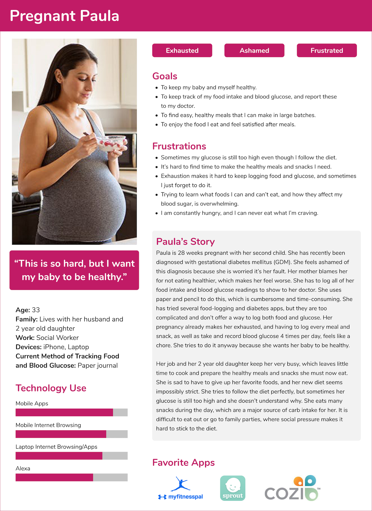
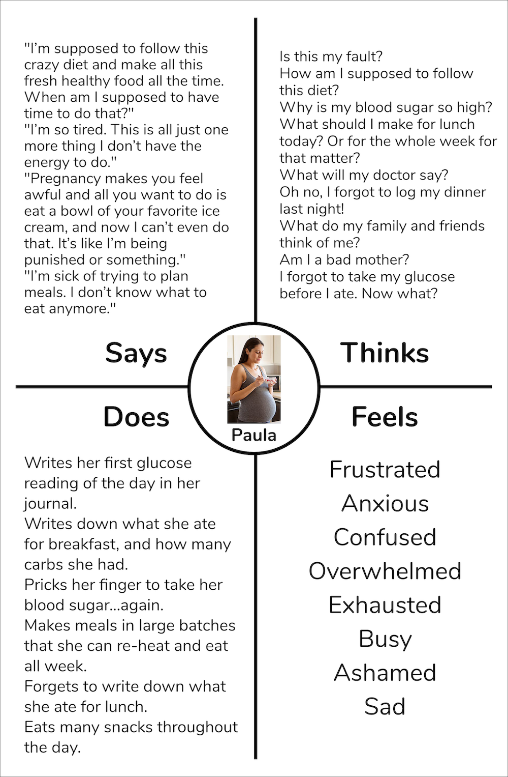
The client shared with us that women with GDM currently logged and reported their food intake and blood glucose using paper and pencil, and this was time-consuming and cumbersome. It was especially difficult to consistently log their food. Before we began designing, we needed to know why they were having trouble logging and reporting their food intake. I learned more about our target users by reading articles about living with GDM, reading reddit forums dedicated to GDM, and interviewing an expecting mother with GDM. To help us put ourselves in our users' shoes, I created a persona based on the themes I discovered during my research.
I also created an empathy map for that persona in order to help us further understand our users:
To help guide the rest of the project, I created a problem statement that summarized the users' primary needs and problems:
“Women with gestational diabetes need a fast, fun, and motivating way to log food intake and blood glucose because their exhausting, busy lives make it difficult to do this consistently.”
Ideation
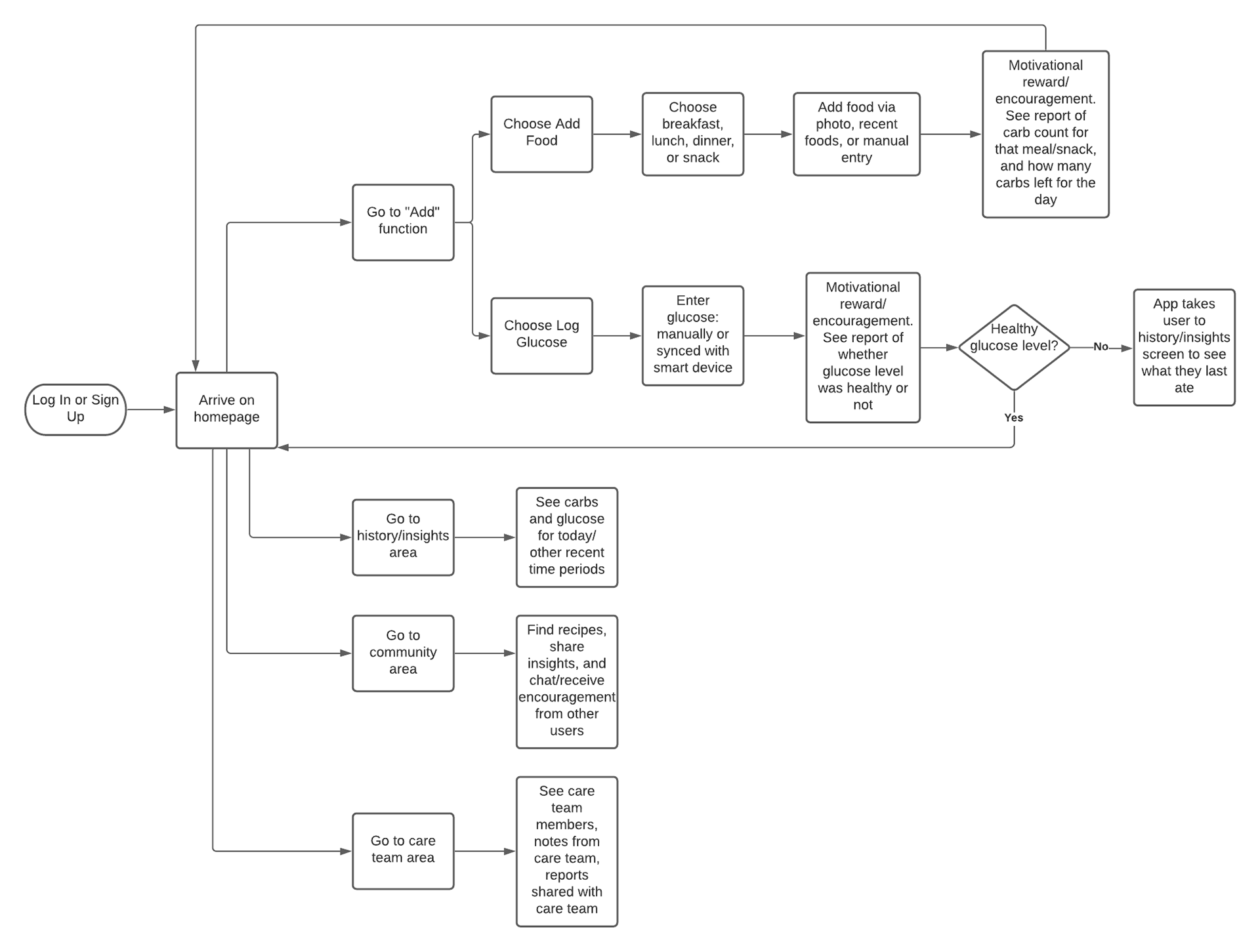
A good understanding of the user flow was essential to design an app that would help the user achieve their goals with as little friction as possible. We created a user flow to map out the steps a user would take to complete common tasks in the app. This helped us begin to generate ideas of ways to make these flows easy, pleasant, and fun.
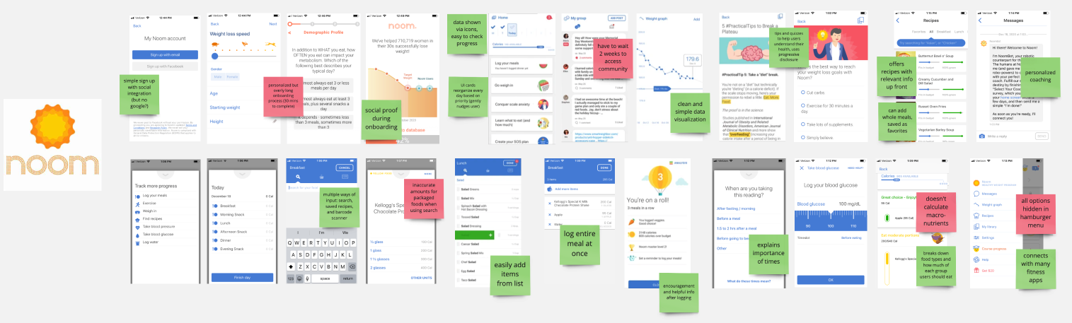
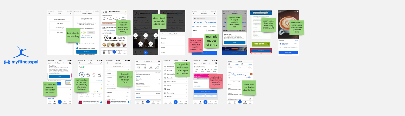
We also wanted to make sure we designed an app that was different and better than the competition, while sharing some basic qualities to ensure the app would still be intuitive to use. To help the team accomplish this goal, I analyzed the main competitors to see what they were doing well, and what we could improve upon.

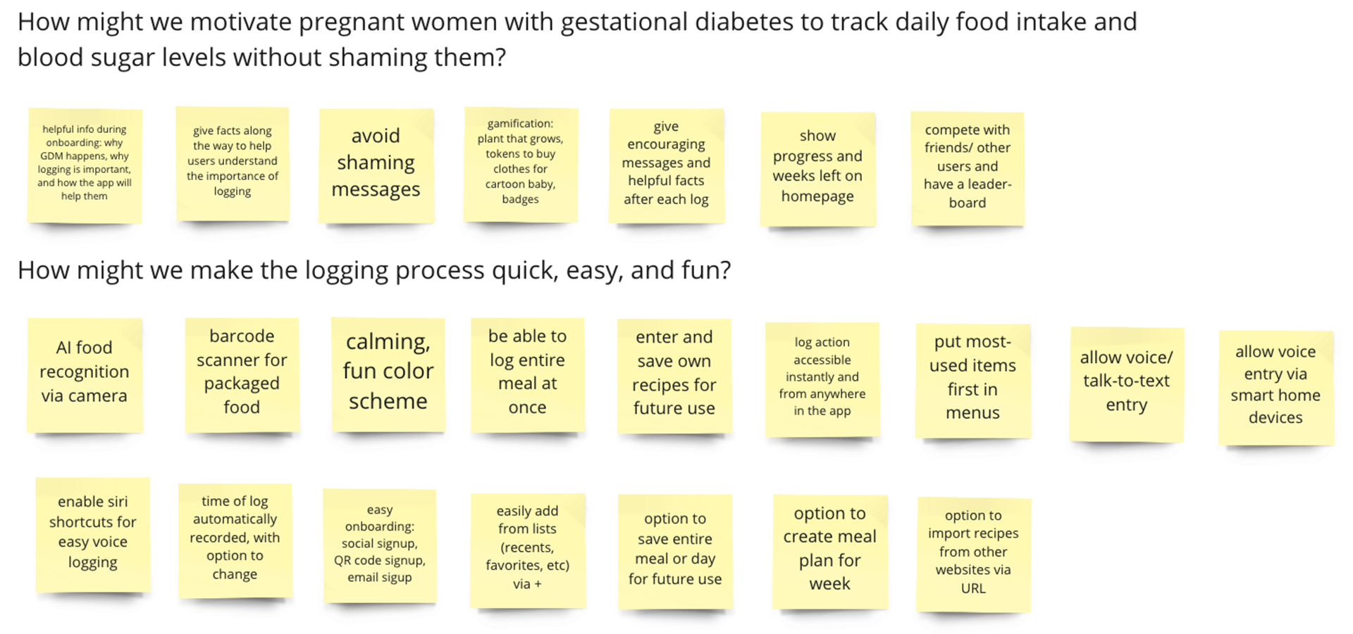
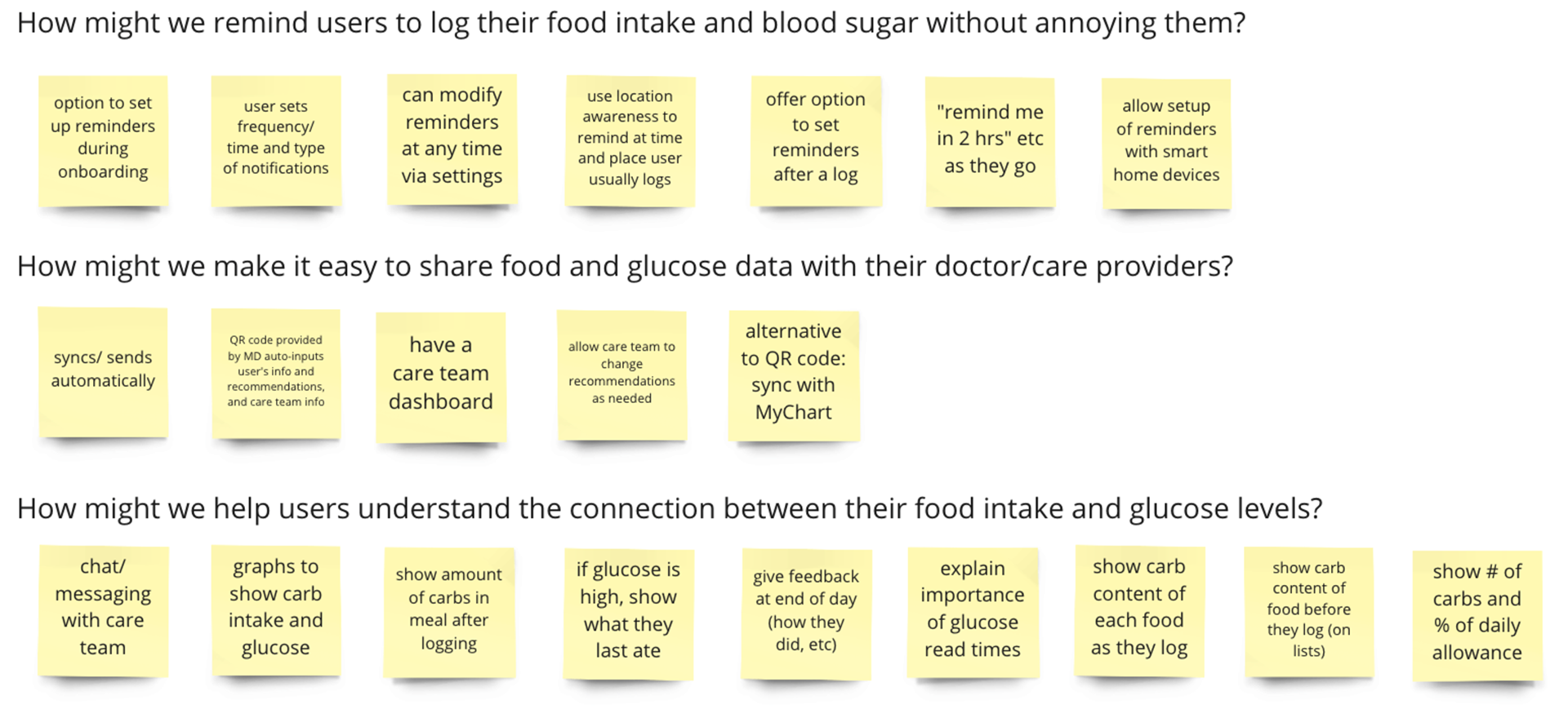
Using "how might we" questions to address problems and needs led to many more ideas:
Wireframes
Since we were working together remotely, we continued ideating by creating low-fidelity wireframes collaboratively in Figma.
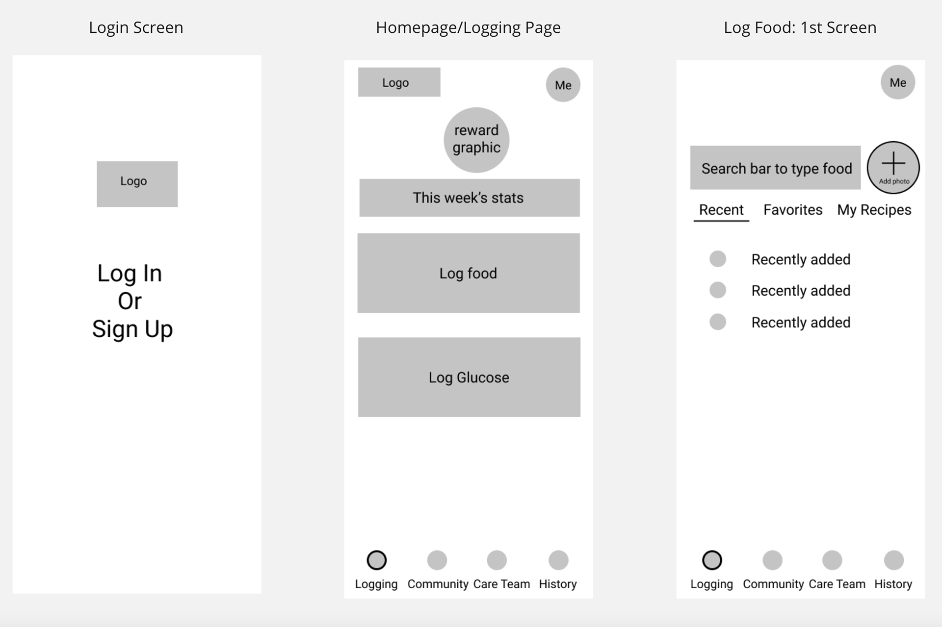
I conducted brief usability testing with these wireframes and learned:
• Users easily found the log buttons for their first logging, however it was not immediately obvious how to return to this page.
• Users were not sure where to find information about the meals logged so far that day.
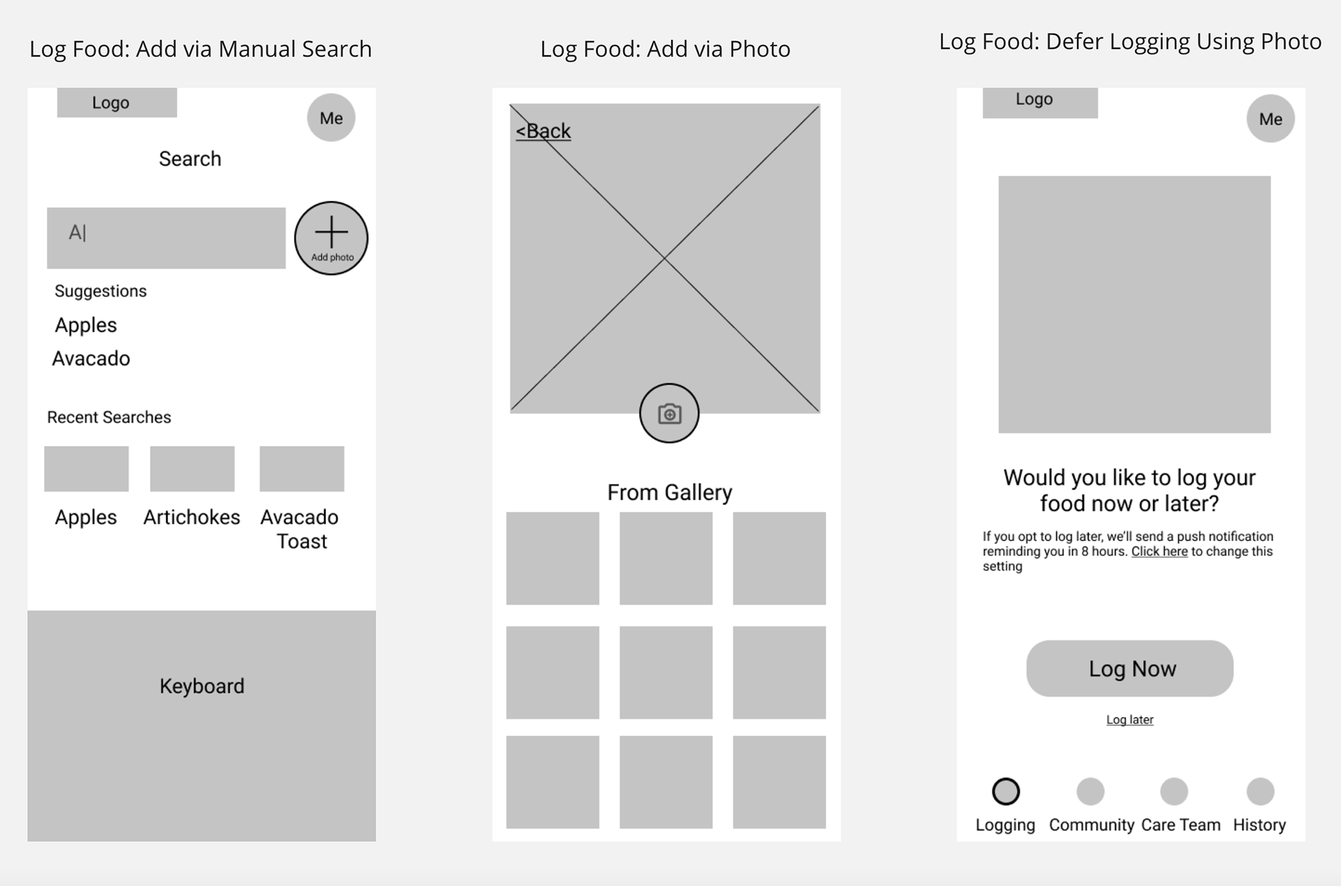
• Users were confused by the option to defer logging via photo.
I quickly sketched out some new ideas to test with the users. Users preferred homepage option 1 (pictured below) because seeing the meals they recently logged was a more important and more frequent task than reading articles and recipes. Barcode scanning and voice input offer additional input methods that may be easier than manual entry.
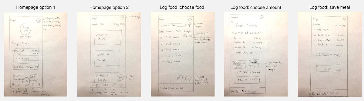
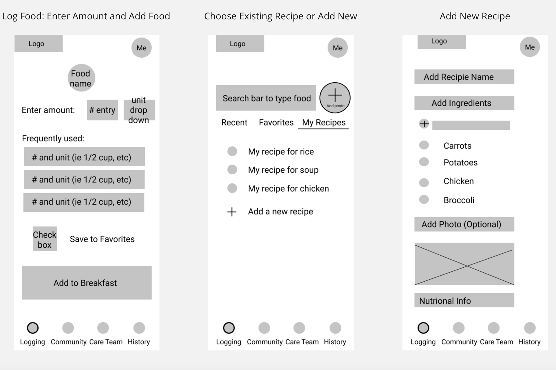
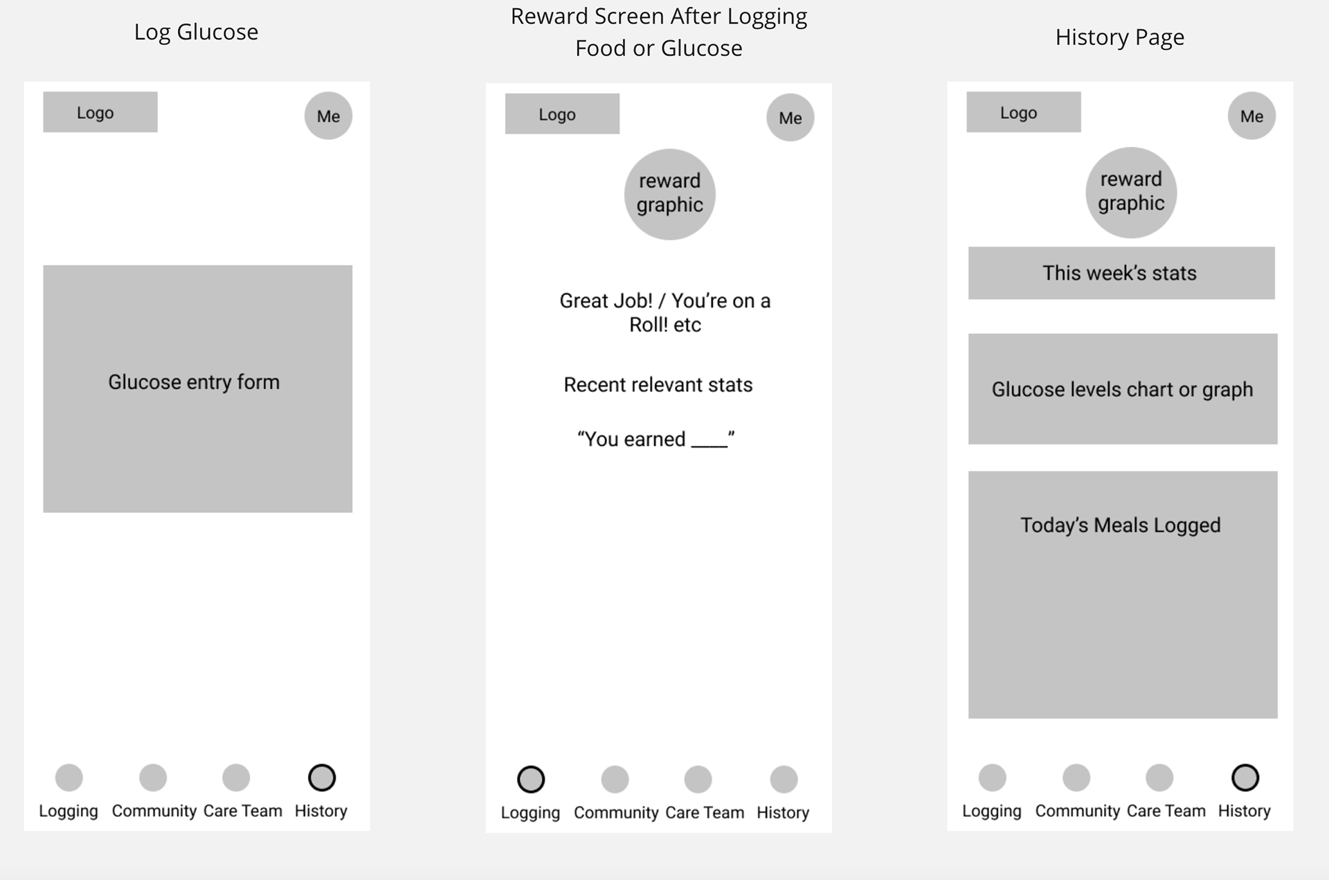
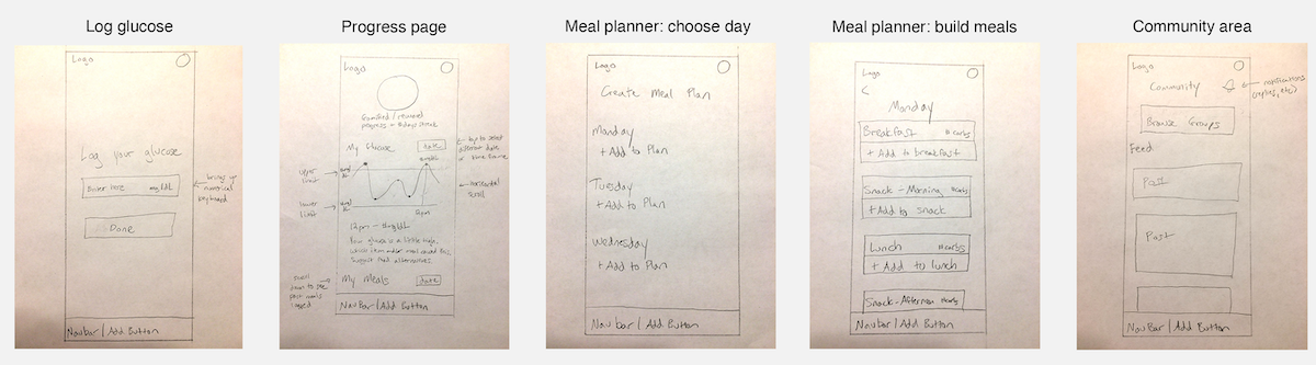
On the progress page, users receive the feedback they need to understand the relationship between their food and blood glucose levels. A new meal planning feature offers users the option to enter meals in advance to save time on busy days.
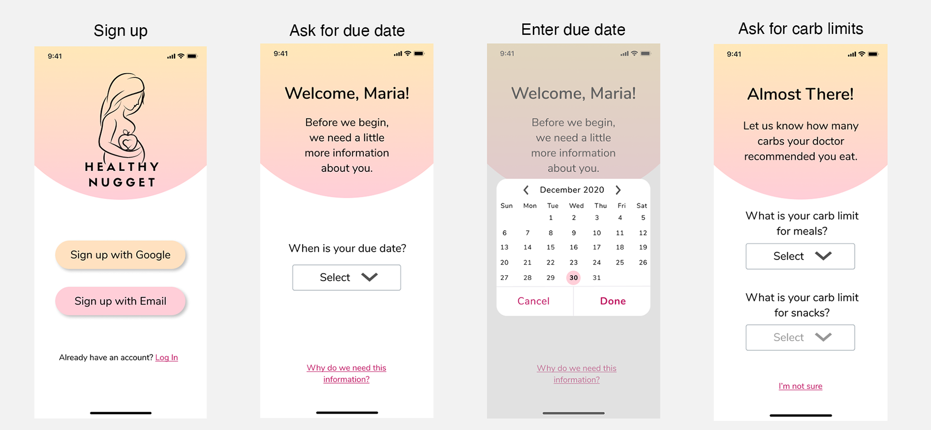
High-Fidelity Prototypes
In order to thoroughly and accurately test these ideas with users, an interactive prototype was needed. Due to time constraints, we created an interactive prototype that focused only on the essential functions of the app in order to test the main goals of the app.
Usability Testing
Now that the prototypes were ready to go, it was time to test them with users. I completed usability testing remotely via video chat and screen sharing. Testing tasks included logging food via different input methods, logging glucose, locating food and glucose data, planning meals ahead of time, locating recipes, changing notifications, and locating the doctor/care team area.
Results
Successes:
√ 5/5 users experienced no difficulty creating an account or navigating through the onboarding process. They found the onboarding process to be fast and easy.
√ 5/5 users were able to easily locate the log action from anywhere in the app.
√ 5/5 users easily located their food and glucose data. They found the information about the link between glucose and food to be helpful.
√ 5/5 easily located recipes in the community area.
Pain Points:
X 4/5 users were confused by the glucose logging icon. They did not recognize that it was a glucometer and instead chose the food logging icon when they meant to log their glucose.
X 3/5 users were unsure how to exit the glucose logging area after landing there by mistake.
X On the page to log food via AI photo recognition, 3/5 users attempted to click the "add to lunch" phrase instead of the "done" button, expecting this to navigate them to the final meal page.

The Final Product
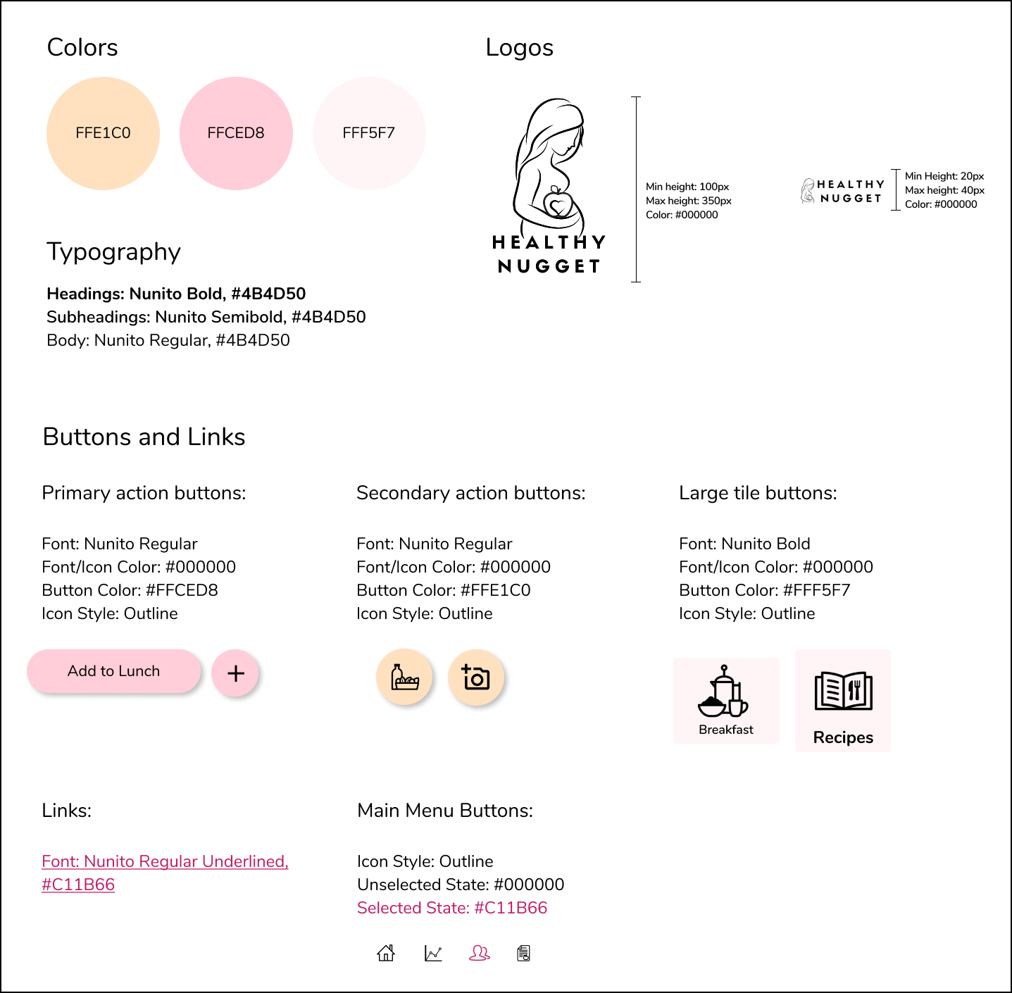
Style Guide
Interact with the Prototype (Desktop Browser)
Just want to see images? View Mockups of the Final Prototype
More Case Studies
Flora2Go
Epic and Pyxis