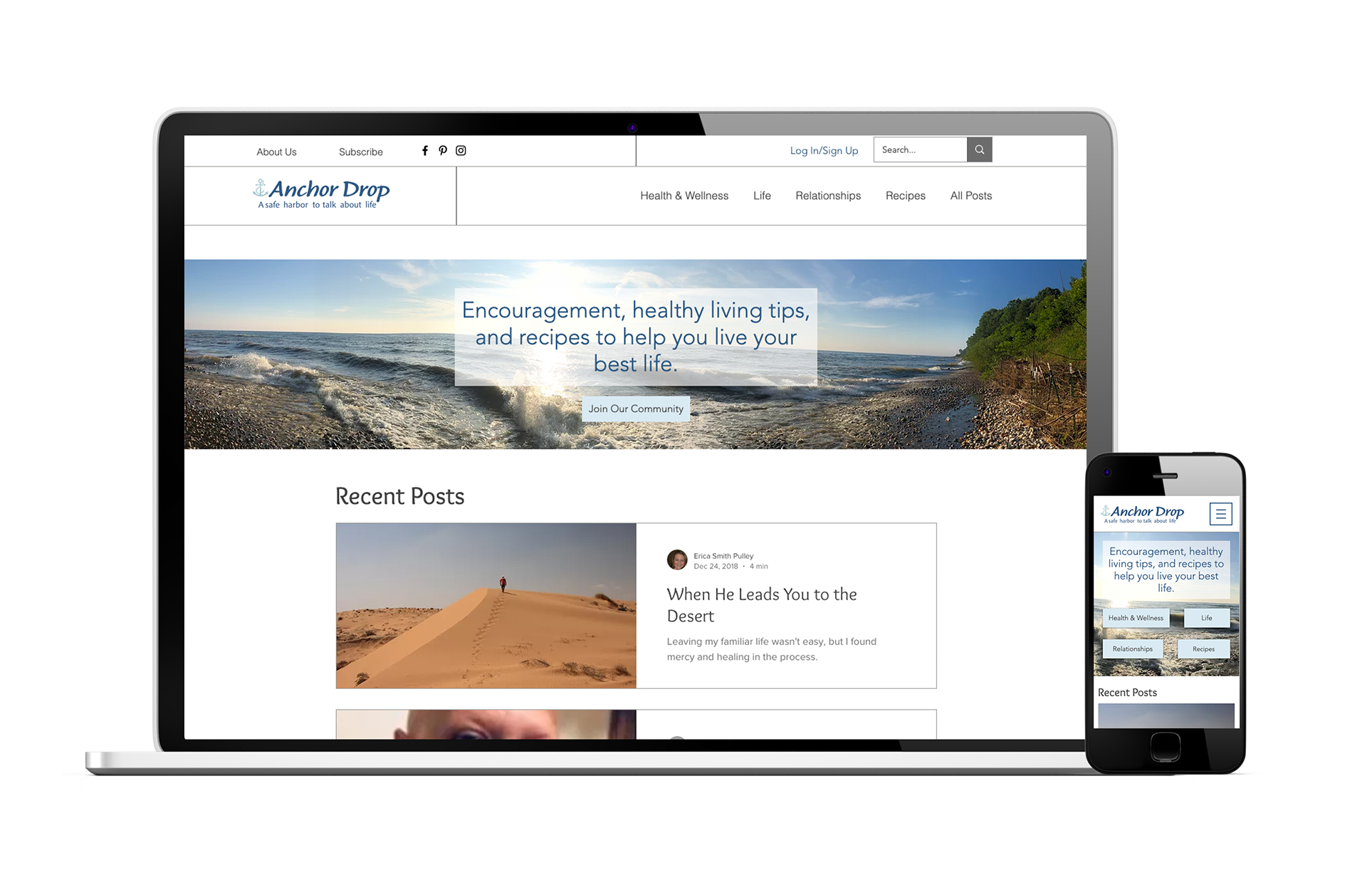


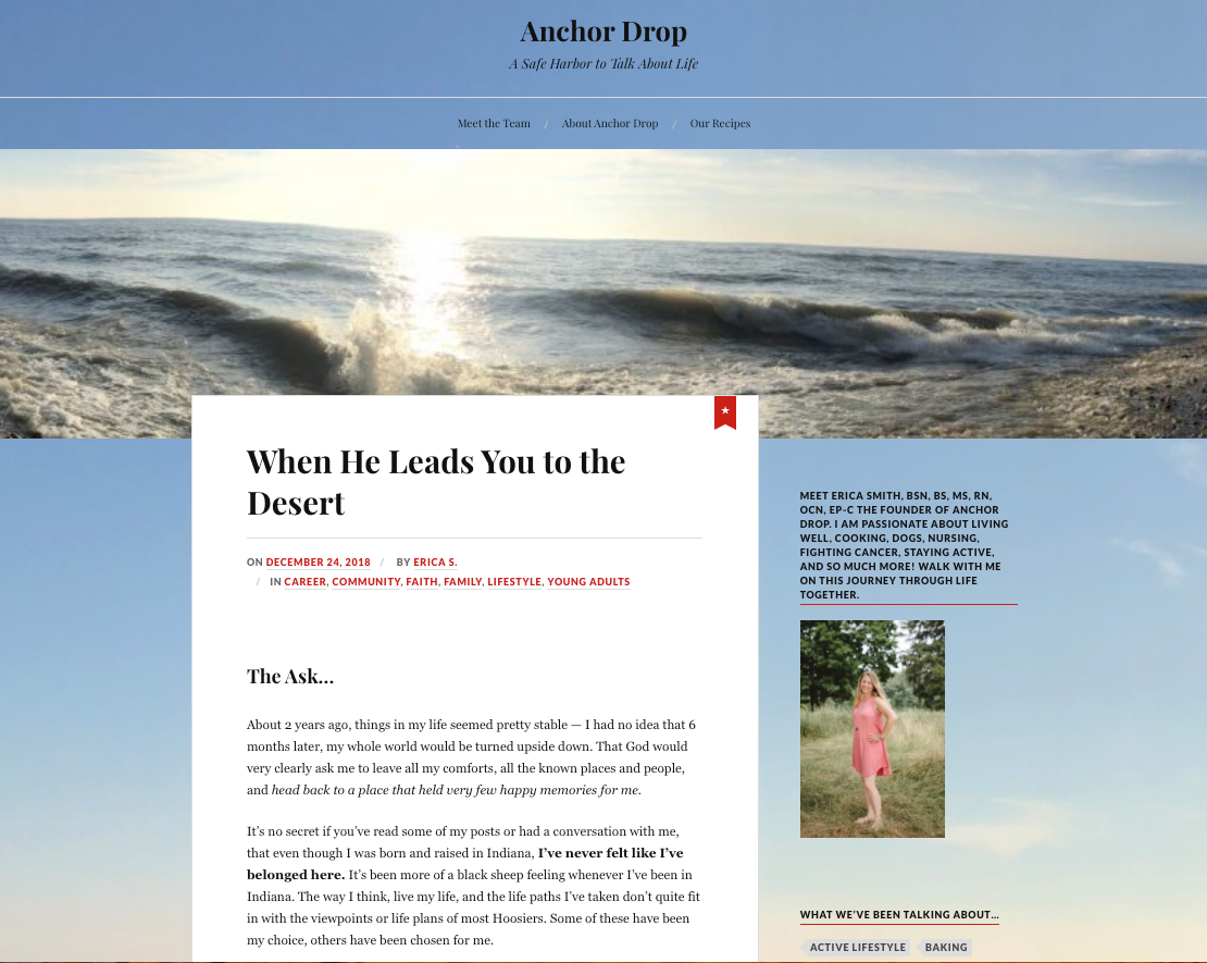
Anchor Drop Site (Homepage)
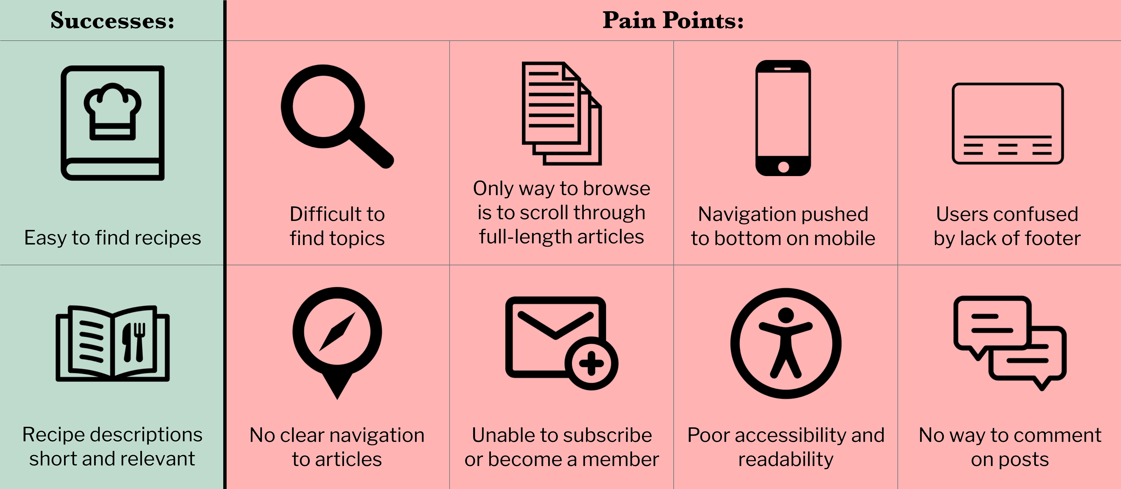
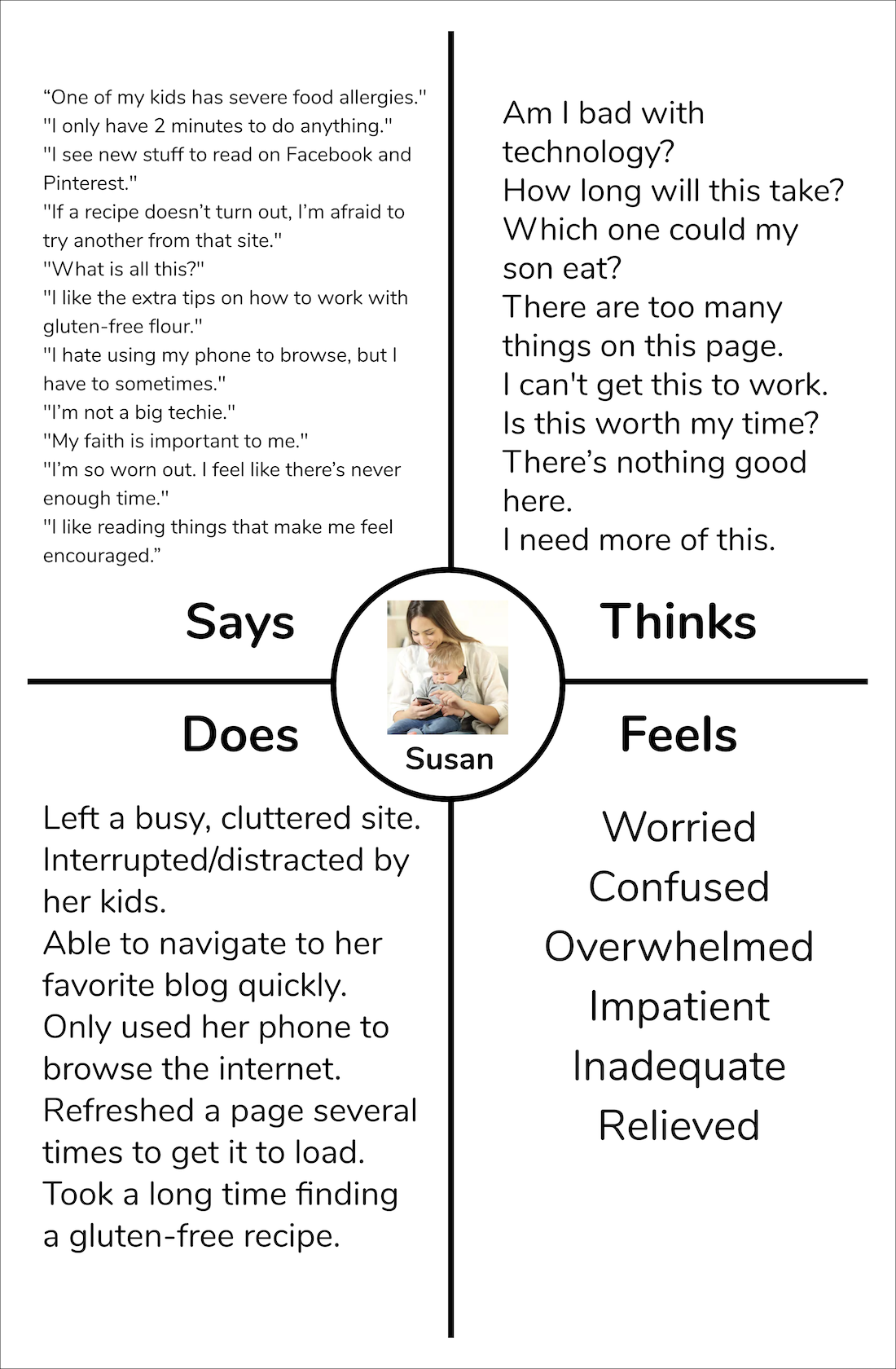
Anchor Drop Site Testing Results
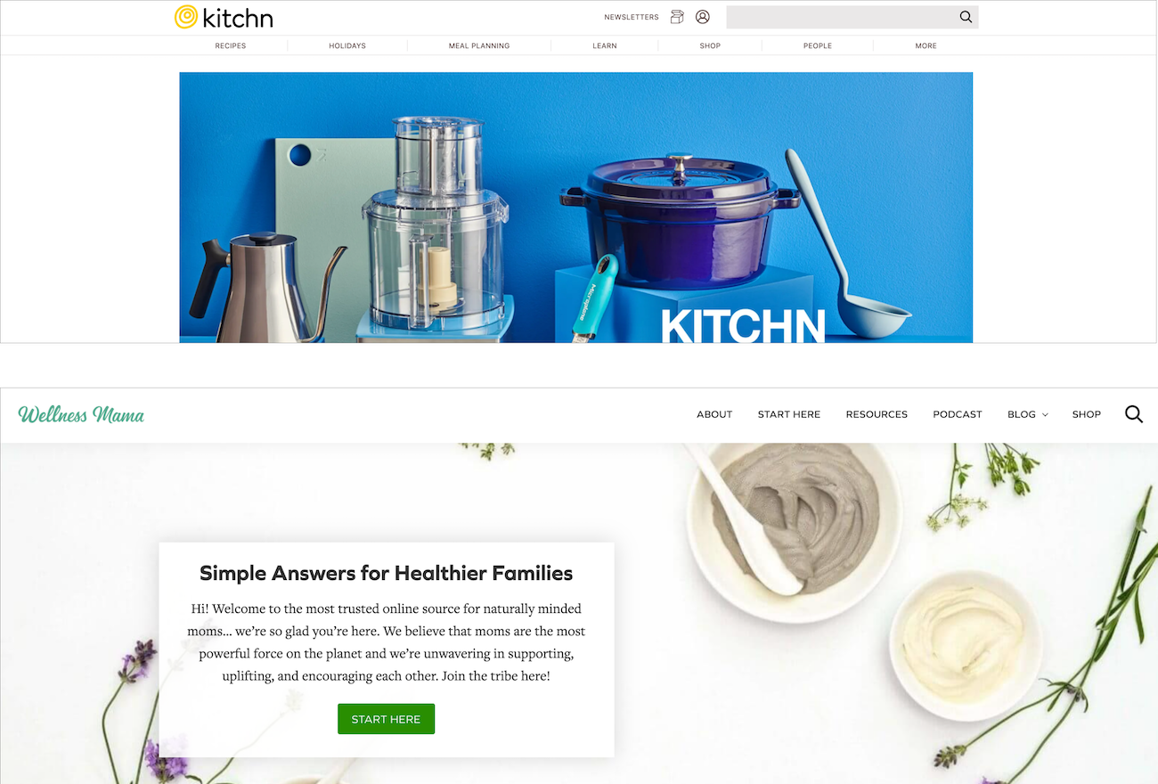
Competitor Sites: TheKitchn and Wellness Mama
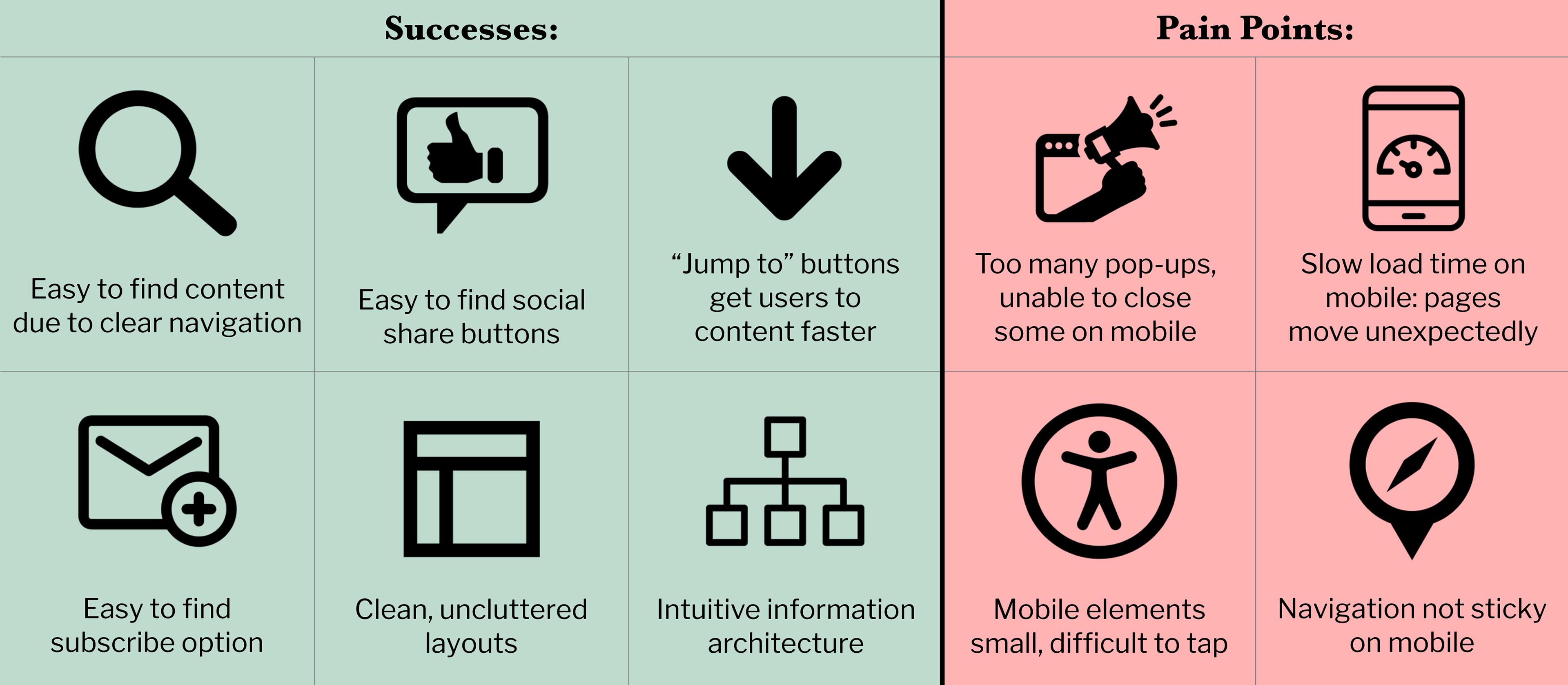
Competitor Site Testing Results


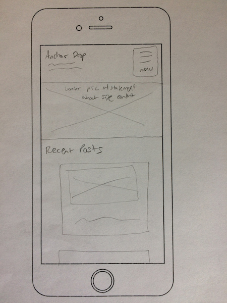
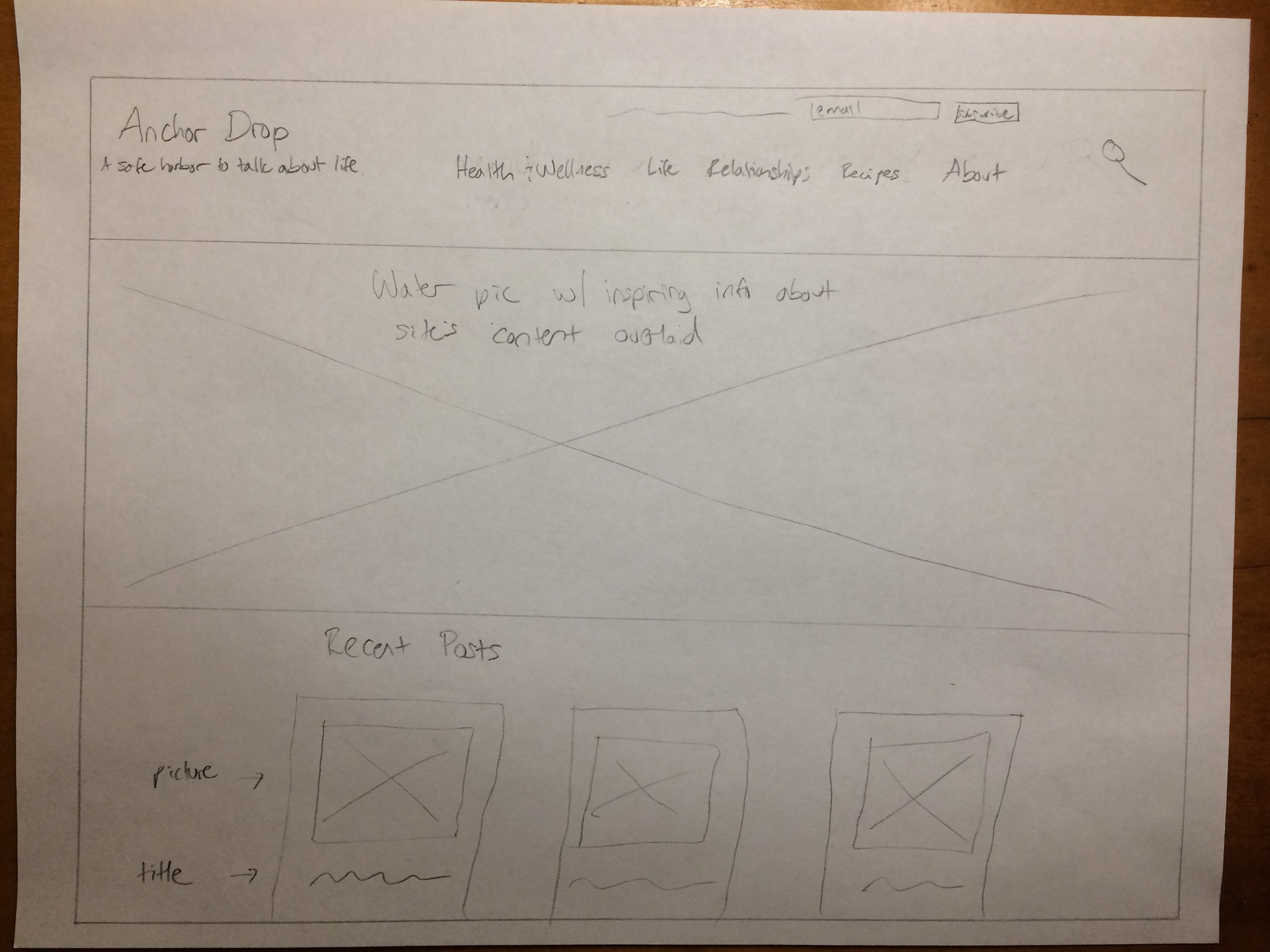
Homepage design #1
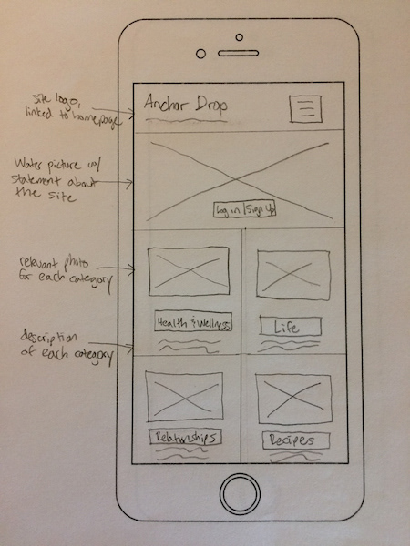
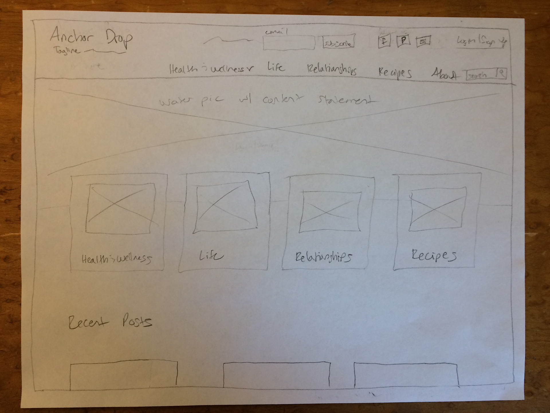
Homepage design #2
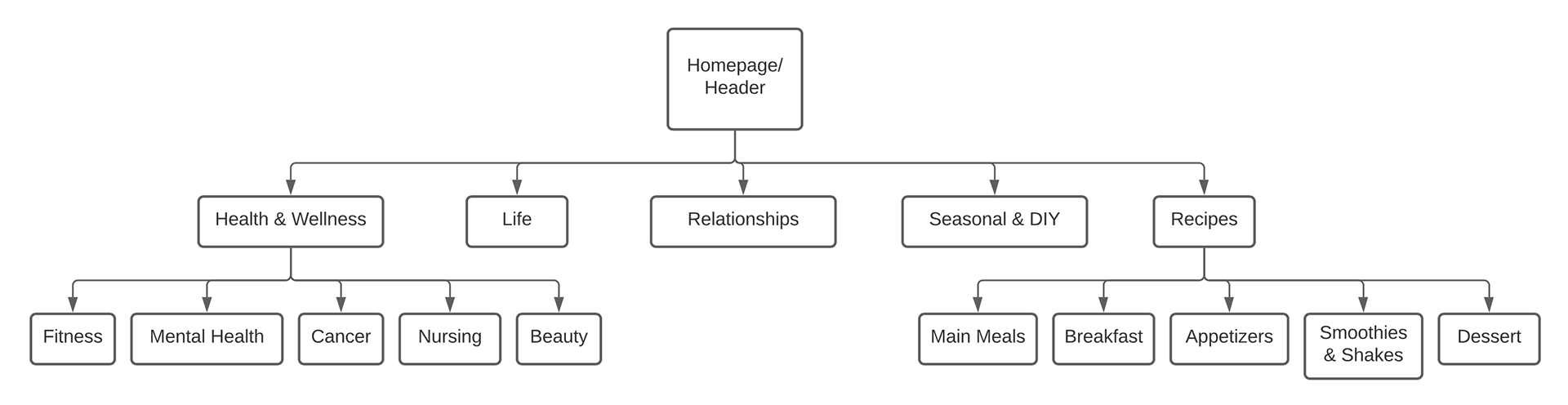
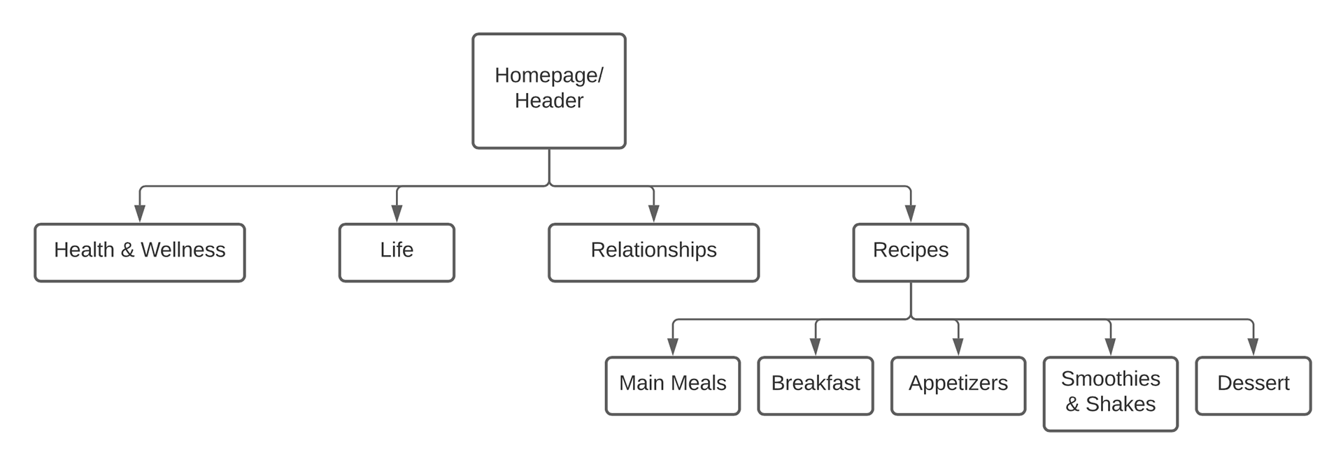
Navigation
Recipes page design #1
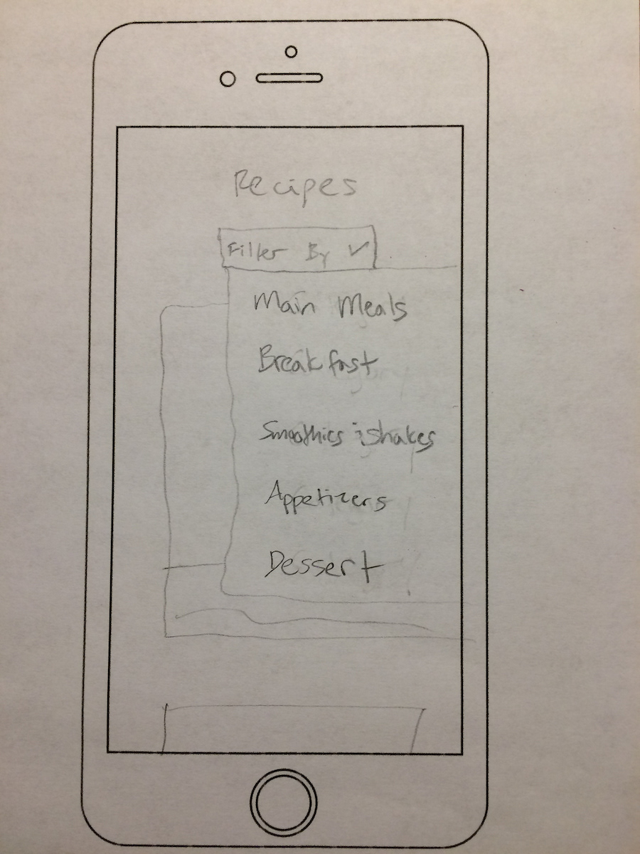
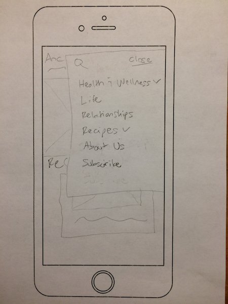
Recipes page design #1 dropdown menu
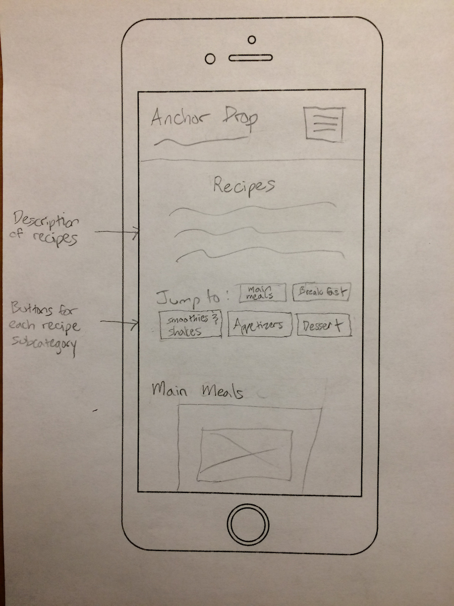
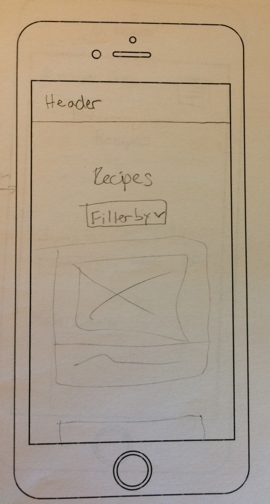
Recipes page design #2
Design #1: Mirrors the mobile site.
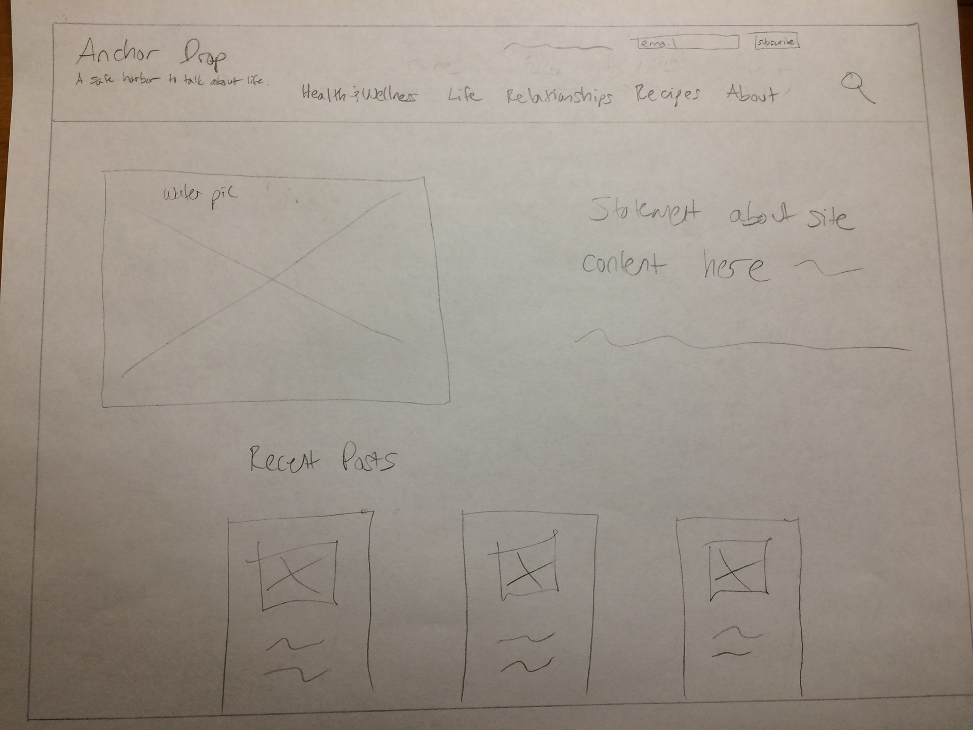
Design #2: Jumps right into recent posts.
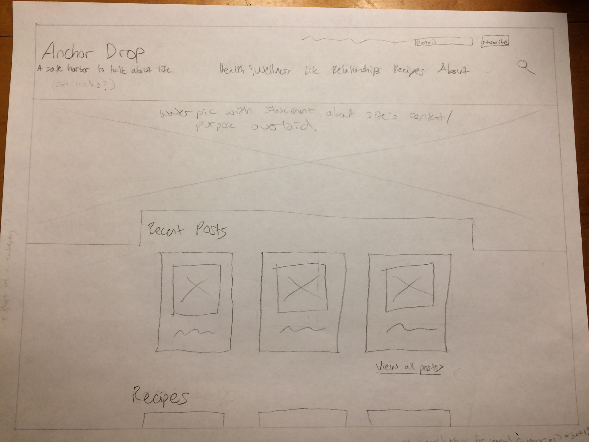
Design #3: Increases the content shown above the fold.
Design #4: Decreases the risk of banner blindness caused by full-width picture right under the header.

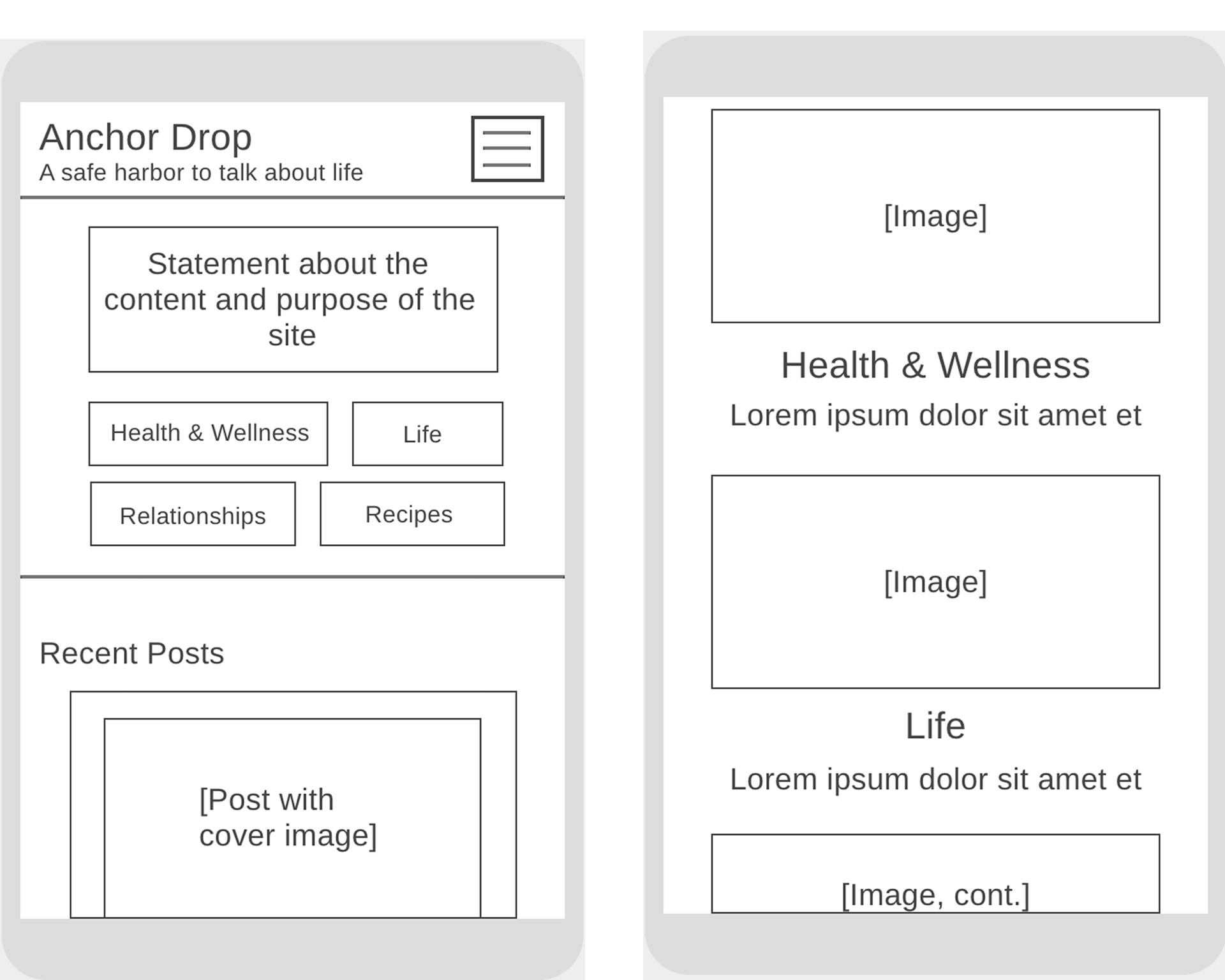
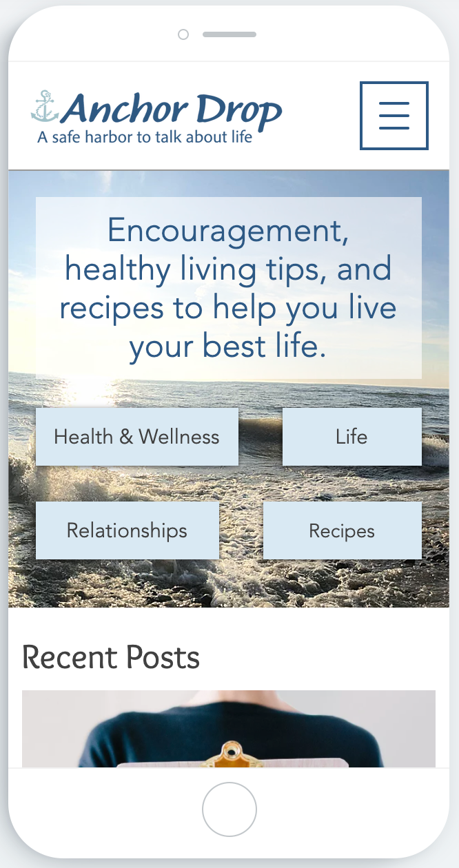
Mobile homepage top and area below the fold
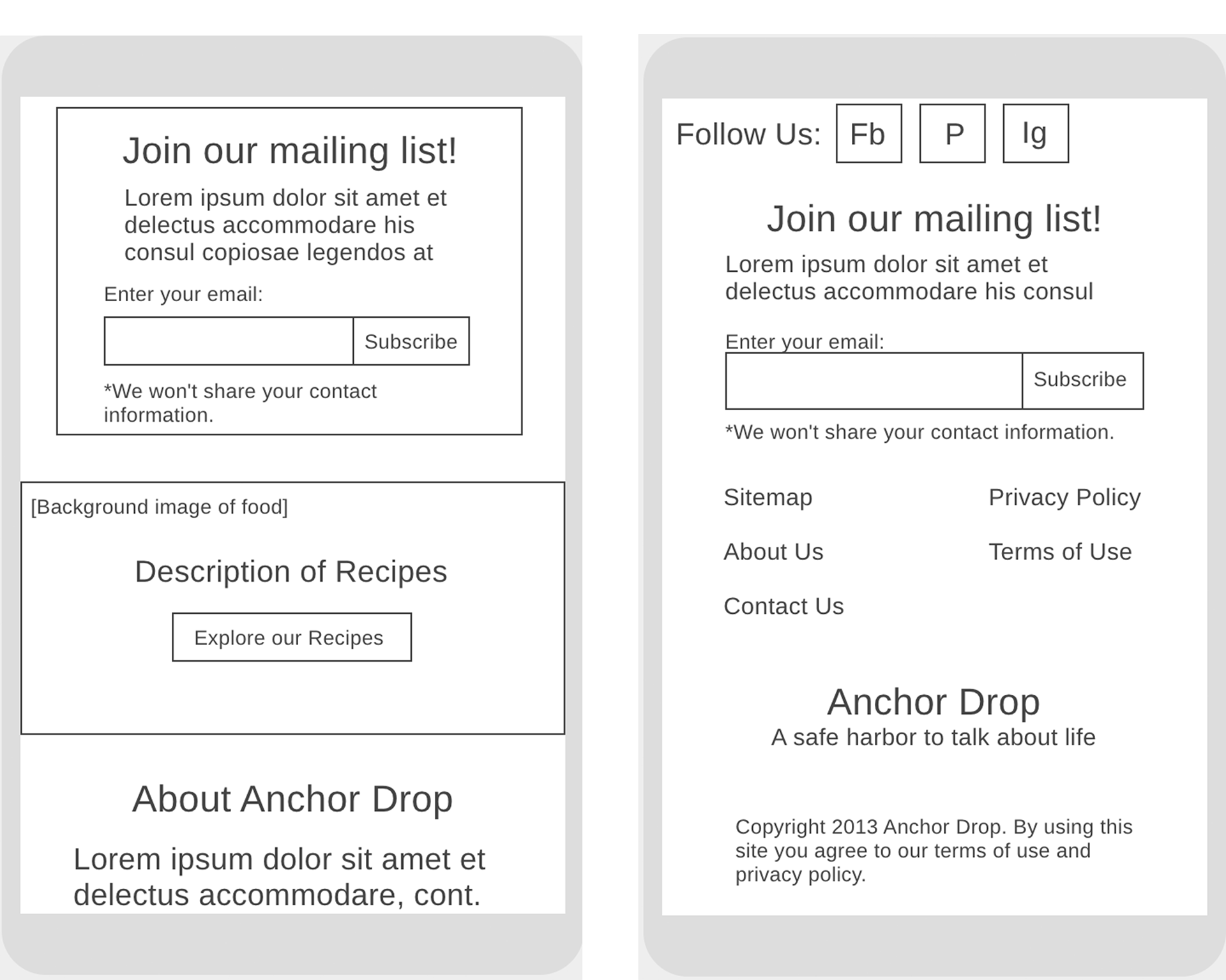
Mobile homepage continued, and footer
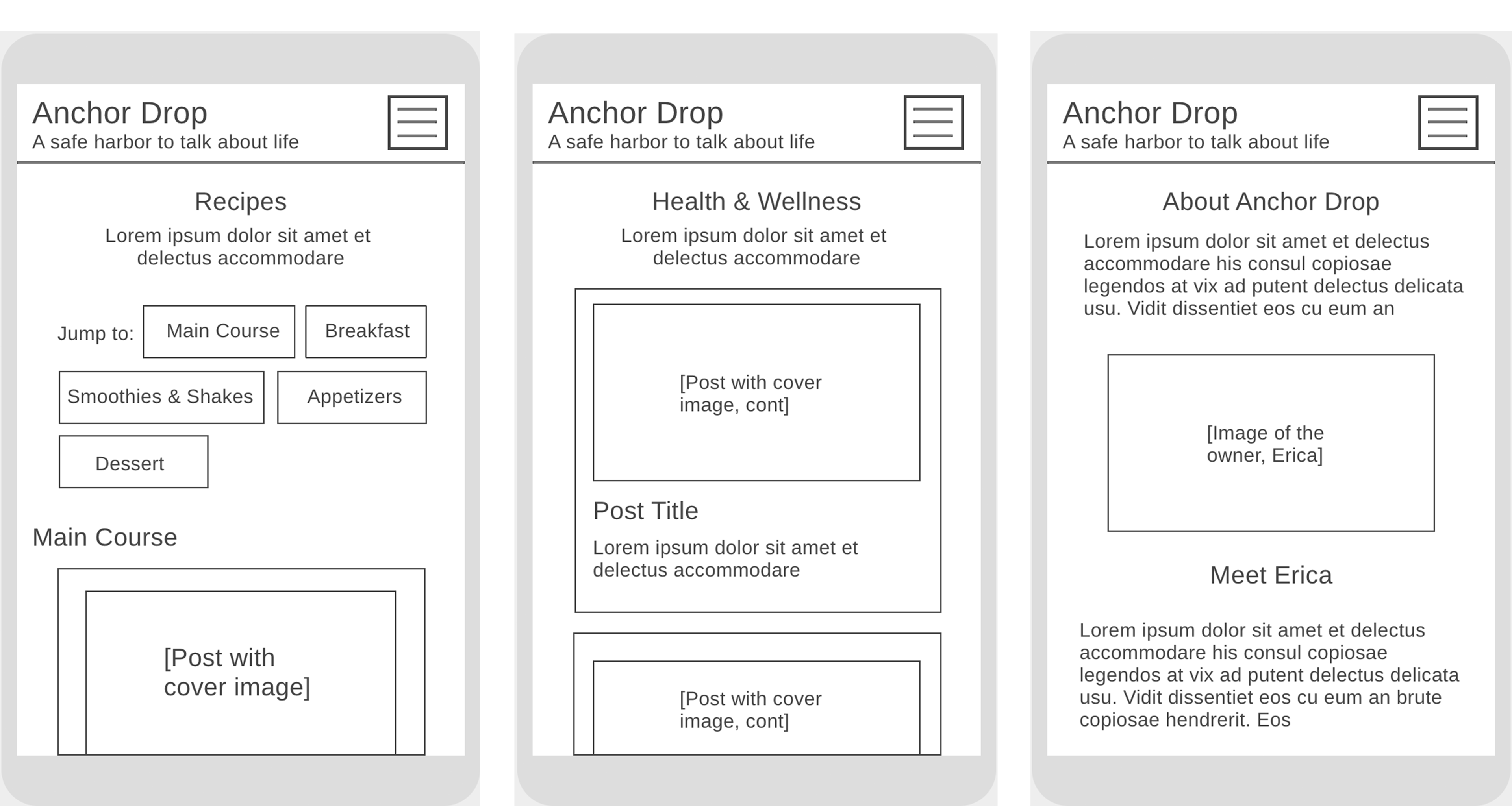
Mobile recipes page, blog category page, and about page
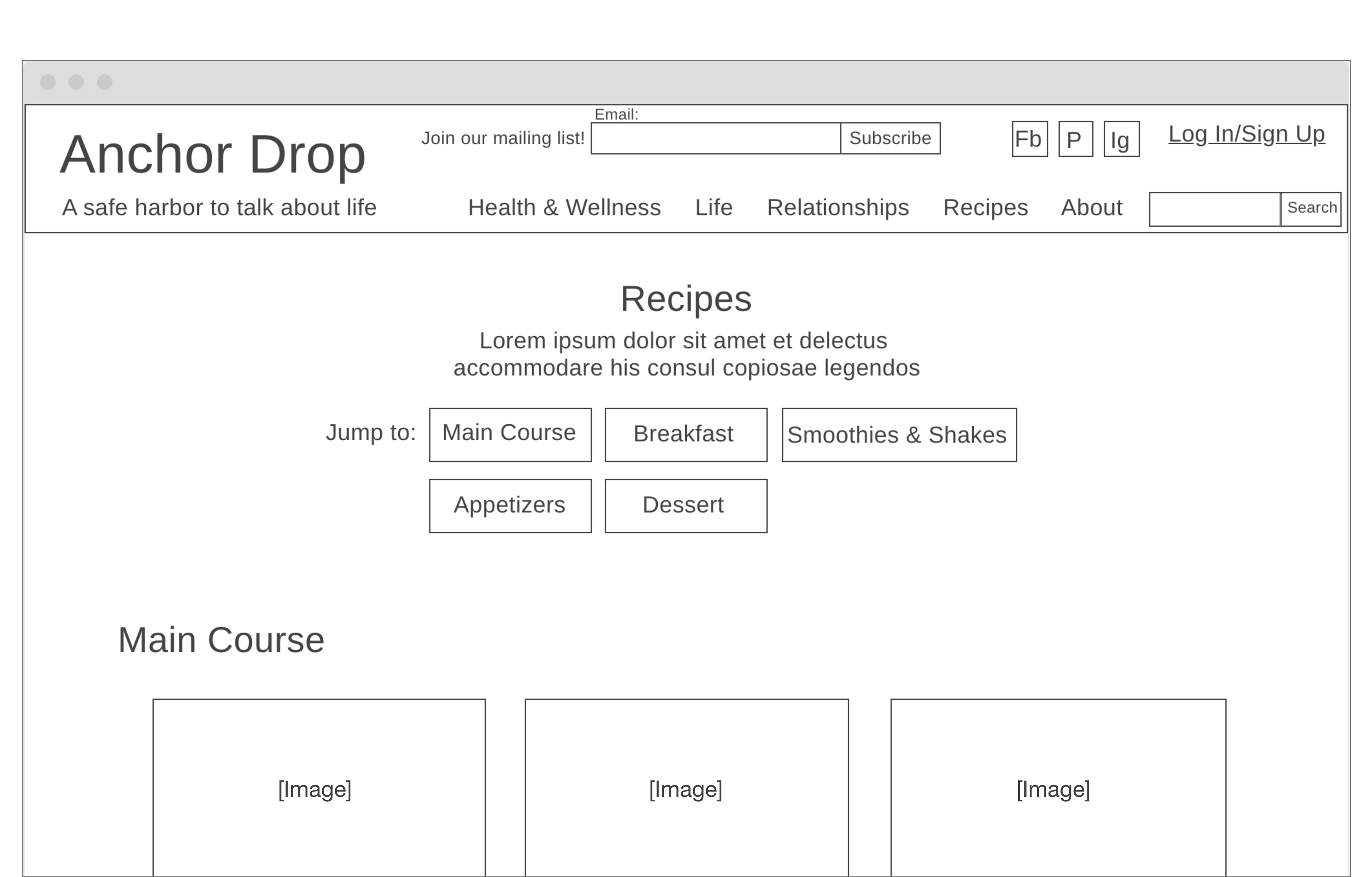
Desktop recipes page
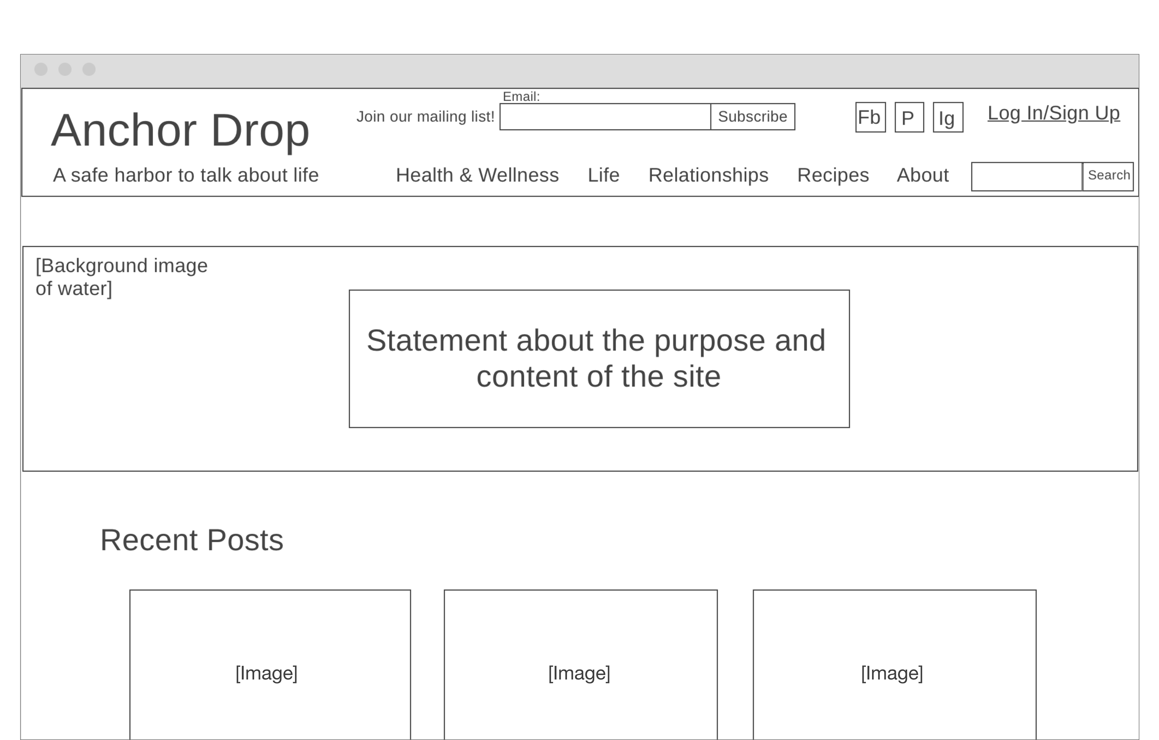
Desktop homepage top
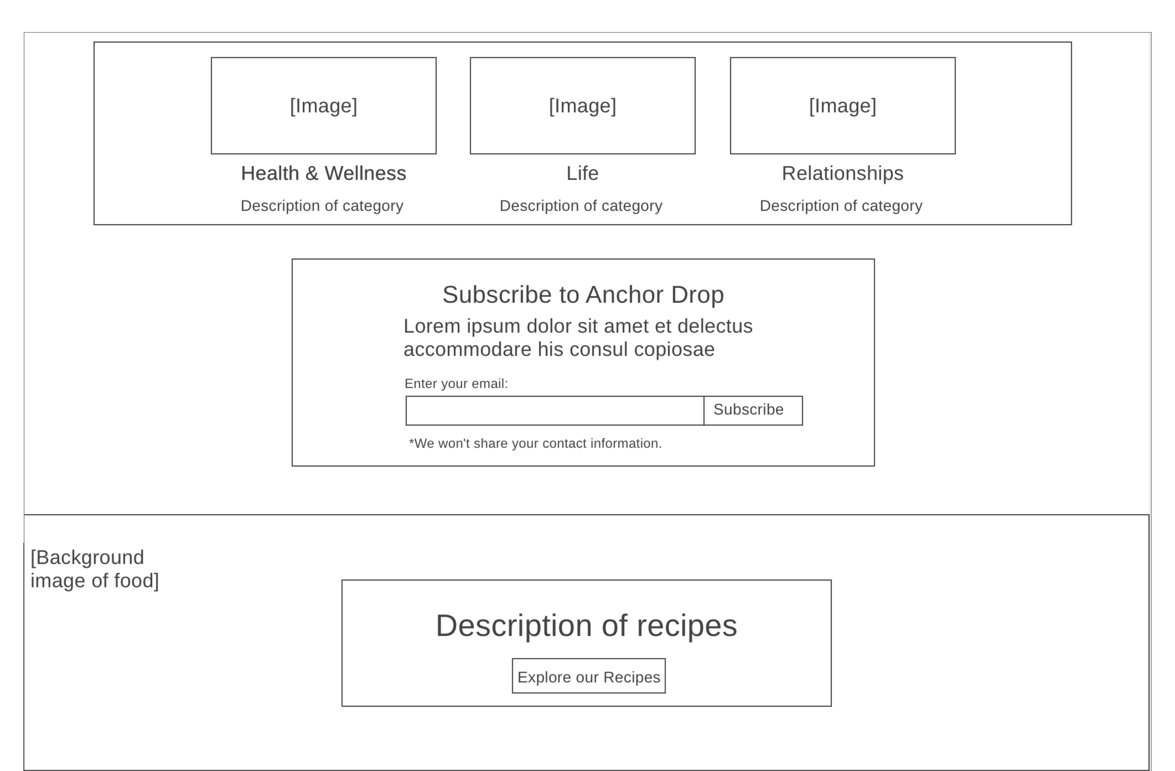
Desktop homepage center
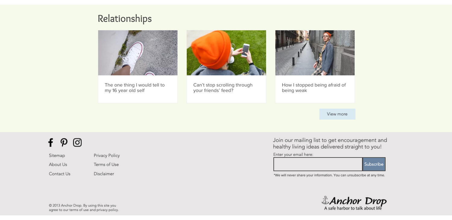
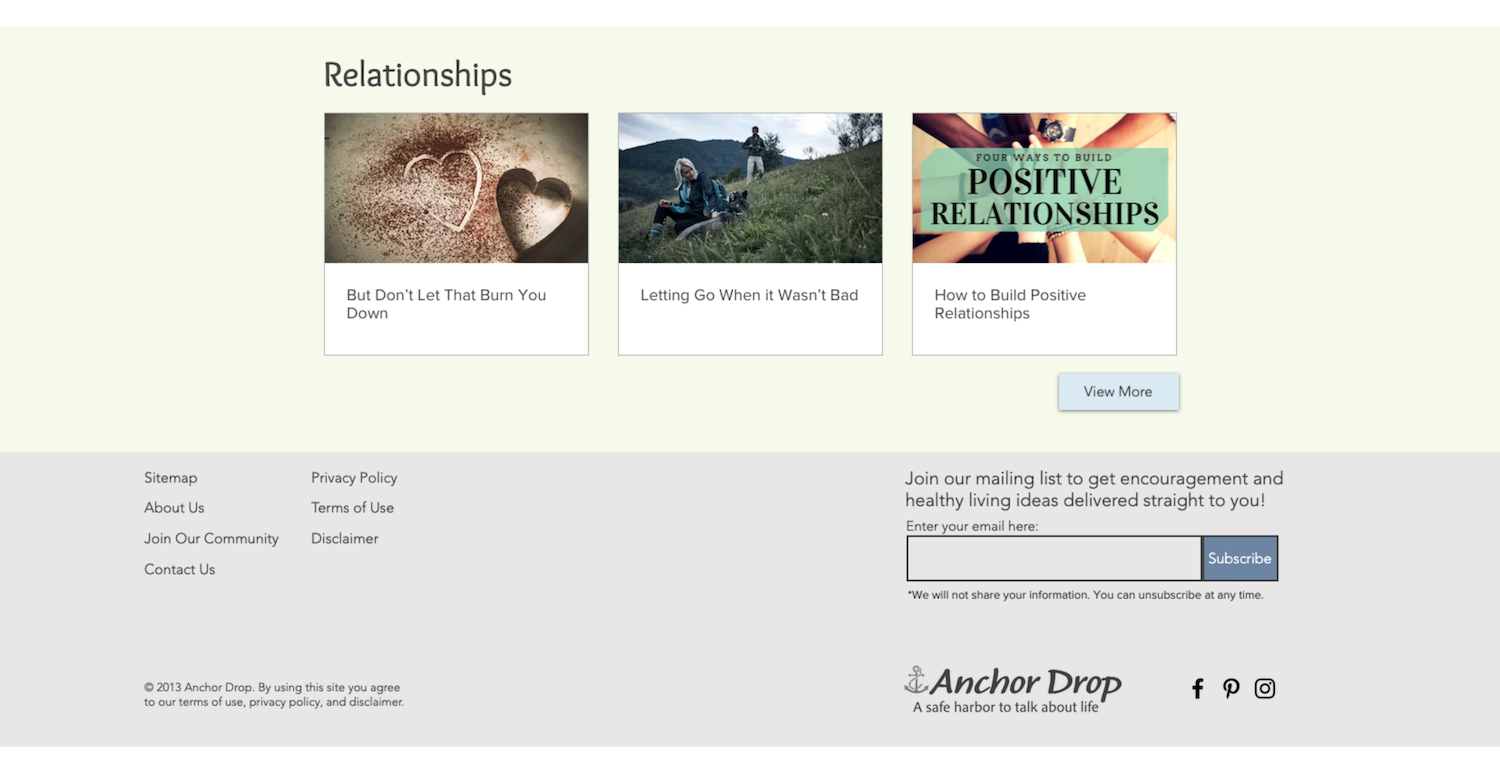
Desktop homepage bottom with footer
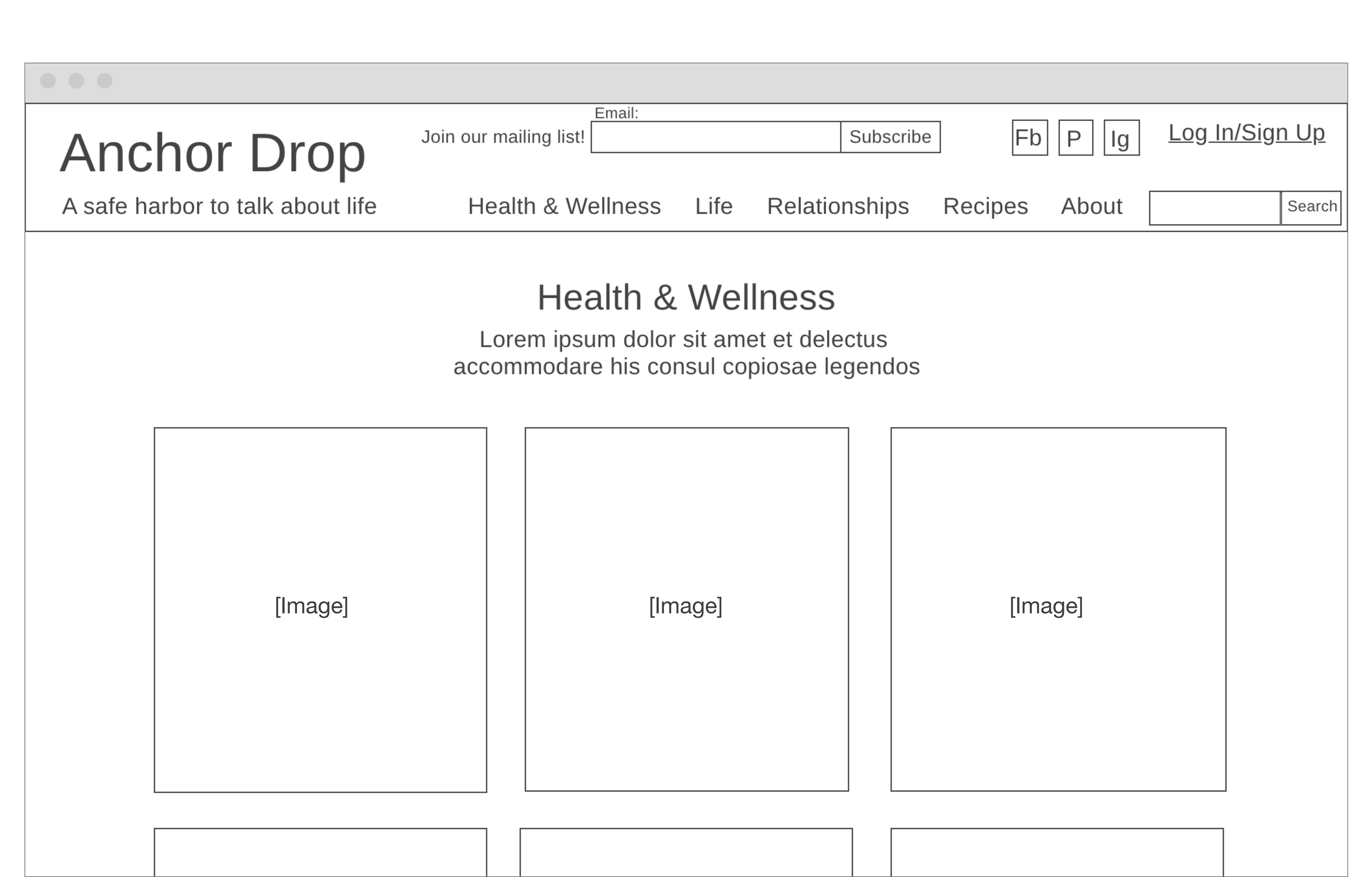
Desktop blog category page
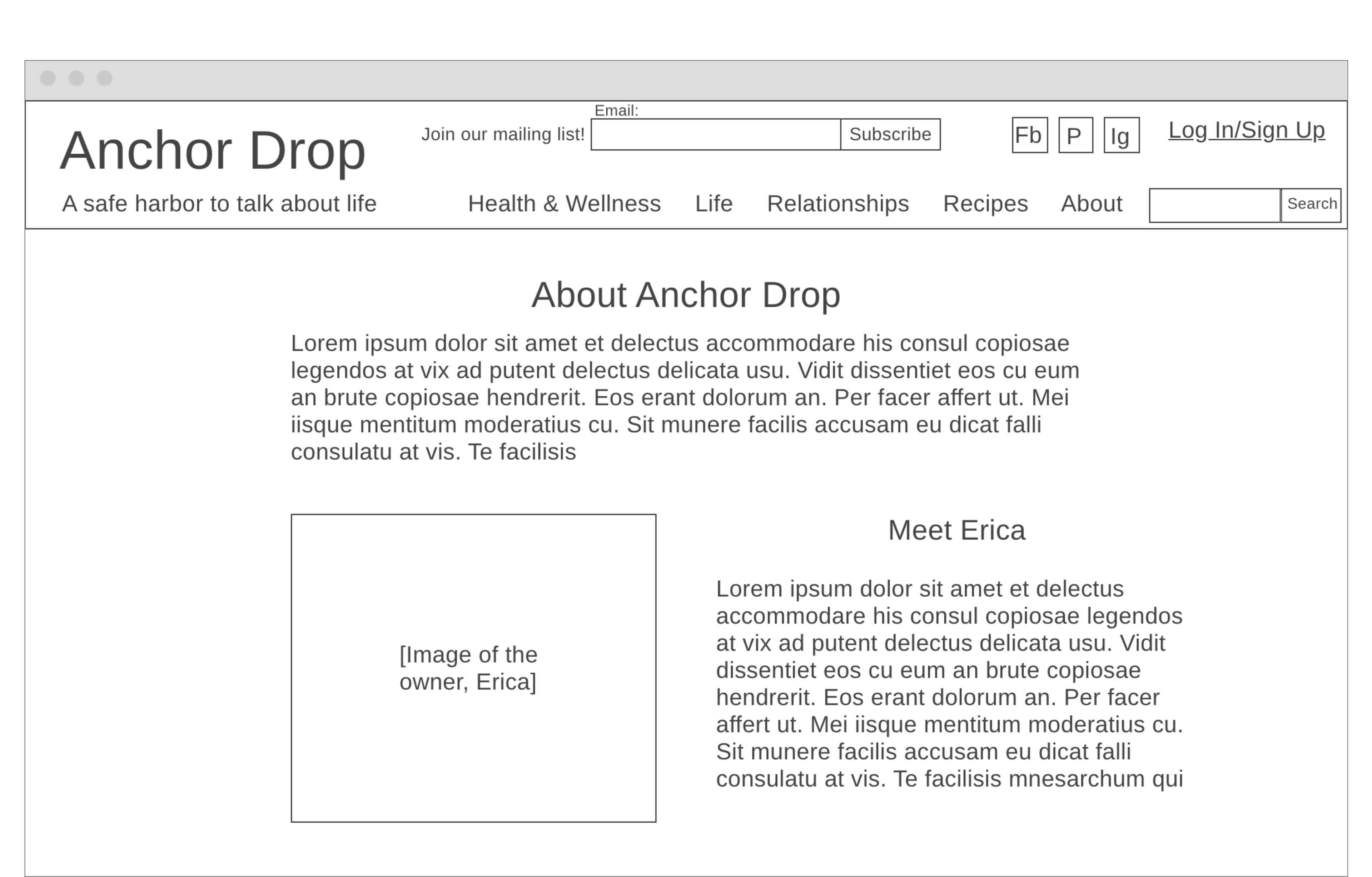
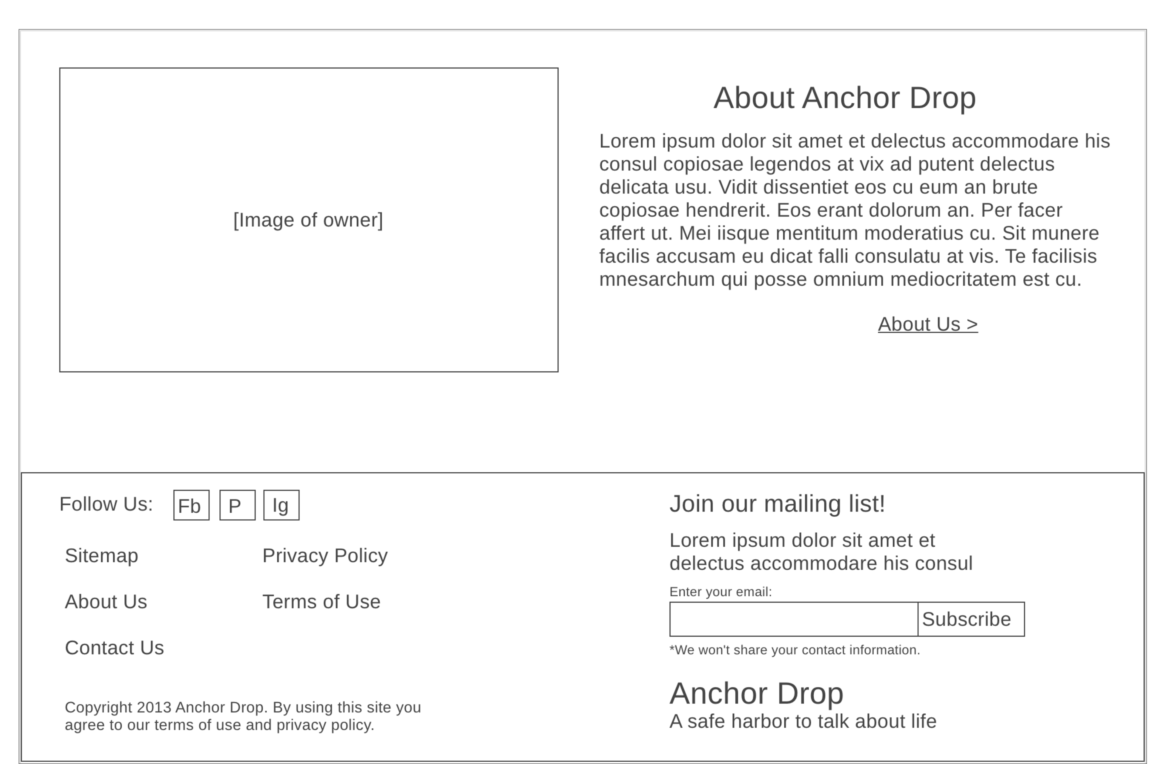
Desktop about page

Homepage
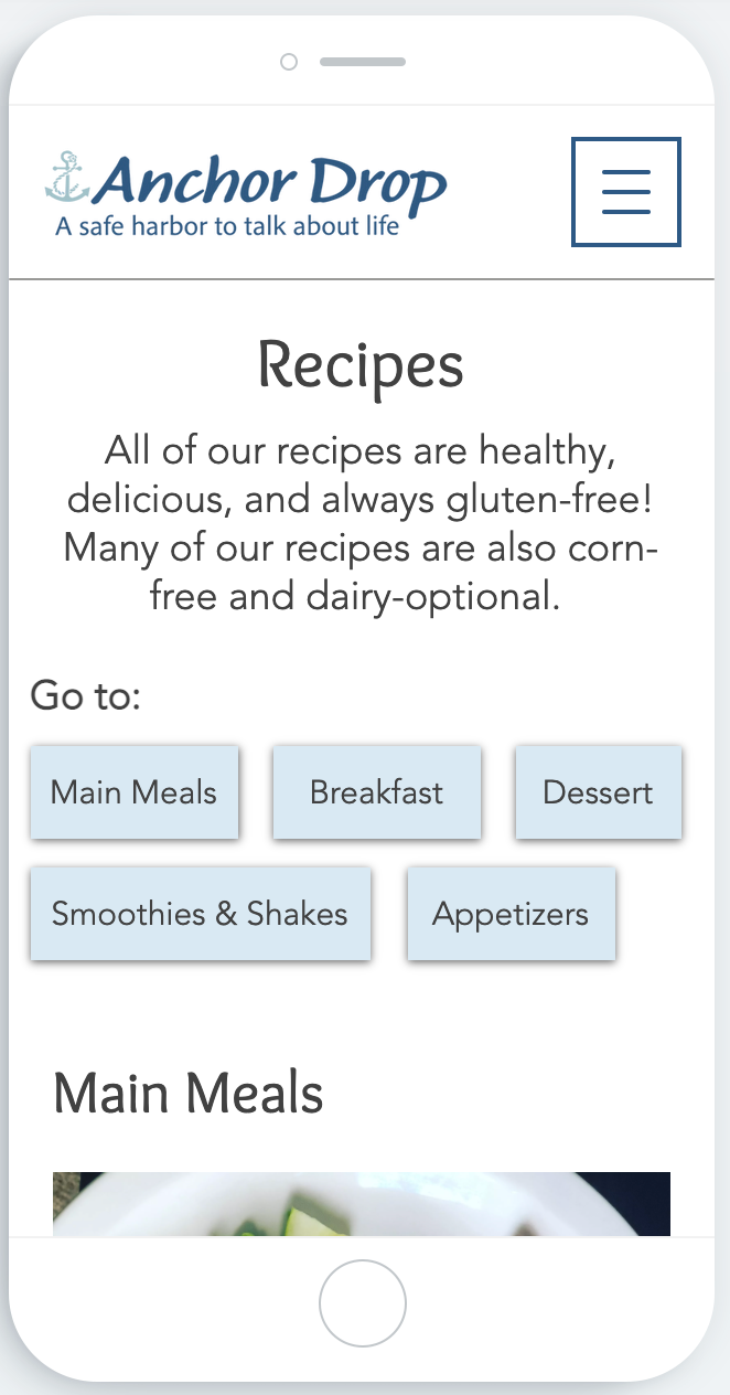
Recipes page

Blog category page
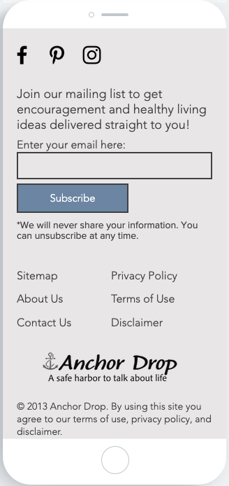
Footer

Desktop homepage
Desktop footer

Desktop category page
Desktop subscription form


Homepage
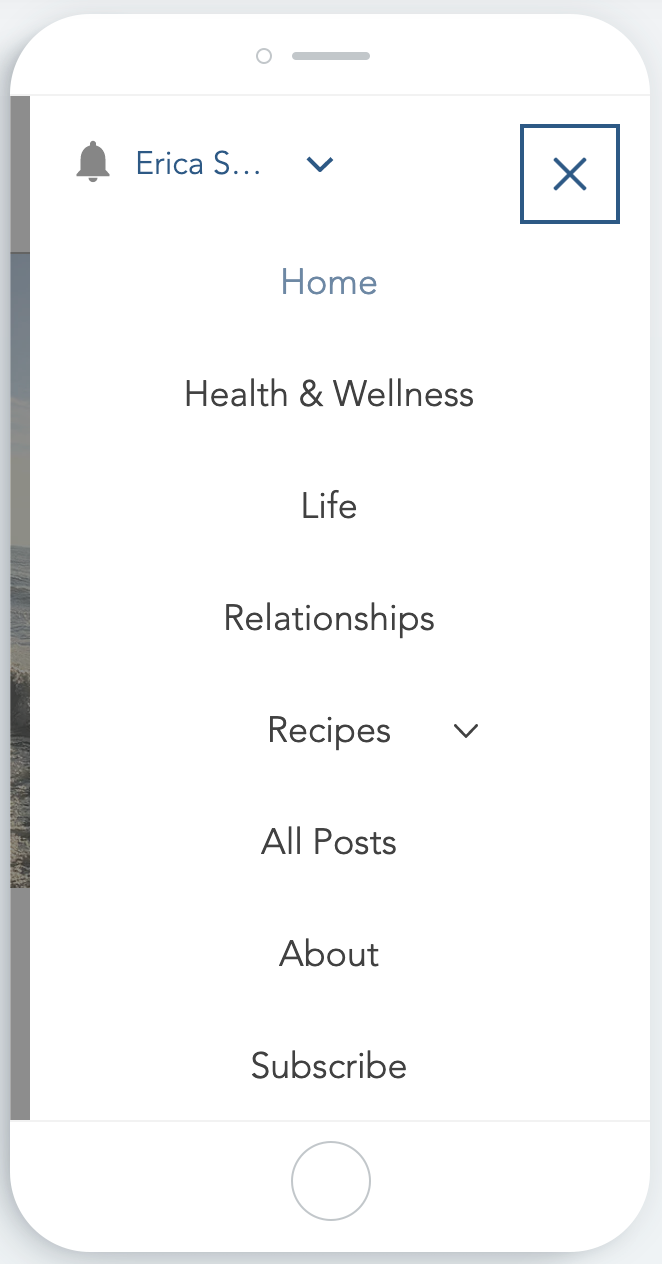
Open hamburger menu
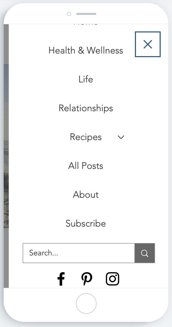
Open hamburger menu continued

Footer

All recipes page
Bottom of recipe subcategory page
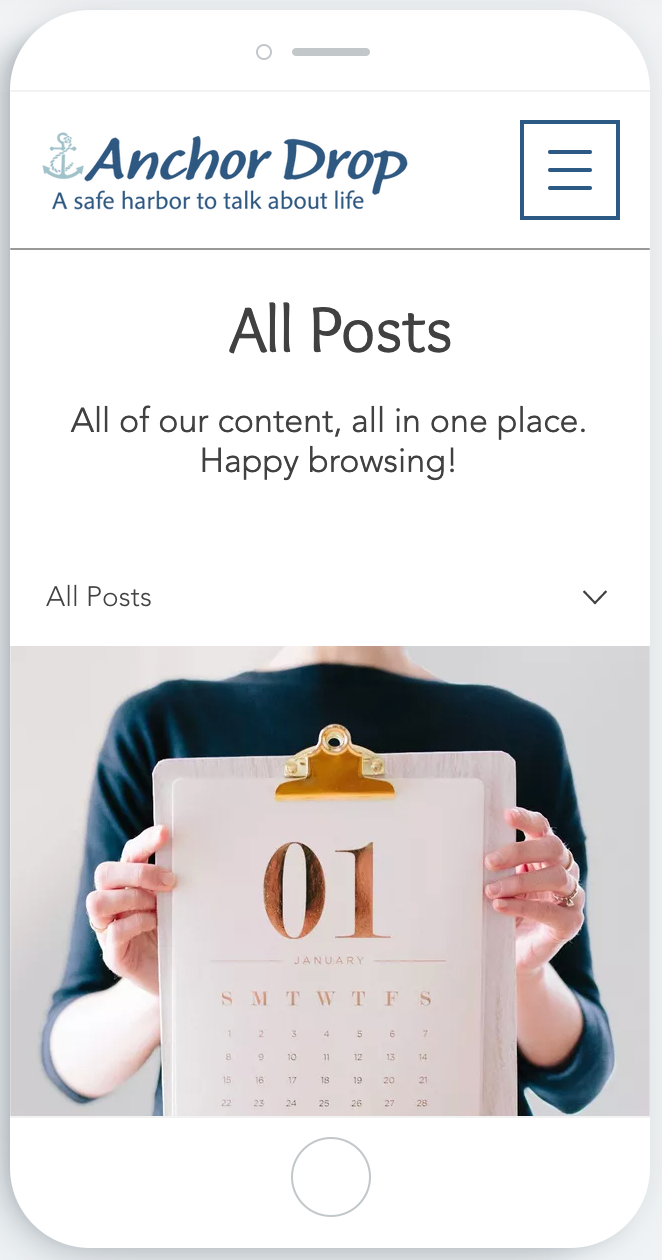
All posts page

Blog category page
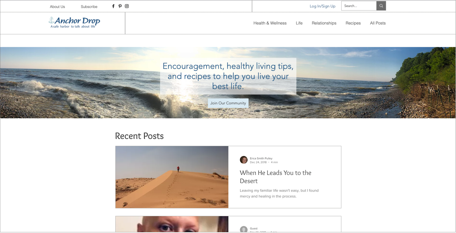
Homepage, above the fold

Homepage continued
Footer (bottom of homepage)

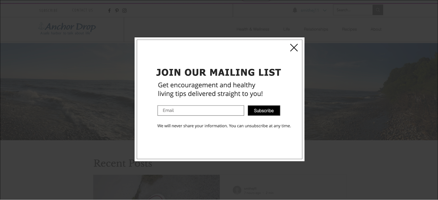
Subscription page
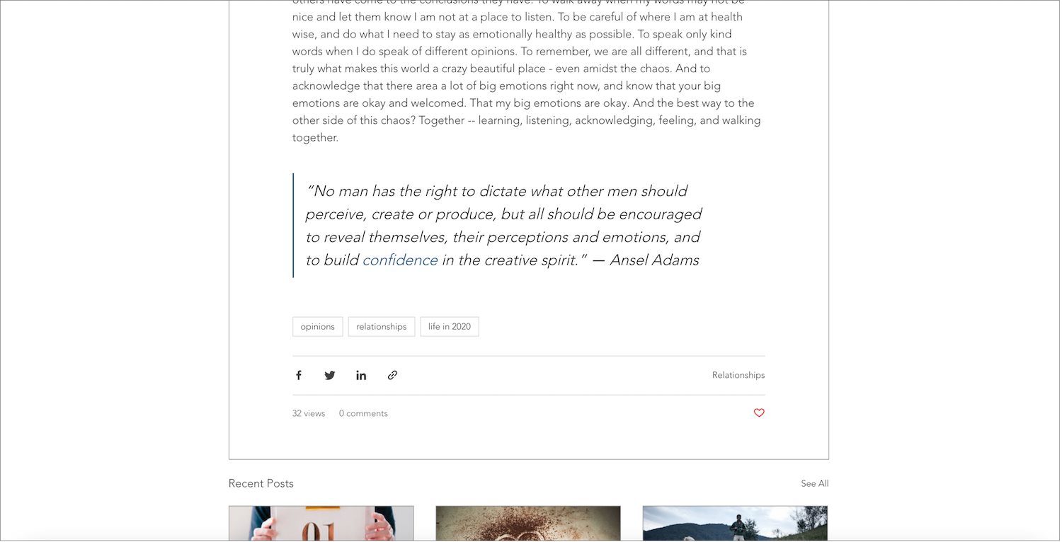
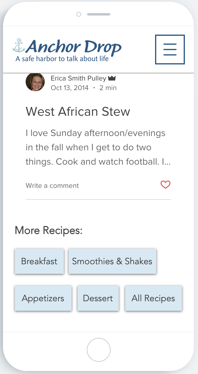
Blog post (bottom)
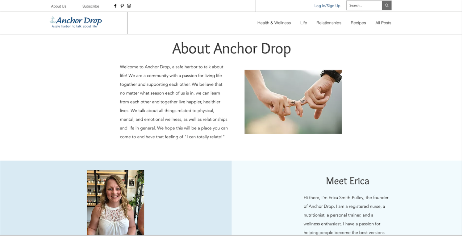
About Us page
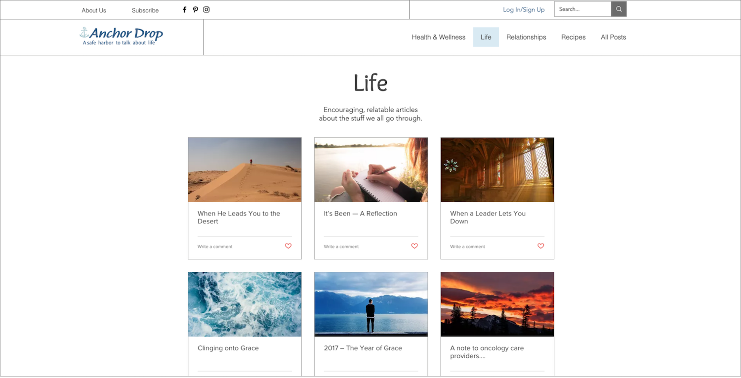
Category page
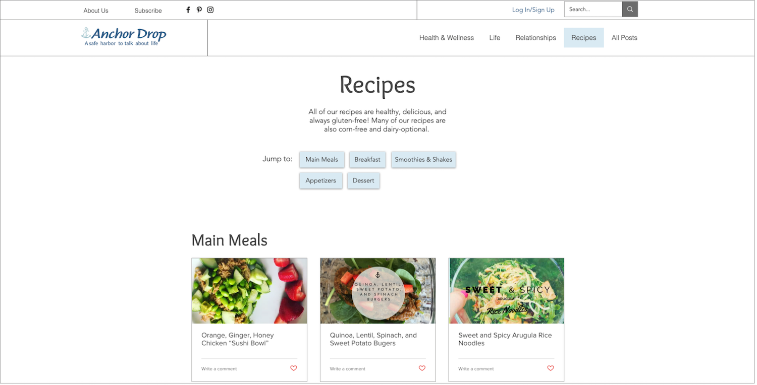
Recipes page

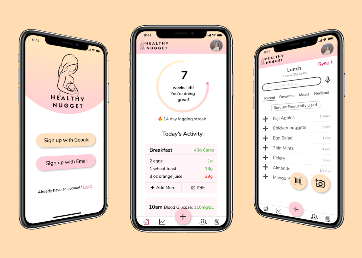
Healthy Nugget
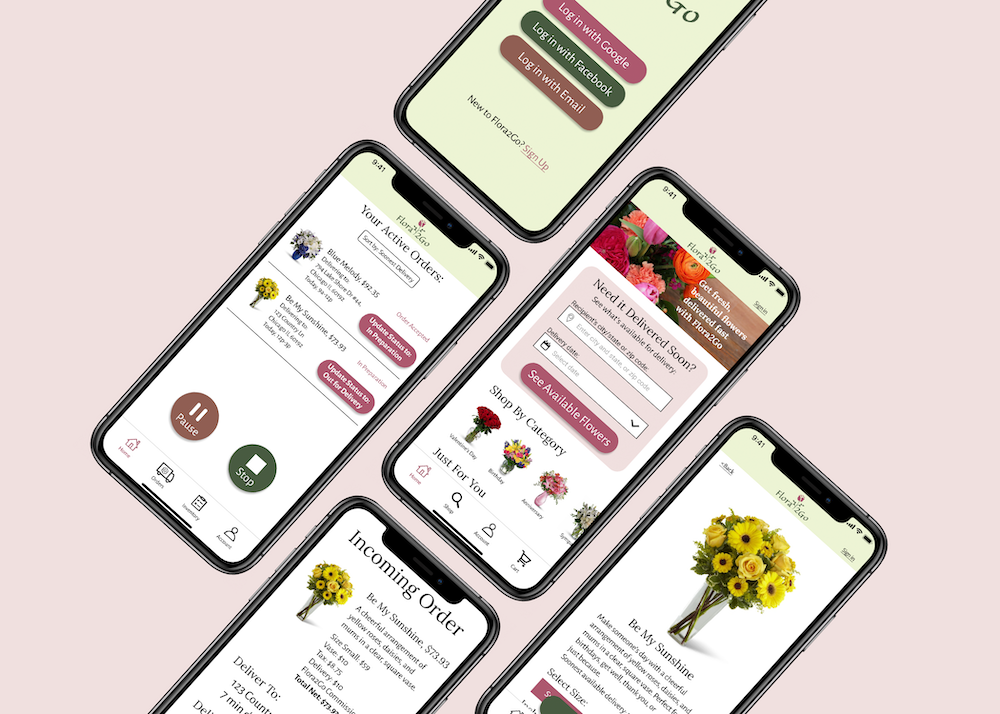
Flora2Go